Data summarization is an essential process in statistical programming, which involves reducing and simplifying large datasets into more manageable and understandable forms. This process is crucial as it helps in highlighting the key aspects of the data by extracting important patterns, trends, and relationships. In the realm of statistical analysis, summarization is not just about making the data smaller or simpler; it’s about capturing the essence of the data in a way that is both informative and useful for analysis.
Significance in Large Datasets
The advent of big data has made data summarization more important than ever. With the sheer volume of data available today, it’s practically impossible to analyze every individual data point. Summarization helps in distilling large datasets to a form where they can be easily interpreted and analyzed. This process not only saves time and computational resources but also aids in making data-driven decisions more effectively.
For instance, summarizing sales data over years can reveal trends and patterns that might not be evident when looking at daily sales figures. Similarly, summarizing survey data can help in quickly understanding the general opinion or trend, without getting lost in the myriad of individual responses.
Types of Summarization Techniques
Numerical Summarization: This involves using statistical measures to summarize the key characteristics of numerical data. Techniques include calculating measures of central tendency (like mean, median, and mode) and measures of variability or spread (like range, variance, and standard deviation). These techniques are fundamental in providing a quick snapshot of the data’s overall distribution and central values.
Categorical Summarization: When dealing with categorical (or qualitative) data, summarization often involves understanding the frequency or occurrence of different categories. Techniques include creating frequency tables, cross-tabulations, and using measures like mode. This type of summarization is particularly useful in understanding the distribution of categorical variables, like customer categories or product types.
Visual Summarization: Visual representations of data, such as histograms, bar charts, box plots, and scatter plots, provide an intuitive way to summarize and understand complex datasets. These techniques are invaluable in revealing patterns, trends, outliers, and relationships in data that might not be obvious in textual or numerical summaries.
In R, these summarization techniques are supported by a variety of functions and packages, making it an ideal environment for both basic and advanced data summarization tasks. This chapter will delve into these techniques, providing the reader with the knowledge and tools to effectively summarize and interpret large datasets using R.
Summarizing Numerical Data
Introduction to Normality Testing.
Normality testing is a fundamental step in statistical analysis, particularly when deciding which statistical methods to apply. Many statistical techniques assume that the data follows a normal (or Gaussian) distribution. However, real-world data often deviates from this idealized distribution. Therefore, assessing the normality of your dataset is crucial before applying techniques that assume normality, such as parametric tests.
In R, there are several methods to test for normality, including graphical methods like Q-Q plots and statistical tests like the Shapiro-Wilk test. Let’s explore how to perform these tests in R with an example dataset.
Graphical Methods to Identify Normality distribution
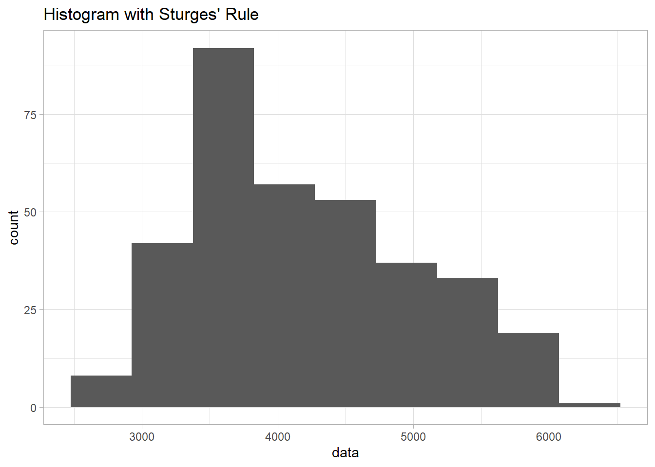
1) Histogram
library(palmerpenguins)library(ggplot2)data <-na.omit(penguins$body_mass_g) # Remove NA valuesnum_bins_sturges <-1+log2(length(data)) #calculating number of bins using struge's rulesggplot(data.frame(data), aes(x = data)) +geom_histogram(bins =round(num_bins_sturges)) +ggtitle("Histogram with Sturges' Rule") +theme_light()
Based on the Histogram, we can conclude that the data is a bit skewed to the right.
2) Boxplot
ggplot(penguins, aes(body_mass_g)) +geom_boxplot() +ggtitle("A Boxplot showing distribution of weight of Penguins in grams") +theme_minimal() +scale_y_continuous(limits=c(-1,1))
Based on the boxplot, we can clearly see that the data was a bit skewed to the right.
3) Kurtosis and Skewness
Kurtosis is a measure of a sample or population that identifies how flat or peaked it is with respect to a normal distribution. It refers to how concentrated the values are in the center of the distribution. In other hand, sample can be described as a measure of horizontal symmetry with respect to a normal distribution by measuring the skewness coefficient. If the coefficient of skewness can be either positive (right skew), zero (no skew), or negative (left skew).
Steps examining sample normality by skewness and kurtosis:
1) Determine sample mean and standard deviation
2) Determine sample kurtosis and skewness
Formula Skewness:
Formula for Standard Error of Skewness:
Formula Kurtosis:
Formula for Standard Error of Kurtosis:
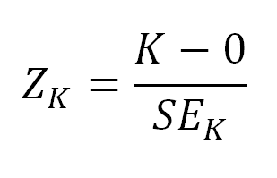
3) Calculate the standard error of the kurtosis and the standard error of the skewness
4) Calculate Z-Score for the kurtosis and Z-Score for the skewness
Formula for Z-Score Skewness:
Formula for Z-Score Kurtosis:
5) Compare the Z-Score to the critical region obtained from the normal distribution
The Z-score is to examine the sample’s approximation to a normal distribution.
Z-score values for kurtosis and skewness must fall between -2 and 2 to pass the normality assumption for alpha=0.05.
Z-score for Skewness: This score indicates how many standard deviations the skewness of the dataset is from the mean skewness of a normally distributed dataset. A higher absolute value of the z-score indicates a greater degree of asymmetry.
Z-score for Kurtosis: Similarly, this score tells us how many standard deviations the kurtosis of the dataset is from the mean kurtosis of a normal distribution. It reflects the “tailedness” or the peak height of the distribution.
Z-score between -2 and 2: This range is generally considered to indicate that the skewness or kurtosis is not significantly different from what would be expected in a normal distribution. The data can be considered approximately normal in this aspect.
Z-score less than -2: This suggests a significant deviation from normality in a negative direction. For skewness, it would mean a left skew (tail is on the left side). For kurtosis, it indicates a platykurtic distribution (less peaked than a normal distribution).
Z-score greater than 2: This indicates a significant deviation in a positive direction. For skewness, it would imply a right skew (tail is on the right side). For kurtosis, it suggests a leptokurtic distribution (more peaked than a normal distribution).
It is clearly seen that the value of Z-Score for skewness is beyond 2, which indicating the data is skewed to the right tail. and the value of Z-Score for kurtosis is less than -2, indicating platykurtic distribution (less peaked than a normal distribution).
4) Q-Q plots
Q-Q plots are scatterplots created by plotting two sets of quantiles against each other: the quantiles from the dataset and the quantiles of a normal distribution. If the data are normally distributed, the points in the Q-Q plot will approximately lie on a straight line.
Interpreting the Q-Q Plot
Linearity: In a Q-Q plot, if the data are normally distributed, the points will approximately lie on a straight line. The closer the points are to the line (qqline), the more normal the distribution is.
Departures from Linearity: Deviations from the line can indicate departures from normality:
Left Tail (lower end of the plot): If the points deviate below the line at the lower end, it suggests a left-skewed distribution (lighter left tail than normal).
Right Tail (upper end of the plot): If the points deviate above the line at the upper end, it indicates a right-skewed distribution (heavier right tail than normal).
Center of the Plot: If the points deviate from the line in the middle of the plot, it suggests a difference in the median or a distribution with different kurtosis from normal (either more peaked or flatter than a normal distribution).
#Create Q-Q plotqqnorm(penguins$body_mass_g)#Adding straight diagonal line to plotqqline(penguins$body_mass_g)qqline(penguins$body_mass_g,main ='Q-Q Plot for Normality', xlab ='Theoretical Dist', ylab ='Sample dist', col ='steelblue')
Another way to construct qqplot
library(ggpubr)ggqqplot(penguins$body_mass_g)
By examining how the points in the Q-Q plot deviate from the reference line, we can infer if and how the body_mass_g distribution deviates from a normal distribution. Remember, a Q-Q plot provides a visual assessment and should be used in conjunction with other methods for a comprehensive analysis of normality.
5) p-p Plot
A P-P (Probability-Probability) plot is a graphical technique used to assess how closely two probability distributions agree with each other. Specifically, it compares the cumulative distribution function (CDF) of a sample data set against the CDF of a theoretical distribution, which is often a normal distribution in many applications. The P-P plot is particularly useful for evaluating the goodness of fit of a distribution model to observed data.
How a P-P Plot Works:
Theoretical Distribution: This is often a standard distribution like a normal distribution, but it could be any specified distribution. The cumulative probabilities from this distribution are plotted on one axis (usually the x-axis).
Sample Data Distribution: The observed data’s cumulative probabilities are calculated and plotted on the other axis (usually the y-axis).
Plotting: On a P-P plot, each point represents a cumulative probability from the sample data against the corresponding cumulative probability from the theoretical distribution. If the sample data perfectly follow the theoretical distribution, all the points will lie on the diagonal line.
Interpreting a P-P Plot:
Linearity: If the points on a P-P plot lie close to the diagonal line (45-degree line), this indicates that the sample data follow the theoretical distribution closely.
Deviations from Linearity:
Both Ends Deviate: If the points deviate from the diagonal at both the lower and upper tails, it suggests that the sample distribution has heavier or lighter tails than the theoretical distribution.
Middle Deviates: If the points deviate in the middle of the plot but are closer at the tails, this could indicate a discrepancy in the central part of the distribution, like a difference in variance between the sample and theoretical distributions.
S-shaped Curve: An S-shaped curve in the P-P plot indicates that one of the distributions is more skewed compared to the other.
    Jarque Bera Test

data:  data1$body_mass_g
X-squared = 20.014, df = 2, p-value = 4.508e-05
D’Agostino skewness Test
D’Agostino’s K-squared test is a statistical method used to test the hypothesis that a given sample comes from a normally distributed population, focusing particularly on the skewness of the distribution.
Skewness is a measure of the asymmetry of the probability distribution of a real-valued random variable.
Focus on Skewness: The test specifically examines the skewness of the distribution, which is the degree to which it leans to one side. In a perfectly normal distribution, the skewness would be zero, indicating symmetry.
Test Statistic: The test involves calculating a standardized skewness measure and then squaring it to get the test statistic. This statistic essentially measures how far the sample’s skewness deviates from that expected in a normal distribution.
Sample Size Consideration: The calculation of the test statistic incorporates the sample size, as skewness can be more variable in smaller samples. The test is adjusted to account for this variability.
P-Value: The test produces a p-value, which indicates the probability of observing the given degree of skewness (or more extreme) if the null hypothesis of normality is true. A low p-value (typically less than 0.05) would lead to rejecting the null hypothesis, suggesting the distribution is not normal with respect to skewness.
Applicability: While D’Agostino’s K-squared test is robust for various sample sizes, it is particularly useful for larger samples where the approximation of the p-value becomes more accurate.
Interpretation: It’s important to interpret the results within the context of your data. Even if a dataset fails this test, it might still be approximately normal enough for certain statistical methods that assume normality. Conversely, a pass does not guarantee all aspects of normality (like kurtosis).
    D'Agostino skewness test

data:  data1$body_mass_g
skew = 0.46826, z = 3.44537, p-value = 0.0005703
alternative hypothesis: data have a skewness
Pearson’s Chi-Square Normality Test
The Pearson Chi-Square normality test, often referred to as the Pearson’s Chi-Squared test for goodness-of-fit, is a statistical test used to determine if a sample comes from a population with a specific distribution, in this case, a normal distribution.
Basic Concept: The test compares the observed frequencies in each category/bin of the data to the frequencies expected if the data followed a normal distribution. The bins are typically intervals of values in your data set.
Test Statistic: The test statistic is computed by summing the squared differences between the observed and expected frequencies, divided by the expected frequencies.
Degrees of Freedom: The degrees of freedom for the test are typically the number of bins minus the number of parameters estimated (mean and standard deviation for a normal distribution) and minus one.
P-Value: The test yields a p-value which indicates the probability of observing the data if it actually comes from a normal distribution. A low p-value (typically less than 0.05) suggests that the data do not come from a normal distribution.
Cautions: The test can be sensitive to the choice of bins and is generally less powerful for detecting deviations from normality than other tests like the Shapiro-Wilk test. It is more suitable for large sample sizes.
    Pearson chi-square normality test

data:  penguins$body_mass_g
P = 59.947, p-value = 2.087e-06
Shapiro-Francia Normality Test
The Shapiro-Francia normality test is a modification of the Shapiro-Wilk test for normality. It is particularly useful for testing the normality of distributions that are suspected of having light tails. Compared to the Shapiro-Wilk test, the Shapiro-Francia test is less sensitive to deviations in the tails of the distribution.
Focus on Light Tails: The test is specifically tailored to detect departures from normality due to light tails.
Test Statistic: Similar to the Shapiro-Wilk test, the Shapiro-Francia test computes a test statistic that measures the closeness of the data to the normal distribution. However, it uses a different weighting scheme that makes it less sensitive to the tails.
Interpretation: As with other normality tests, a low p-value (typically less than 0.05) suggests that the data do not come from a normal distribution.
library(nortest)sf.test(penguins$body_mass_g)
    Shapiro-Francia normality test

data:  penguins$body_mass_g
W = 0.96126, p-value = 4.027e-07
Cramer-Von Mises Normality Test
The Cramér-von Mises criterion is a goodness-of-fit test used in statistics to test the hypothesis that a given set of observations is drawn from a specified distribution. In the context of testing for normality, the Cramér-von Mises test compares the empirical cumulative distribution function (ECDF) of the sample data against the CDF of a normal distribution.
Test Statistic: The Cramér-von Mises test statistic measures the sum of squared differences between the ECDF of the sample and the CDF of the theoretical normal distribution.
Sensitivity: Unlike tests that may focus more on the tails (like the Anderson-Darling test) or the center of the distribution (like the Kolmogorov-Smirnov test), the Cramér-von Mises test is a more general test of goodness-of-fit and doesn’t give special weight to any part of the distribution.
P-Value: The test yields a p-value, which can be used to determine whether to reject the null hypothesis that the data are drawn from a normal distribution. A low p-value (usually less than 0.05) suggests that the data are not normally distributed.
library(nortest)cvm.test(penguins$body_mass_g)
    Cramer-von Mises normality test

data:  penguins$body_mass_g
W = 0.75983, p-value = 2.474e-08
Exercise 1
1) Apply the lilliefor’s test to dep_delay across all flights in nycflights13. What does the result indicate about the distribution of departure delays?
2) Assess whether the body mass (body_mass_g) of these penguins follows a normal distribution for each species. [palmerpenguins]
3) Perform Jarque-Bera test on flipper_length_mm for penguins on each island (island). Which island exhibit the most normal-like distribution in terms of flipper length?
Basic Statistical Summarisation
Data summarization is a crucial aspect of statistical analysis, providing a way to describe and understand large datasets through a few summary statistics. Among the key concepts in data summarization are measures of central tendency, position, and dispersion. Each of these measures gives different insights into the nature of the data. [for continuous/numerical data only]
1. Measures of Central Tendency
Measures of central tendency describe the center point or typical value of a dataset. The most common measures are:
Mean (Arithmetic Average): The sum of all values divided by the number of values. It’s sensitive to outliers and can be skewed by them.
# calculating mean of numerical variablemean(penguins$body_mass_g, na.rm =TRUE)
[1] 4201.754
Median: The middle value when the data is sorted in ascending order. It’s less affected by outliers and skewness and provides a better central value for skewed distributions.
#calculating median of numerical variablemedian(penguins$body_mass_g, na.rm=TRUE)
[1] 4050
Mode: The most frequently occurring value in the dataset. There can be more than one mode in a dataset (bimodal, multimodal). Useful in understanding the most common value, especially for categorical data.
Measures of position describe how data points fall in relation to the distribution or to each other. These include:
Percentiles: Values below which a certain percentage of the data falls. For example, the 25th percentile (or 1st quartile) is the value below which 25% of the data lies.
quantile(penguins$body_mass_g, na.rm=TRUE)
  0%  25%  50%  75% 100%
2700 3550 4050 4750 6300
Quartiles: Special percentiles that divide the dataset into four equal parts. The median is the second quartile.
Interquartile Range (IQR): The range between the first and third quartiles (25th and 75th percentiles). It represents the middle 50% of the data and is a measure of variability that’s not influenced by outliers.
IQR(penguins$body_mass_g, na.rm=TRUE)
[1] 1200
3. Measures of Dispersion
Measures of dispersion or variability tell us about the spread of the data points in a dataset:
min: To find the minimum value in the variable
min(penguins$body_mass_g, na.rm =TRUE)
[1] 2700
max: To find the maximum value in the variable
max(penguins$body_mass_g, na.rm=TRUE)
[1] 6300
length: to find how many observations in the variable
length(penguins$body_mass_g)
[1] 344
Range: The difference between the highest and lowest values. It’s simple but can be heavily influenced by outliers.
Variance: The average of the squared differences from the mean. It gives a sense of the spread of the data, but it’s not in the same unit as the data.
var(penguins$body_mass_g, na.rm=TRUE)
[1] 643131.1
Standard Deviation (SD): The square root of the variance. It’s in the same units as the data and describes how far data points tend to deviate from the mean.
sd(penguins$body_mass_g, na.rm=TRUE)
[1] 801.9545
Coefficient of Variation (CV): The ratio of the standard deviation to the mean. It’s a unitless measure of relative variability, useful for comparing variability across datasets with different units or means.
The summary() function in R is a generic function used to produce result summaries of various model and data objects. When applied to a data frame, it provides a quick overview of the statistical properties of each column. The function is particularly useful for getting a rapid sense of the data, especially during the initial stages of data analysis.
Key Features of summary() in R:
Applicability to Different Objects: The summary() function can be used on different types of objects in R, including vectors, data frames, and model objects. The output format varies depending on the type of object.
Default Output for Data Frames: For a data frame, summary() typically returns the following statistics for each column:
For factor variables: Counts for each level, and NA count if there are missing values.
Handling of Missing Values: The function includes NA values in its output, providing a count of missing values, which is crucial for data cleaning and preprocessing.
Customization: The behavior of summary() can be customized for user-defined classes (S3 or S4) in R. This means that when you create a new type of object, you can also define what summary() should return when applied to objects of this type.
Use in Exploratory Data Analysis (EDA): It is often used as a preliminary step in EDA to get a sense of the data distribution, identify possible outliers, and detect missing values.
summary(penguins)
      species          island    bill_length_mm  bill_depth_mm
 Adelie   :152   Biscoe   :168   Min.   :32.10   Min.   :13.10
 Chinstrap: 68   Dream    :124   1st Qu.:39.23   1st Qu.:15.60
 Gentoo   :124   Torgersen: 52   Median :44.45   Median :17.30
                                 Mean   :43.92   Mean   :17.15
                                 3rd Qu.:48.50   3rd Qu.:18.70
                                 Max.   :59.60   Max.   :21.50
                                 NA's   :2       NA's   :2
 flipper_length_mm  body_mass_g       sex           year
 Min.   :172.0     Min.   :2700   female:165   Min.   :2007
 1st Qu.:190.0     1st Qu.:3550   male  :168   1st Qu.:2007
 Median :197.0     Median :4050   NA's  : 11   Median :2008
 Mean   :200.9     Mean   :4202                Mean   :2008
 3rd Qu.:213.0     3rd Qu.:4750                3rd Qu.:2009
 Max.   :231.0     Max.   :6300                Max.   :2009
 NA's   :2         NA's   :2
Notes:
While summary() provides a quick and useful overview, it’s often just a starting point for data analysis. Depending on the results, you might need more detailed analysis, such as specific statistical tests or detailed data visualizations.
The function is particularly handy for quickly checking data after importation, allowing for a rapid assessment of data quality, structure, and potential areas that may require further investigation.
Data Summarization on Matrices
rowMeans(x):
Purpose: Calculates the mean of each row in a matrix x.
Use Case: Useful when you need to find the average across different variables (columns) for each observation (row).
Output: Returns a numeric vector containing the mean of each row.
data <- penguins# Selecting only numeric columns for the matrixnumeric_data <- data[, sapply(data, is.numeric)]numeric_matrix <-as.matrix(na.omit(numeric_data))# Apply summarization functions# Means of each rowrow_means <-rowMeans(numeric_matrix)
colMeans(x):
Purpose: Computes the mean of each column in a matrix x.
Use Case: Used when you want to find the average value of each variable (column) across all observations (rows).
Output: Produces a numeric vector with the mean of each column.
# Means of each columncolMeans(numeric_matrix)
   bill_length_mm     bill_depth_mm flipper_length_mm       body_mass_g
         43.92193          17.15117         200.91520        4201.75439
             year
       2008.02924
rowSums(x):
Purpose: Calculates the sum of each row in a matrix x.
Use Case: Helpful for aggregating data across multiple variables (columns) for each individual observation (row).
Output: Returns a numeric vector containing the sum of each row.
# Sums of each rowrow_sums <-rowSums(numeric_matrix)
colSums(x):
Purpose: Computes the sum of each column in a matrix x.
Use Case: Useful for aggregating data for each variable (column) across all observations (rows).
Output: Generates a numeric vector with the sum of each column.
# Sums of each columncolSums(numeric_matrix)
   bill_length_mm     bill_depth_mm flipper_length_mm       body_mass_g
          15021.3            5865.7           68713.0         1437000.0
             year
         686746.0
Detecting how many missing values
To detect how many missing values in the variable
table(is.na(penguins$body_mass_g))
FALSE  TRUE
  342     2
TRUE means number of missing values in the dataset for variable body_mass_g.
Apply function
We can calculate summary statistics simultaneously by using sapply, this function allow us to get the numerical statistics measures for all numerical values. we will discuss about apply family in other lecture.
Mean
sapply(numeric_data, mean, na.rm=TRUE)
   bill_length_mm     bill_depth_mm flipper_length_mm       body_mass_g
         43.92193          17.15117         200.91520        4201.75439
             year
       2008.02907
Standard Deviation
sapply(numeric_data, sd, na.rm=TRUE)
   bill_length_mm     bill_depth_mm flipper_length_mm       body_mass_g
        5.4595837         1.9747932        14.0617137       801.9545357
             year
        0.8183559
Sum / total in a column
sapply(numeric_data, sum, na.rm=T)
   bill_length_mm     bill_depth_mm flipper_length_mm       body_mass_g
          15021.3            5865.7           68713.0         1437000.0
             year
         690762.0
Basically, we can just substitute the numerical measure inside the 2nd arguments.
Summary Statistics by group
Usually in data analysis, if there are a categorical variable, we would like to compare the numerical measure with the categorical data. For example, we want to know the mean and standard deviation by gender (male and female) instead of sumarizing the mean and standard deviation for whole dataset.
Example: calculating mean and standard deviation for mtcars dataset
#Testing the normality of Miles per Gallon variable by Number of cylinders#Selecing 4 cylinderscyl4 <- mtcars %>%filter(cyl==4)lillie.test(cyl4$mpg)
    Lilliefors (Kolmogorov-Smirnov) normality test

data:  cyl4$mpg
D = 0.16784, p-value = 0.5226
Example: calculating median and IQR for non-normal distributed data (mtcars dataset) - Just Assume even though it is normal [for the sake of demonstration]
     nbr.val     nbr.null       nbr.na          min          max        range
3.420000e+02 0.000000e+00 2.000000e+00 3.210000e+01 5.960000e+01 2.750000e+01
         sum       median         mean      SE.mean CI.mean.0.95          var
1.502130e+04 4.445000e+01 4.392193e+01 2.952205e-01 5.806825e-01 2.980705e+01
     std.dev     coef.var
5.459584e+00 1.243020e-01
Summarizing categorical data is an essential part of data analysis, especially when dealing with survey results, demographic information, or any data where variables are qualitative rather than quantitative. The goal is to gain insights into the distribution of categories, identify patterns, and make inferences about the population being studied.
Key Concepts in Summarizing Categorical Data:
Frequency Counts:
The most basic form of summarization for categorical data is to count the number of occurrences of each category.
In R, table() function is commonly used for this purpose.
# To tabulate categorical datatable(penguins$species)
   Adelie Chinstrap    Gentoo
      152        68       124
Proportions and Percentages:
Converting frequency counts into proportions or percentages provides a clearer understanding of the data relative to the whole.
This is particularly useful when comparing groups of different sizes.
#to get relative frequency by groupprop.table(table(penguins$species))
Cross-tabulation (or contingency tables) involves summarizing two or more categorical variables simultaneously, making it possible to observe the relationship between them.
In R, this can be achieved using the table() function with multiple variables.
# to tabulate the cross tabulation between species and islandtable(penguins$species, penguins$island)
This package can be also use for cross tabulation table, for example tabulation for species and sex
library(gmodels)CrossTable(penguins$species, penguins$sex,format="SPSS", expected = T, #expected valueprop.r = T, #row totalprop.c = F, #column totalprop.t = F, #overall totalprop.chisq = F, #chi-square contribution of each cellchisq = T, #the results of a chi-squarefisher = F, #the result of a Fisher Exact testmcnemar = F) #the result of McNemar test
# A tibble: 6 × 2
  country        before_2000_avg
  <chr>                    <dbl>
1 Afghanistan              168
2 Albania                   26.3
3 Algeria                   41.8
4 American Samoa             8.5
5 Andorra                   28.8
6 Angola                   225.
new <- data1 %>%
  dplyr::select("country", "before_2000_avg")
4) Summarize the data by mean and standard deviation
summary(new)
   country          before_2000_avg
 Length:208         Min.   :  3.50
 Class :character   1st Qu.: 26.45
 Mode  :character   Median : 61.20
                    Mean   :113.88
                    3rd Qu.:175.20
                    Max.   :637.10
                    NA's   :1
Youth Tobacco
Import the dataset from this link: https://dataintror.s3.ap-southeast-1.amazonaws.com/Youth_Tobacco_Survey_YTS_Data.csv
Frequencies
data2$MeasureDesc
Type: Character

                                                                  Freq   % Valid   % Valid Cum.   % Total   % Total Cum.
--------------------------------------------------------------- ------ --------- -------------- --------- --------------
                    Percent of Current Smokers Who Want to Quit   1205     12.30          12.30     12.30          12.30
      Quit Attempt in Past Year Among Current Cigarette Smokers   1041     10.63          22.93     10.63          22.93
                                                 Smoking Status   3783     38.63          61.56     38.63          61.56
                                                    User Status   3765     38.44         100.00     38.44         100.00
                                                           <NA>      0                               0.00         100.00
                                                          Total   9794    100.00         100.00    100.00         100.00
summarytools::freq(data2$Gender)
Frequencies
data2$Gender
Type: Character

                Freq   % Valid   % Valid Cum.   % Total   % Total Cum.
------------- ------ --------- -------------- --------- --------------
       Female   3256     33.24          33.24     33.24          33.24
         Male   3256     33.24          66.49     33.24          66.49
      Overall   3282     33.51         100.00     33.51         100.00
         <NA>      0                               0.00         100.00
        Total   9794    100.00         100.00    100.00         100.00
summarytools::freq(data2$Response)
Frequencies
data2$Response
Type: Character

                 Freq   % Valid   % Valid Cum.   % Total   % Total Cum.
-------------- ------ --------- -------------- --------- --------------
       Current   2514     33.31          33.31     25.67          25.67
          Ever   2520     33.39          66.69     25.73          51.40
      Frequent   2514     33.31         100.00     25.67          77.07
          <NA>   2246                              22.93         100.00
         Total   9794    100.00         100.00    100.00         100.00
2) Filter MeasureDesc = Smoking Status, all gender = overall and response = current year
using nycflights13 library and use flights dataset, answer the questions below:
1) Use a lilliefors test to check if the distribution of flight durations (air_time) is normally distributed. What do the test results suggest?
2) Create a histogram of air_time. Does the histogram visually confirm the findings from the Shapiro-Wilk test?
3) Calculate the skewness and kurtosis of dep_delay. How do these values help in understanding the nature of departure delays?
4) Generate a boxplot showing arrival delays (arr_delay) for each carrier. Which carrier shows the greatest variability in arrival delays?
5) Calculate the average departure delay for each month. Which month has the highest average delay?
6) Identify the top five busiest airports by the number of departures. Use a bar plot to visualize these counts.
7) Calculate the proportion of flights to each destination (dest). Which are the top three most common destinations?
8) Perform a Chi-square test to check for independence between carrier and dest. What does the result imply about the relationship between these two variables?
9) Analyze the mean and median dep_delay and arr_delay for each airline (carrier). Use these statistics to determine which airlines, on average, have the longest and shortest delays. What does this suggest about the performance of different airlines?
10) Divide the day into four time periods (e.g., Morning, Afternoon, Evening, Night) and calculate the number of flights that depart in each time period. Which time of day is busiest for departures? Create a bar plot to visualize this information.