plot(x, y,
     main = "Title",
     xlab = "X-axis label",
     ylab = "Y-axis label",
     col  = "color",
     pch  = 19,
     xlim = c(min(x), max(x)),
ylim = c(min(y), max(y)))Data Visualization (Base package)
1 Data Visualization - Base R
In the realm of data analysis and statistical computing, R stands out as a towering figure, offering a comprehensive suite of tools that enable researchers, data analysts, and statisticians to delve into the essence of their data. Among these tools, R’s plotting capabilities are especially celebrated. They transform raw data into informative visual stories, facilitating the communication of complex insights with clarity and precision. This chapter is dedicated to the art and science of plotting with R’s base graphics system – the original visualization powerhouse of R.
1.1 Learning Outcomes
By the end of this lecture, students will be able to:
Create a variety of plots (scatter, line, bar, histogram, boxplot) using base R functions.
Customize plot titles, axis labels, colors, symbols, and scales.
1.2 The Base Graphics System in R
R’s base graphics system, sometimes simply called “base plotting,” is a classic and powerful means of creating graphics. Born out of the S language and matured within the R environment, the base graphics system provides a fine-grained control over plot elements, making it possible to craft both simple and intricate plots with relative ease. It has stood the test of time, not only because of its versatility but also due to the high level of customization it offers to users.
1.3 Why Base Graphics?
In a landscape where numerous libraries exist for data visualization, why do we still turn to R’s base graphics system? The answer lies in its:
Simplicity: Base graphics functions can quickly create standard plots with minimal code.
Control: It offers extensive control over every aspect of a plot, allowing for detailed customization.
Stability: As a core component of R, it remains stable over time, ensuring that code written years ago still runs without issue.
Compatibility: The base graphics system works seamlessly with the core R data structures and is often the first to be supported by new data types and structures.
1.4 Prerequisites
Before diving into the nitty-gritty of plotting, ensure that you are comfortable with the following:
Basic R concepts and commands
Familiarity with R data structures (vectors, data frames, etc.)
Understanding of simple statistical concepts, as plots often represent statistical ideas
1.5 Anatomy of Base R Plotting Functions
Most base R plots follow a similar structure:
main: main title
xlab, ylab: axis labels
col: point or line color
pch: plotting symbol
xlim, ylim: axis scales
2 Bar Chart
Creating bar plots in R using the base package is a straightforward process that allows you to turn categorical data into a visual format that’s easy to understand. Below are notes that cover the essentials of constructing a bar plot in R using its base graphics capabilities:
2.0.1 Notes on constructing a bar plot using R’s base package
Basic Function: The primary function for creating bar plots in R’s base package is
barplot(). This function takes a number of arguments and can be used to produce a simple or multi-stacked bar plot.Data Input:
barplot()can take a vector or matrix as input. If you provide a matrix, it will stack the bars or place them beside each other, depending on the argument settings.Height: The
heightargument of thebarplot()function determines the height of the bars in the plot. This is usually the frequency or count of the categories you want to plot.Names Argument: The
names.argparameter can be used to provide names for the bars on the x-axis, which is useful for labeling the categories that the bars represent.Bar Colors: You can set the color of the bars using the
colargument, where you can pass a vector of colors if you want different colors for each bar.Main Title and Axis Labels: The
mainparameter is used to give the bar plot a main title, andxlabandylabare used to label the x-axis and y-axis, respectively.Horizontal or Vertical: Bar plots can be horizontal or vertical; you control the orientation with the
horizargument, setting it toTRUEfor horizontal bars orFALSEfor vertical bars (which is the default).Plotting Beside or Stacked: When using a matrix, the
besideparameter controls whether bars are plotted next to each other (beside=TRUE) or stacked (beside=FALSE, which is the default).Space: The
spaceargument can be used to control the space between bars or groups of bars.Adding Values: You can add values on top of the bars using the
text()function, often after creating the bar plot, to annotate the height of each bar.Error Bars: To add error bars to a bar plot, you can use the
arrows()orsegments()function to draw the error bars manually.
2.1 1) Constructing Simple Bar Chart
2.1.1 1) Converting cyl to factor data and look into the frequency table
mtcars$cyl <- as.factor(mtcars$cyl) #converting to factor level
table(mtcars$cyl) #frequency table
 4  6  8
11  7 14
2.1.2 2) Constructing simple bar chart - vertically
barplot(table(mtcars$cyl))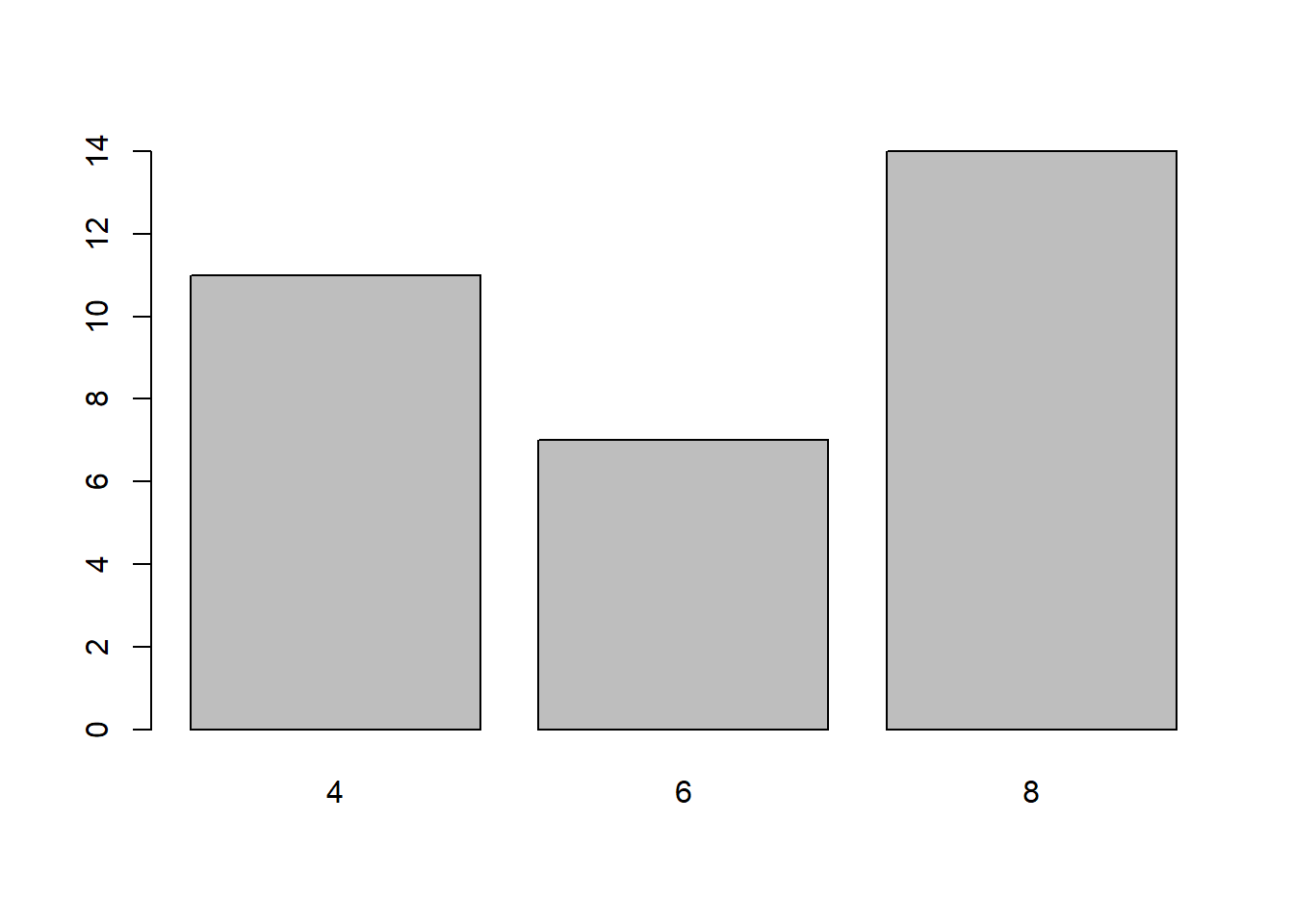
2.1.3 2.1) Creating simple bar chart with quantitative variable.
we can add the quantitative values in y-axis such as mean, median, variance or standard deviation. But we need to makesure the data is in aggregated form. In his example, I would like to construct bar chart to compare mean mpg with number of cylinders.
1st: we need to aggregate the data
library(dplyr)
Attaching package: 'dplyr'The following objects are masked from 'package:stats':
filter, lagThe following objects are masked from 'package:base':
intersect, setdiff, setequal, uniond <- mtcars %>%
group_by(as.factor(cyl)) %>%
summarise(mean_mpg = mean(mpg,na.rm=T))
d# A tibble: 3 × 2
`as.factor(cyl)` mean_mpg
<fct> <dbl>
1 4 26.7
2 6 19.7
3 8 15.12nd: Now we can construct bar chart for cyl compared with mean mpg
barplot(d$mean_mpg, names.arg = c("4 Cylinders", "6 Cylinders", "8 Cylinders"))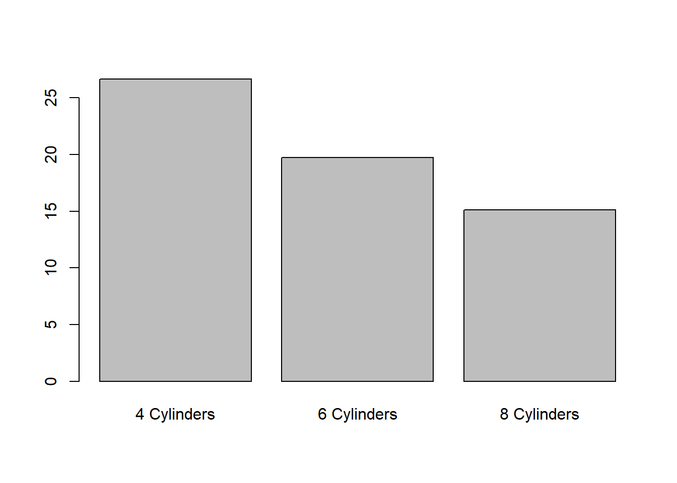
2.1.4 3) Adding colour into bar plot - [you can see the list of colors available in R by type "colors()" in console
barplot(table(mtcars$cyl),
        col = "violetred4")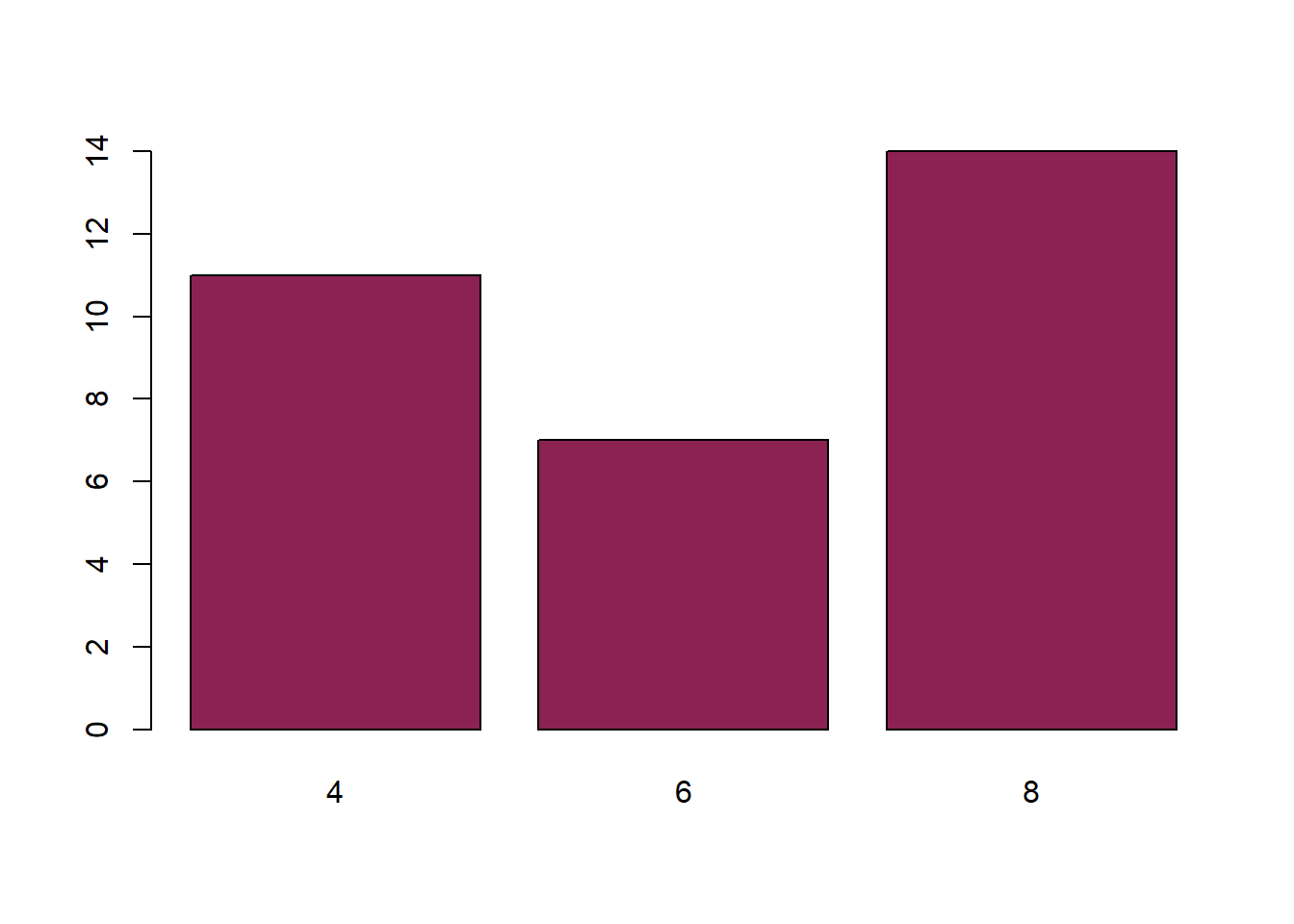
- we can also use html color codes into the bar
barplot(table(mtcars$cyl),
        col = c("#9FD87D", "#E2E473", "#79E5F0")) #adding color to the bar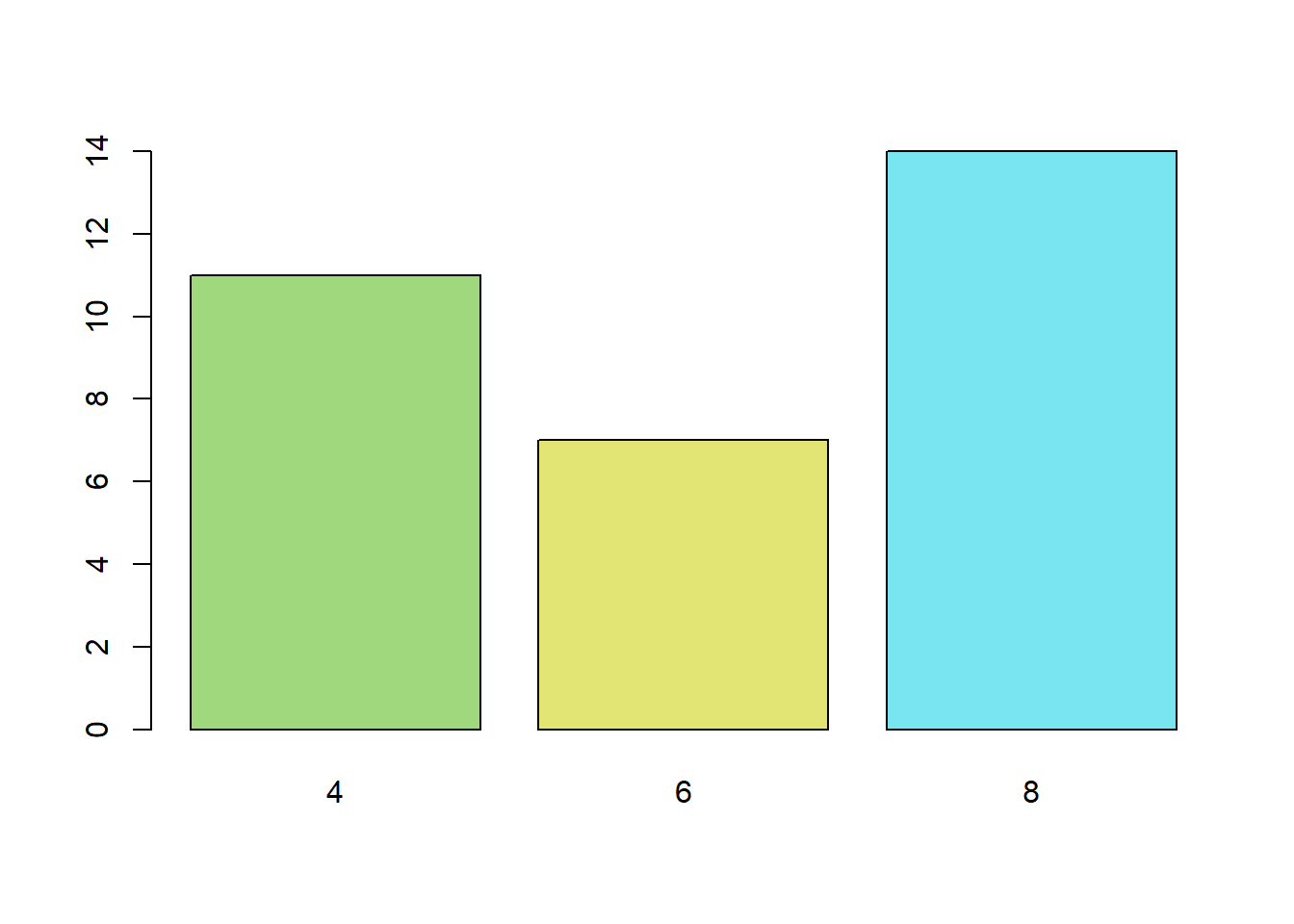
- more colors options, using
colorRamppalette()
pal <- colorRampPalette(colors = c("lightgreen", "lightblue"))(3)
barplot(table(mtcars$cyl),
        col = pal) #adding color to the bar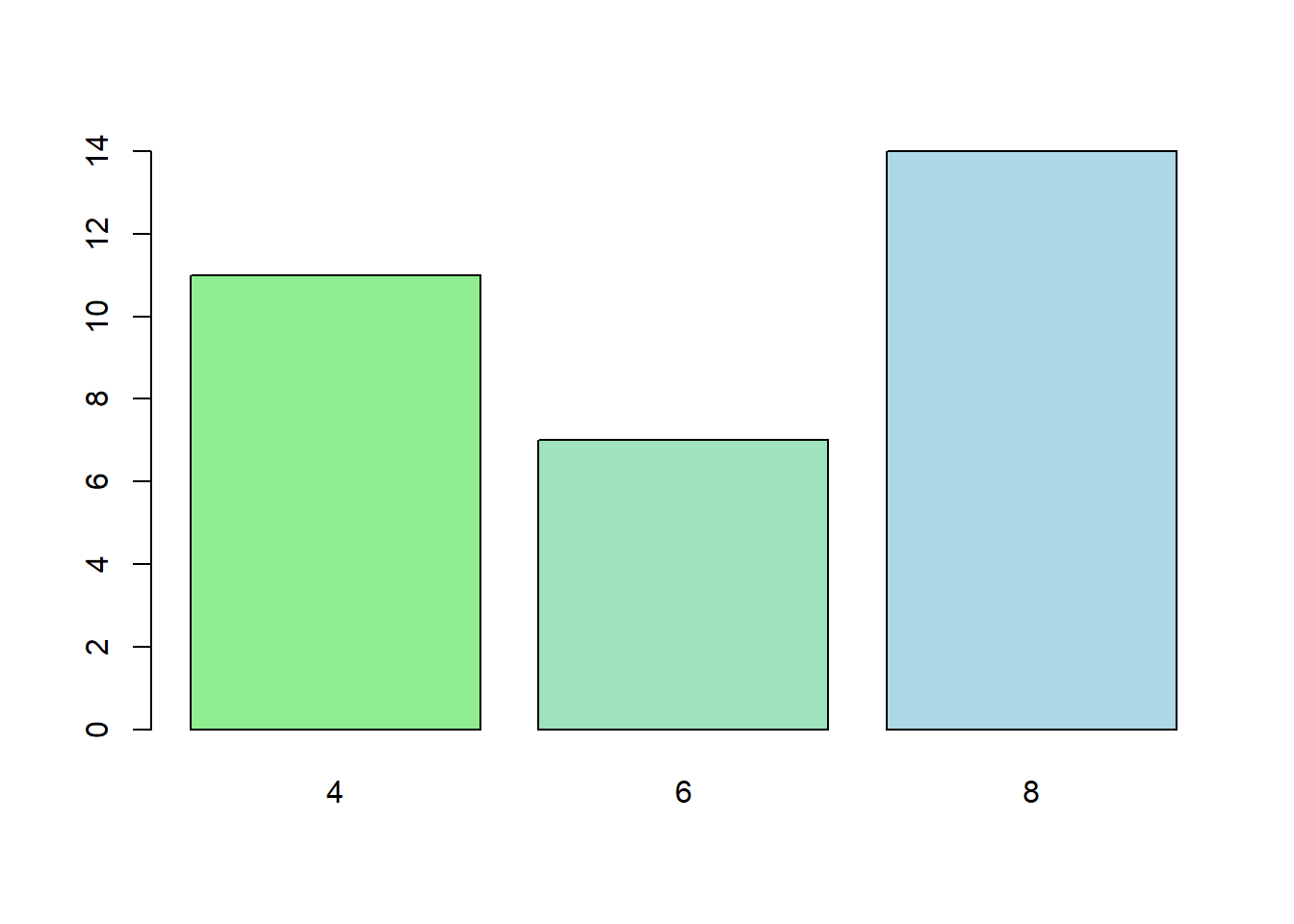
grey.colors()
barplot(table(mtcars$cyl),
col = grey.colors(3)) 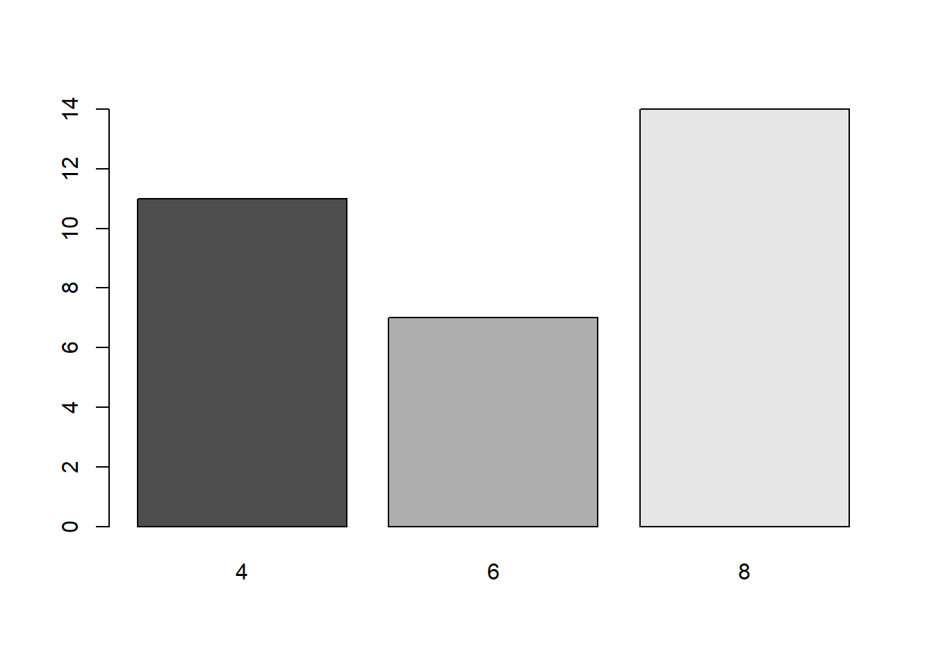
rainbow()
barplot(table(mtcars$cyl),
        col = rainbow(3))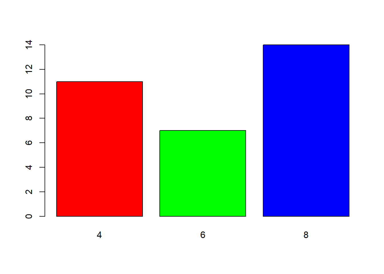
- Using
brewer.pal(). You can find all color brewer in this function by typingdisplay.brewer.all().
library(RColorBrewer)
#display.brewer.all()

barplot(d$mean_mpg, names.arg = c("4 Cylinders", "6 Cylinders","8 Cylinders"),
  main = "A bar chart showing Miles per Gallons \n based on Number of Cylinders",
        xlab= "Number of Cylinders",
        ylab= "Mean of Miles per Gallons",
        col = brewer.pal(n=3, name="Pastel2"))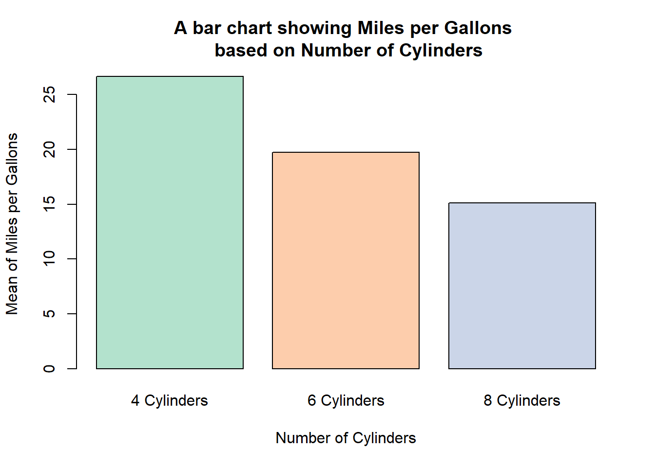
Another example to use brewer.pal().
barplot(d$mean_mpg, names.arg = c("4 Cylinders", "6 Cylinders", "8 Cylinders"),
    main = "A bar chart showing Miles per Gallons \n based on Number of Cylinders",
        xlab= "Number of Cylinders",
        ylab= "Mean of Miles per Gallons",
        col = brewer.pal(n=3, name="Accent"))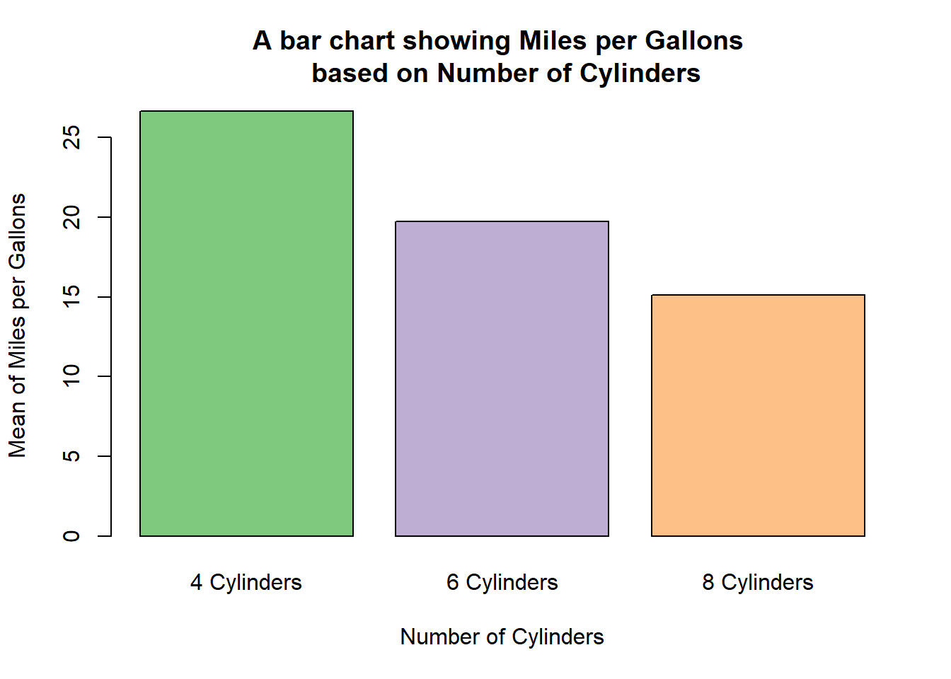
using
wesandersonpackage, we are able to use all palette in wesanderson. There are many palettes available such asBottleRocket1,BottleRocket2,Rushmore1,Royal1,Royal2,Zissou1,Darjeeling1,Darjeeling2,Chevalier1,FantasticFox1,Moonrise1,Moonrise2,
Moonrise3,Cavalcanti1,GrandBudapest1,
GrandBudapest2,IsleofDogs1,IsleofDogs2,FrenchDispatch,AsteroidCity2,
AsteroidCity2,AsteroidCity3
library(wesanderson)

barplot(d$mean_mpg, names.arg = c("4 Cylinders", "6 Cylinders", "8 Cylinders"),
 main = "A bar chart showing Miles per Gallons \n based on Number of Cylinders",
        xlab= "Number of Cylinders",
        ylab= "Mean of Miles per Gallons",
        col = wes_palette(3, name="BottleRocket1", type = "continuous"))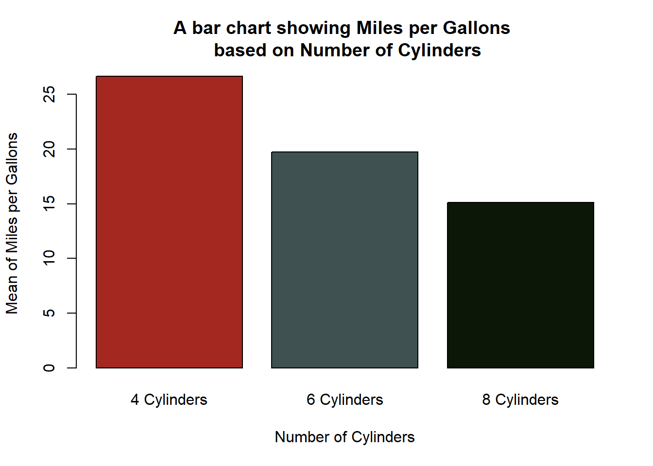
barplot(d$mean_mpg, names.arg = c("4 Cylinders", "6 Cylinders", "8 Cylinders"),
 main = "A bar chart showing Miles per Gallons \n based on Number of Cylinders",
        xlab= "Number of Cylinders",
        ylab= "Mean of Miles per Gallons",
        col = wes_palette(3, name="AsteroidCity3", type = "discrete"))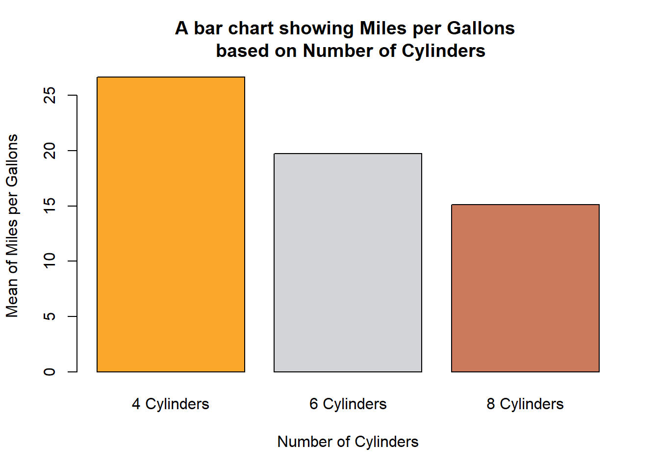
- Using
heat.colors().
barplot(d$mean_mpg, names.arg = c("4 Cylinders", "6 Cylinders", "8 Cylinders"),
 main = "A bar chart showing Miles per Gallons \n based on Number of Cylinders",
        xlab= "Number of Cylinders",
        ylab= "Mean of Miles per Gallons",
        col = heat.colors(3))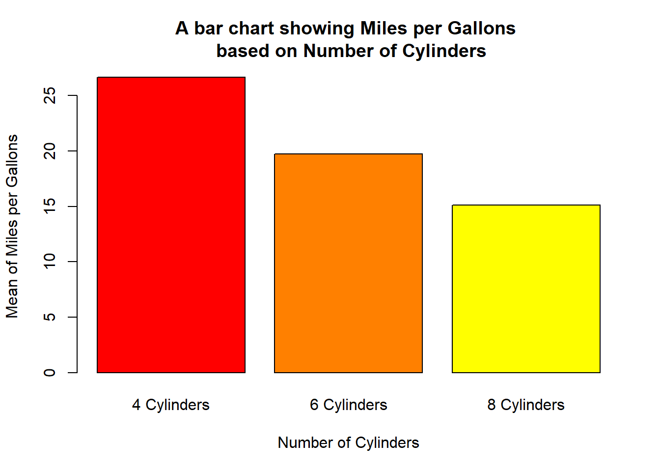
- Using
terrain.colors()
barplot(d$mean_mpg, names.arg = c("4 Cylinders", "6 Cylinders", "8 Cylinders"),
 main = "A bar chart showing Miles per Gallons \n based on Number of Cylinders",
        xlab= "Number of Cylinders",
        ylab= "Mean of Miles per Gallons",
        col = terrain.colors(3))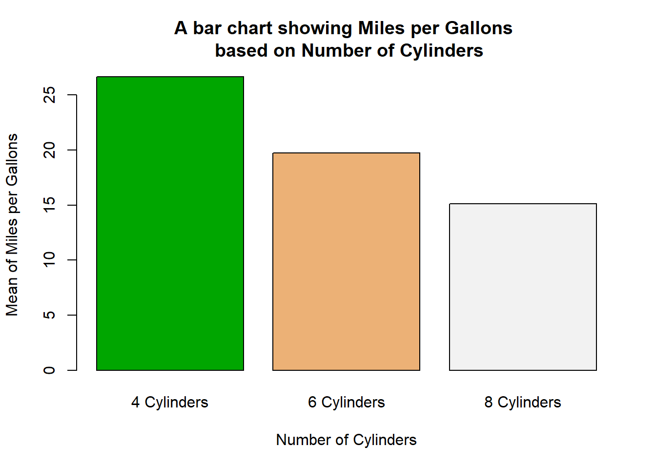
- Using
topo.colors()
barplot(d$mean_mpg, names.arg = c("4 Cylinders", "6 Cylinders", "8 Cylinders"),
 main = "A bar chart showing Miles per Gallons \n based on Number of Cylinders",
        xlab= "Number of Cylinders",
        ylab= "Mean of Miles per Gallons",
        col = topo.colors(6))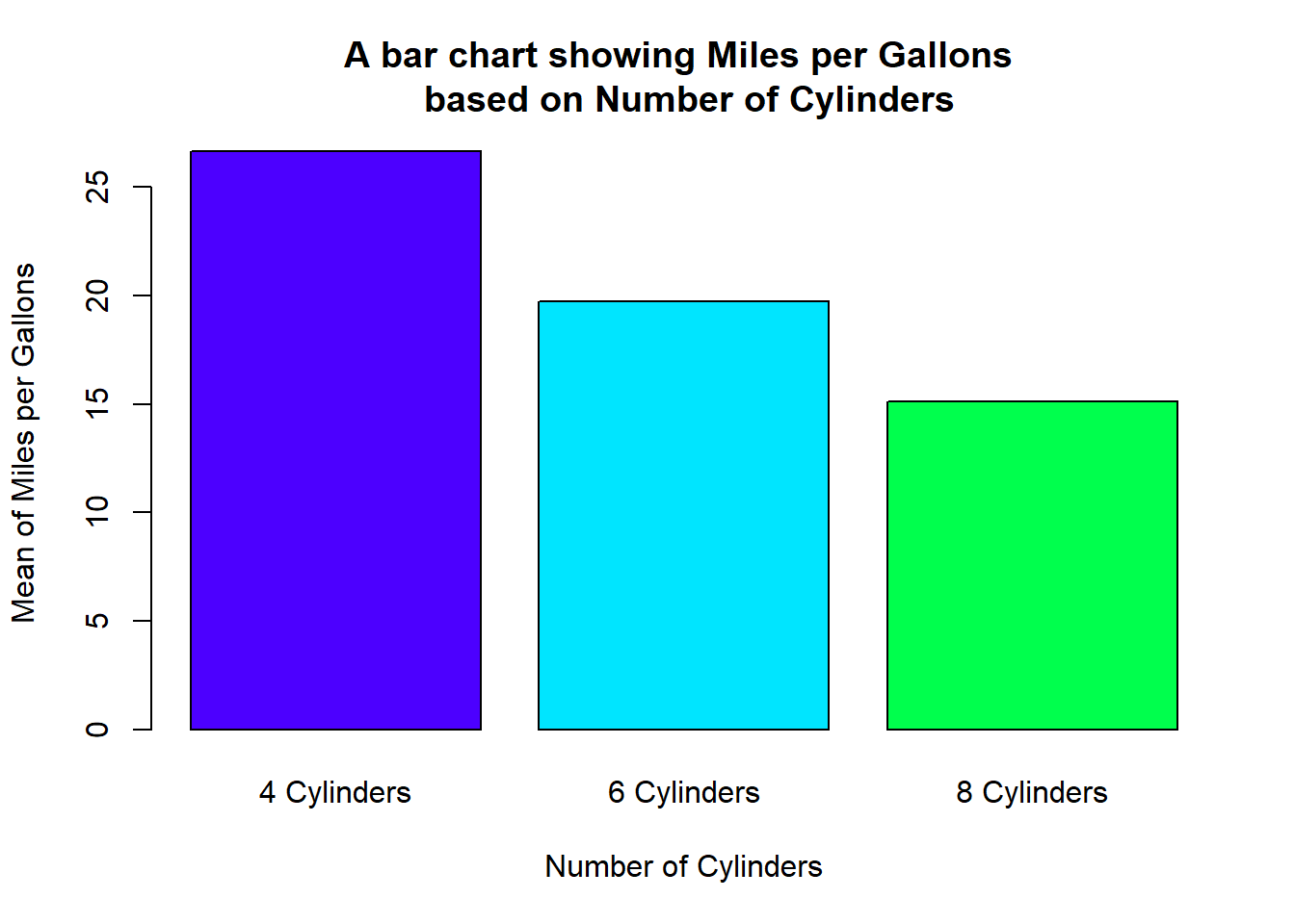
- Using
cm.colors()
barplot(d$mean_mpg, names.arg = c("4 Cylinders", "6 Cylinders", "8 Cylinders"),
 main = "A bar chart showing Miles per Gallons \n based on Number of Cylinders",
        xlab= "Number of Cylinders",
        ylab= "Mean of Miles per Gallons",
        col = cm.colors(3))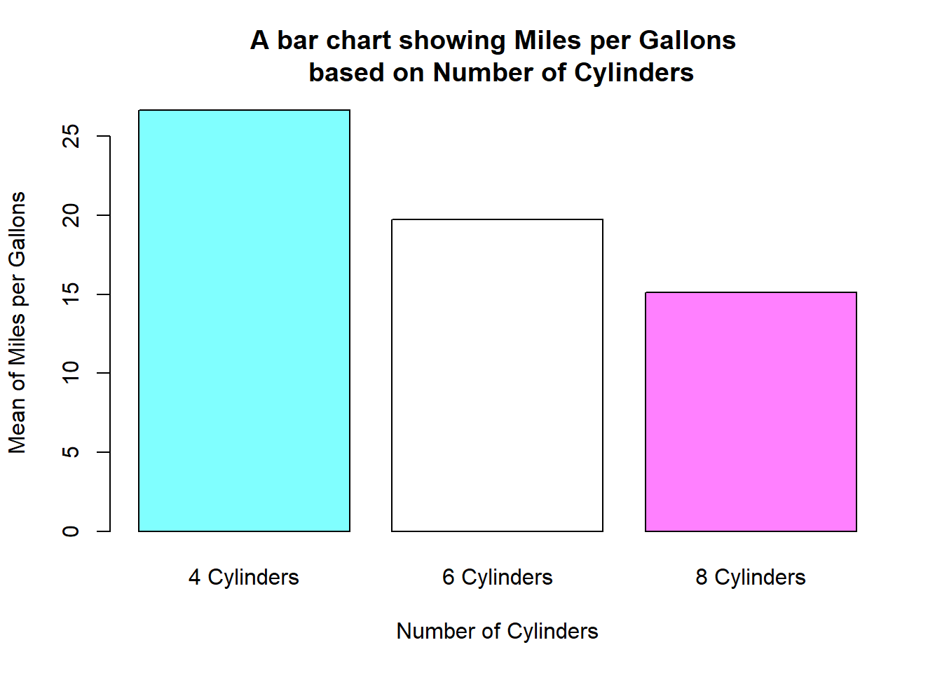
2.1.5 4) Changing colours for border
barplot(d$mean_mpg, names.arg = c("4 Cylinders", "6 Cylinders", "8 Cylinders"),
 main = "A bar chart showing Miles per Gallons \n based on Number of Cylinders",
        xlab= "Number of Cylinders",
        ylab= "Mean of Miles per Gallons",
        col = c("#E0F7CB", "#F6F7CB", "#CBF7F4"),
        border = c("#C7F78A", "#DEDE9F", "#8AF7EE"))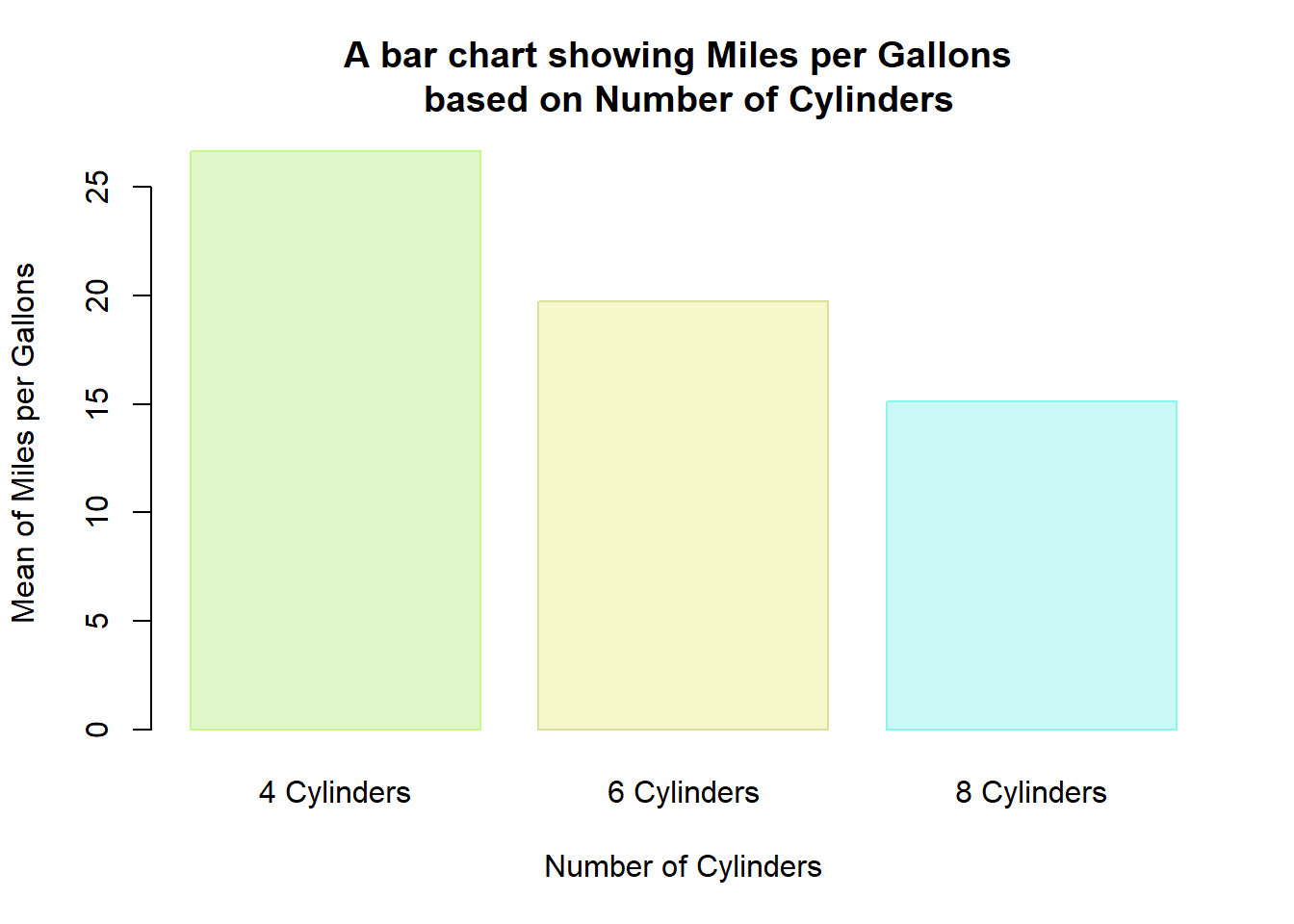
barplot(table(mtcars$cyl),
        col = c("#9FD87D", "#E2E473", "#79E5F0"), #adding color to the bar
        border = "purple") #adjusting the border of the bars
Yet, another trick
barplot(table(mtcars$cyl),
        col = NA, #removing the color of the bar
        border = c("#999999", "#E69F00", "#56B4E9")) #adjusting the border of the bars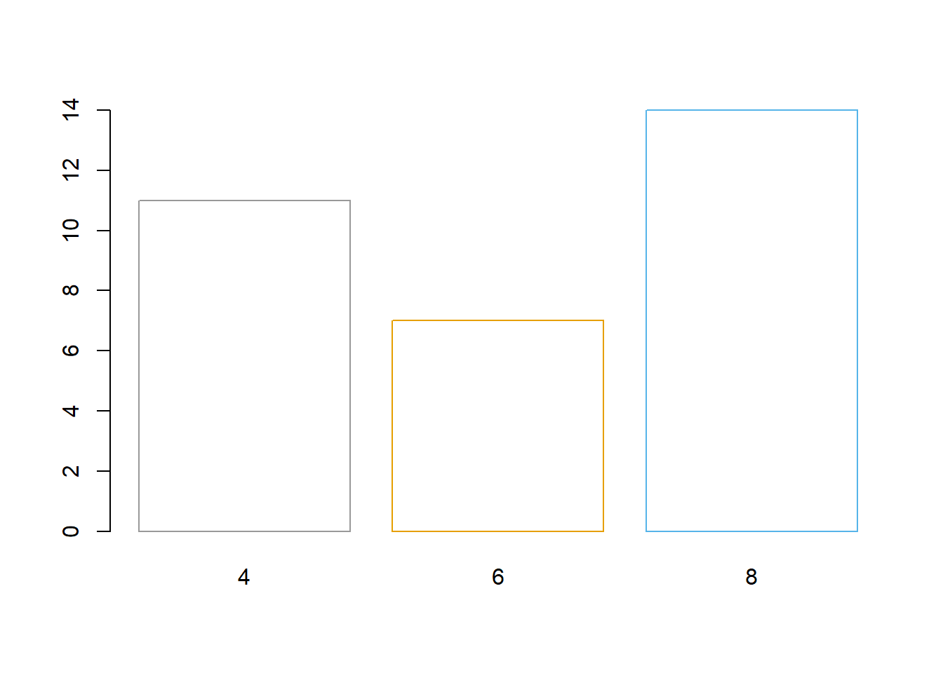
2.1.6 5) To add the title of the chart, we will use "main" argument in the function
barplot(table(mtcars$cyl),
        col = c("#9FD87D", "#E2E473", "#79E5F0"), #adding color to the bar
        border = "purple" , #adjusting the border of the bars
        main = "Bar Chart showing Frequency of \n Number of Cylinders (cyl) n=32")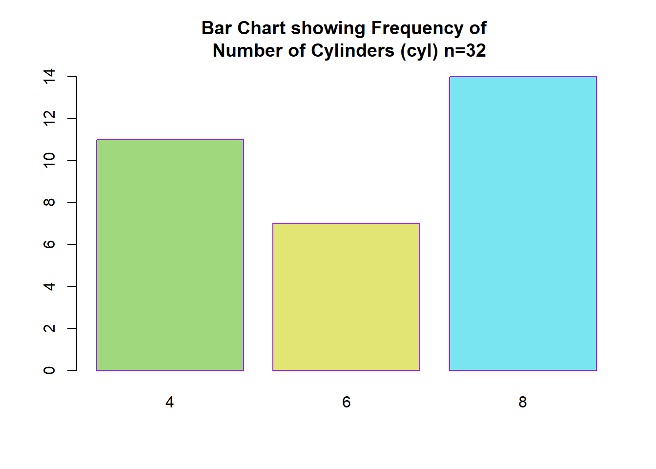
2.1.7 6) Adding x-axis title xlab() and y-axis title ylab()
barplot(table(mtcars$cyl),
        col = c("#9FD87D", "#E2E473", "#79E5F0"), #adding color to the bar
        border = "purple" , #adjusting the border of the bars
        main = "Bar Chart showing Frequency of \n Number of Cylinders (cyl) n=32",
        xlab = "Number of Cylinders",
        ylab = "Number of Cars")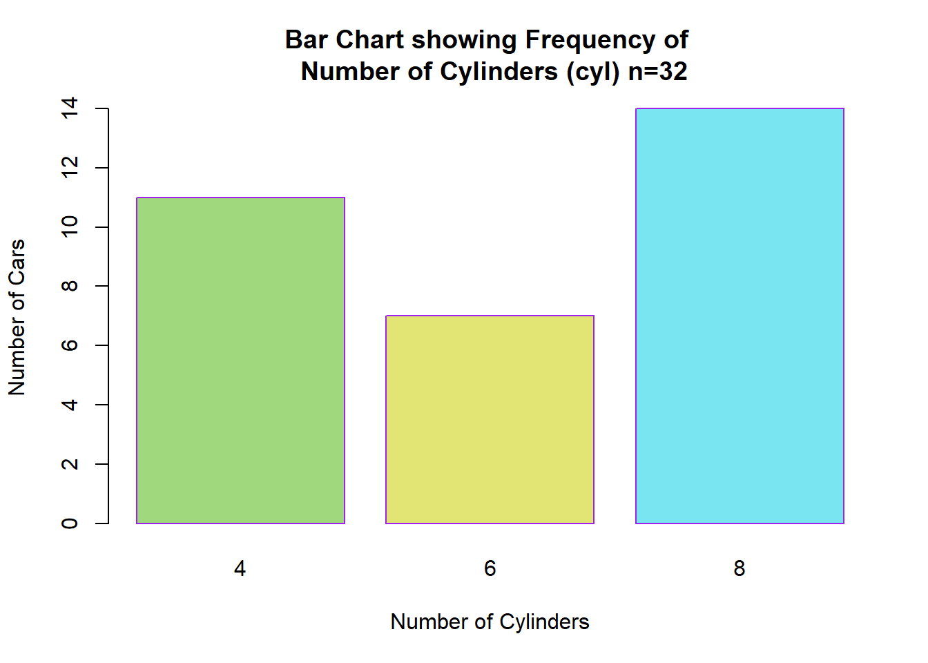
2.1.8 7) Adjusting the names of each categories
barplot(table(mtcars$cyl),
        col = c("#9FD87D", "#E2E473", "#79E5F0"), #adding color to the bar
        border = "purple" , #adjusting the border of the bars
        main = "Bar Chart showing Frequency of \n Number of Cylinders (cyl) n=32",
        xlab = "Number of Cylinders",
        ylab = "Number of Cars",
        names.arg = c("4 cylinder", "6 cylinder", "8 cylinder"))
2.1.9 8) Changing the bar width and making space.
- Width of the bar
barplot(d$mean_mpg, names.arg = c("4 Cylinders", "6 Cylinders", "8 Cylinders"),
  main = "A bar chart showing Miles per Gallons \n based on Number of Cylinders",
        xlab= "Number of Cylinders",
        ylab= "Mean of Miles per Gallons",
        col = c("#E0F7CB", "#F6F7CB", "#CBF7F4"),
        border = c("#C7F78A", "#DEDE9F", "#8AF7EE"),
        width = c(30,20,30))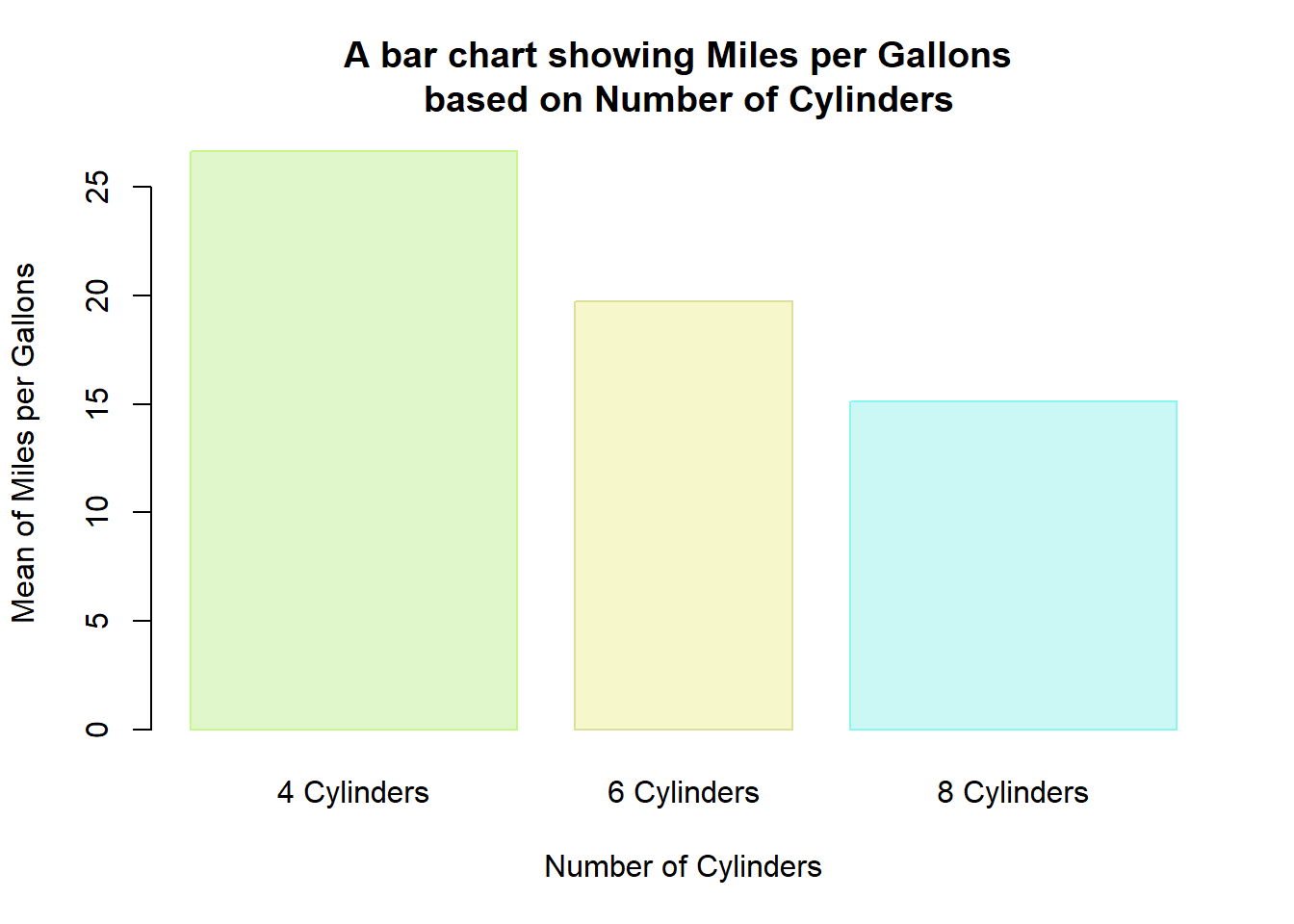
- Space of the bars
barplot(d$mean_mpg, names.arg = c("4 Cylinders", "6 Cylinders", "8 Cylinders"),
   main = "A bar chart showing Miles per Gallons \n based on Number of Cylinders",
        xlab= "Number of Cylinders",
        ylab= "Mean of Miles per Gallons",
        col = c("#E0F7CB", "#F6F7CB", "#CBF7F4"),
        border = c("#C7F78A", "#DEDE9F", "#8AF7EE"),
        width = c(30,20,30),
        space = 1)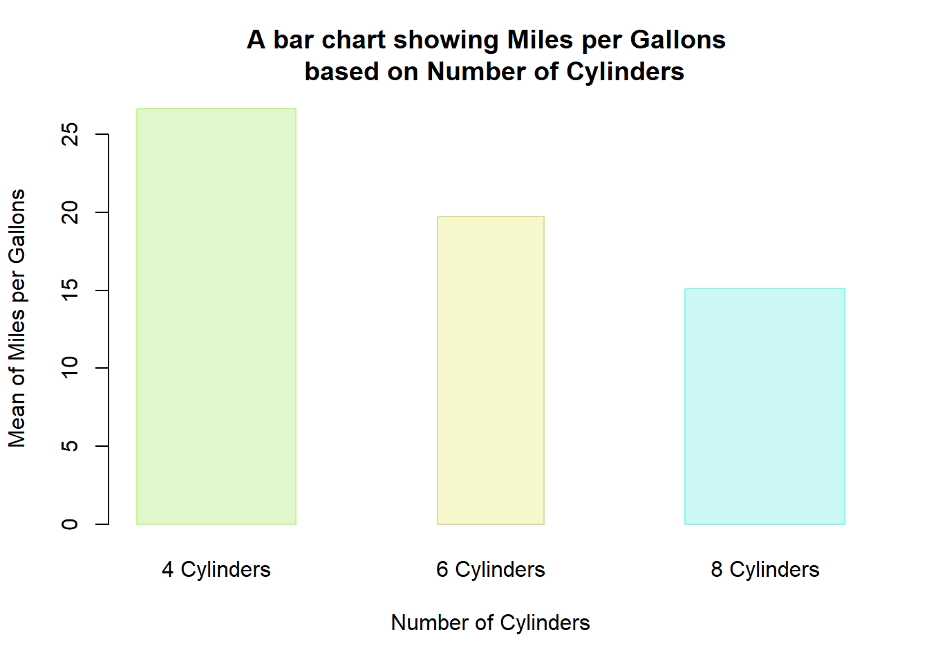
2.1.10 9) Adding Legend on the bar chart
barplot(d$mean_mpg, names.arg = c("4 Cylinders", "6 Cylinders", "8 Cylinders"),
   main = "A bar chart showing Miles per Gallons \n based on Number of Cylinders",
        xlab= "Number of Cylinders",
        ylab= "Mean of Miles per Gallons",
        col = c("#E0F7CB", "#F6F7CB", "#CBF7F4"),
        border = c("#C7F78A", "#DEDE9F", "#8AF7EE"),
        width = c(30,20,30),
        legend.text = c("4 Cylinder", "6 Cylinder", "8 Cylinder"),
        args.legend = list(cex=0.75, x="topright", horiz=T))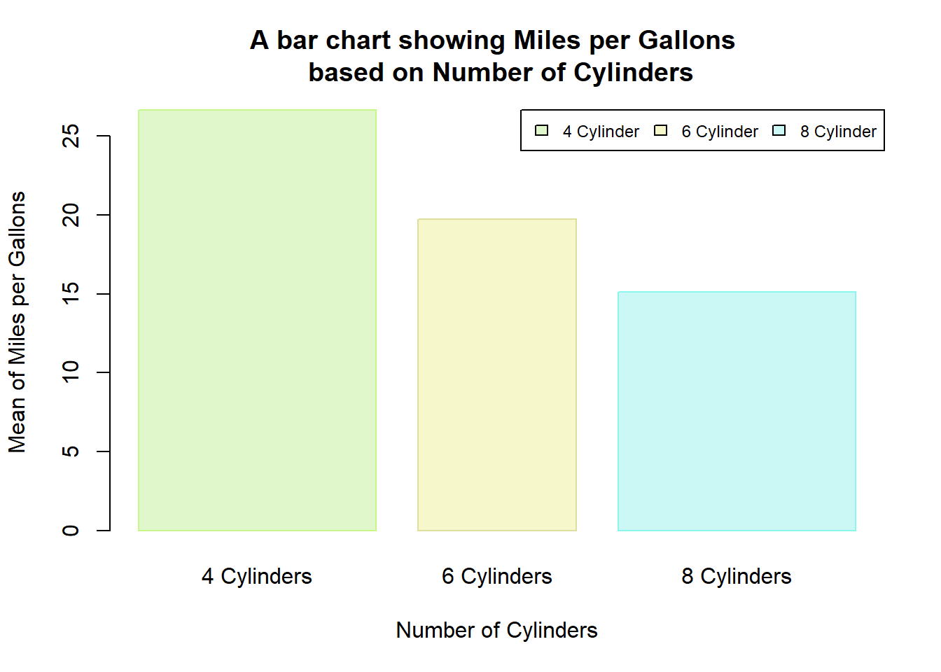
2.1.11 10) Adding Labels - Frequency values
my_bar <- barplot(table(mtcars$cyl),
        col = c("#9FD87D", "#E2E473", "#79E5F0"), #adding color to the bar
        border = "purple" , #adjusting the border of the bars
        main = "Bar Chart showing Frequency of \n Number of Cylinders (cyl) n=32",
        xlab = "Number of Cylinders",
        ylab = "Number of Cars",
        names.arg = c("4 cylinder", "6 cylinder", "8 cylinder"))

text(my_bar, table(mtcars$cyl), paste("n: ", table(mtcars$cyl),
                                      sep=""))
Adjusting the position of the text by pos = 1 (below), pos=2 (left), pos = 3 (above), and pos=4 (right)
my_bar <- barplot(table(mtcars$cyl),
        col = c("#9FD87D", "#E2E473", "#79E5F0"), #adding color to the bar
        border = "purple" , #adjusting the border of the bars
        main = "Bar Chart showing Frequency of \n Number of Cylinders (cyl) n=32",
        xlab = "Number of Cylinders",
        ylab = "Number of Cars",
        names.arg = c("4 cylinder", "6 cylinder", "8 cylinder"))

text(my_bar, table(mtcars$cyl), paste("n: ", table(mtcars$cyl),
                                      sep=""),
     pos = 1)
Adjusting the size of the font by cex()
my_bar <- barplot(table(mtcars$cyl),
        col = c("#9FD87D", "#E2E473", "#79E5F0"), #adding color to the bar
        border = "purple" , #adjusting the border of the bars
        main = "Bar Chart showing Frequency of \n Number of Cylinders (cyl) n=32",
        xlab = "Number of Cylinders",
        ylab = "Number of Cars",
        names.arg = c("4 cylinder", "6 cylinder", "8 cylinder"))

text(my_bar, table(mtcars$cyl), paste("n: ", table(mtcars$cyl),
                                      sep=""),
     pos = 1, cex=0.8)
Adjusting the font family by using family(). We can see the family of the font style in R by typing names(pdfFonts())
my_bar<- barplot(table(mtcars$cyl),
        col = c("#9FD87D", "#E2E473", "#79E5F0"), #adding color to the bar
        border = "purple" , #adjusting the border of the bars
        main = "Bar Chart showing Frequency of \n Number of Cylinders (cyl) n=32",
        xlab = "Number of Cylinders",
        ylab = "Number of Cars",
        names.arg = c("4 cylinder", "6 cylinder", "8 cylinder"))

text(my_bar, table(mtcars$cyl), paste("n: ", table(mtcars$cyl),
                                      sep=""),
     pos = 1, cex=0.8, family="serif")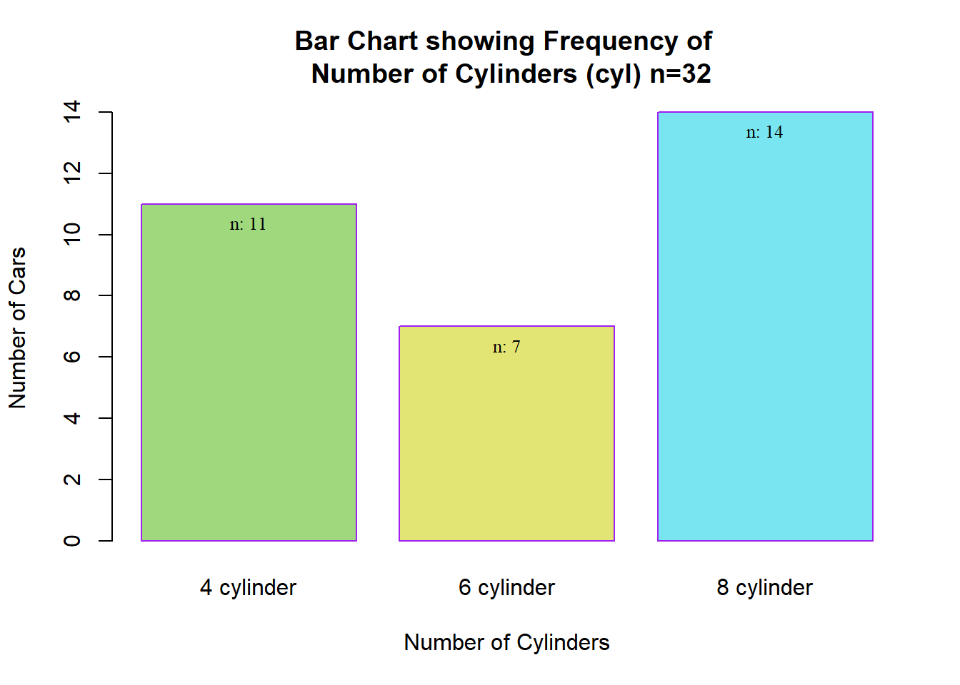
Adjusting the font style, either font=1 (default), font=2 (bold), font = 3 (italic), font = 4 (bold italic)
my_bar <- barplot(table(mtcars$cyl),
        col = c("#9FD87D", "#E2E473", "#79E5F0"), #adding color to the bar
        border = "purple" , #adjusting the border of the bars
        main = "Bar Chart showing Frequency of \n Number of Cylinders (cyl) n=32",
        xlab = "Number of Cylinders",
        ylab = "Number of Cars",
        names.arg = c("4 cylinder", "6 cylinder", "8 cylinder"))

text(my_bar, table(mtcars$cyl), paste("n: ", table(mtcars$cyl),
                                      sep=""),
     pos = 1, cex=0.8, family="serif", font = 2)
Changing the axis label style (1=normal, 2=bold, 3=italic, 4=bold italic) - font.axis()
barplot(d$mean_mpg, names.arg = c("4 Cylinders", "6 Cylinders",
                                  "8 Cylinders"),
        main = "A bar chart showing Miles per Gallons \n based on Number of Cylinders",
        xlab= "Number of Cylinders",
        ylab= "Mean of Miles per Gallons",
        col = c("#E0F7CB", "#F6F7CB", "#CBF7F4"),
        border = c("#C7F78A", "#DEDE9F", "#8AF7EE"),
        width = c(20,20,20),
        legend.text = c("4 Cylinder", "6 Cylinder", "8 Cylinder"),
        args.legend = list(cex=0.75, x="topright", horiz=T),
        font.axis = 3)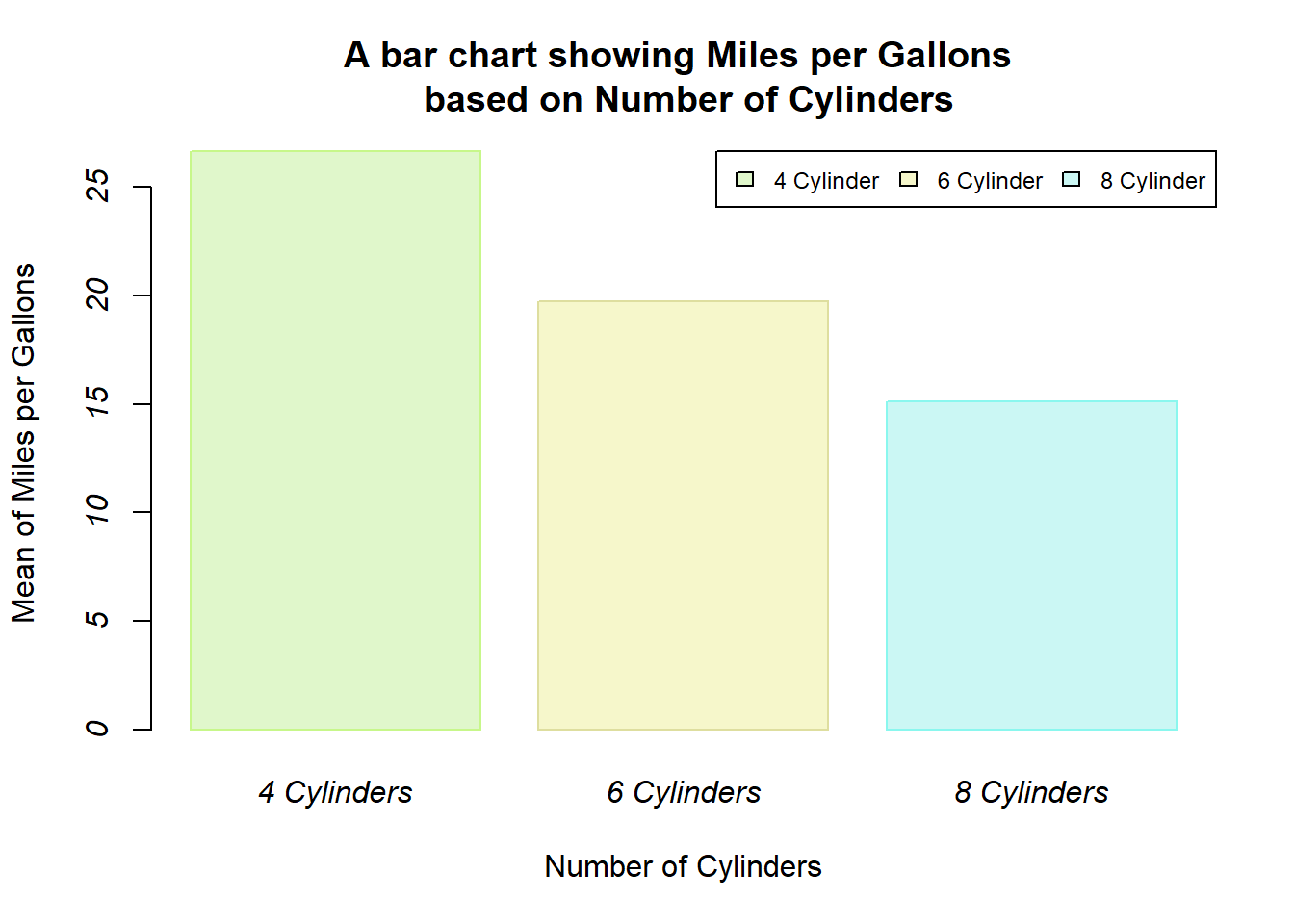
Change the color axis label by col.axis()
barplot(d$mean_mpg, names.arg = c("4 Cylinders", "6 Cylinders",
                                  "8 Cylinders"),
        main = "A bar chart showing Miles per Gallons \n based on Number of Cylinders",
        xlab= "Number of Cylinders",
        ylab= "Mean of Miles per Gallons",
        col = c("#E0F7CB", "#F6F7CB", "#CBF7F4"),
        border = c("#C7F78A", "#DEDE9F", "#8AF7EE"),
        width = c(20,20,20),
        legend.text = c("4 Cylinder", "6 Cylinder", "8 Cylinder"),
        args.legend = list(cex=0.75, x="topright", horiz=T),
        font.axis = 3,
        col.axis = "#381404")
Increase the size of the y-axis label by cex.axis()
barplot(d$mean_mpg, names.arg = c("4 Cylinders", "6 Cylinders",
                                  "8 Cylinders"),
        main = "A bar chart showing Miles per Gallons \n based on Number of Cylinders",
        xlab= "Number of Cylinders",
        ylab= "Mean of Miles per Gallons",
        col = c("#E0F7CB", "#F6F7CB", "#CBF7F4"),
        border = c("#C7F78A", "#DEDE9F", "#8AF7EE"),
        width = c(20,20,20),
        legend.text = c("4 Cylinder", "6 Cylinder", "8 Cylinder"),
        args.legend = list(cex=0.75, x="topright", horiz=T),
        font.axis = 3,
        col.axis = "#381404",
        cex.axis = 0.9)
Increase the size of the axis title by cex.lab()
barplot(d$mean_mpg, names.arg = c("4 Cylinders", "6 Cylinders",
                                  "8 Cylinders"),
        main = "A bar chart showing Miles per Gallons \n based on Number of Cylinders",
        xlab= "Number of Cylinders",
        ylab= "Mean of Miles per Gallons",
        col = c("#E0F7CB", "#F6F7CB", "#CBF7F4"),
        border = c("#C7F78A", "#DEDE9F", "#8AF7EE"),
        width = c(20,20,20),
        legend.text = c("4 Cylinder", "6 Cylinder", "8 Cylinder"),
        args.legend = list(cex=0.75, x="topright", horiz=T),
        font.axis = 3,
        col.axis = "#381404",
        cex.axis = 0.9,
        cex.lab = 1.2)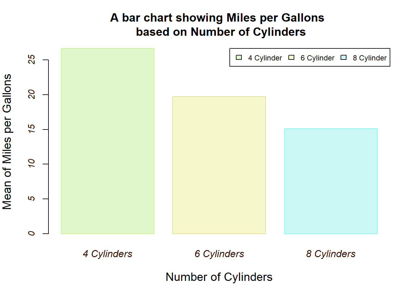
Increase the style of the axis title by font.lab()
barplot(d$mean_mpg, names.arg = c("4 Cylinders", "6 Cylinders",
                                  "8 Cylinders"),
        main = "A bar chart showing Miles per Gallons \n based on Number of Cylinders",
        xlab= "Number of Cylinders",
        ylab= "Mean of Miles per Gallons",
        col = c("#E0F7CB", "#F6F7CB", "#CBF7F4"),
        border = c("#C7F78A", "#DEDE9F", "#8AF7EE"),
        width = c(20,20,20),
        legend.text = c("4 Cylinder", "6 Cylinder", "8 Cylinder"),
        args.legend = list(cex=0.75, x="topright", horiz=T),
        font.axis = 3,
        col.axis = "#381404",
        cex.axis = 0.9,
        cex.lab = 1.2,
        font.lab = 2)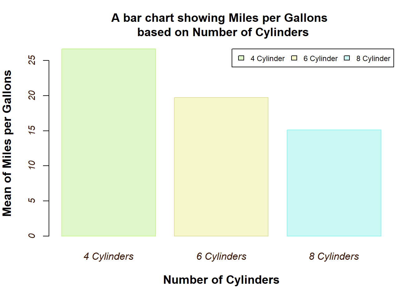
Changing color for axis title by col.lab()
barplot(d$mean_mpg, names.arg = c("4 Cylinders", "6 Cylinders",
                                  "8 Cylinders"),
        main = "A bar chart showing Miles per Gallons \n based on Number of Cylinders",
        xlab= "Number of Cylinders",
        ylab= "Mean of Miles per Gallons",
        col = c("#E0F7CB", "#F6F7CB", "#CBF7F4"),
        border = c("#C7F78A", "#DEDE9F", "#8AF7EE"),
        width = c(20,20,20),
        legend.text = c("4 Cylinder", "6 Cylinder", "8 Cylinder"),
        args.legend = list(cex=0.75, x="topright", horiz=T),
        font.axis = 3,
        col.axis = "#381404",
        cex.axis = 0.9,
        cex.lab = 1.2,
        font.lab = 2,
        col.lab = "#381404")
Rotating the axis label if the group names / label are too long.
las(numeric in {0,1,2,3}; the style of axis labels. 0:always parallel to the axis, [default], 1:always horizontal, 2:always perpendicular to the axis, 3:always vertical.
barplot(d$mean_mpg, names.arg = c("4 Cylinders", "6 Cylinders", "8 Cylinders"),
    main = "A bar chart showing Miles per Gallons \n based on Number of Cylinders",
        xlab= "Number of Cylinders",
        ylab= "Mean of Miles per Gallons",
        col = c("#E0F7CB", "#F6F7CB", "#CBF7F4"),
        border = c("#C7F78A", "#DEDE9F", "#8AF7EE"),
        width = c(20,20,20),
        legend.text = c("4 Cylinder", "6 Cylinder", "8 Cylinder"),
        args.legend = list(cex=0.75, x="topright", horiz=T),
        font.axis = 3,
        col.axis = "#381404",
        cex.axis = 0.9,
        cex.lab = 1.2,
        font.lab = 2,
        col.lab = "#381404",
        las = 1)
Adding reference line
barplot(d$mean_mpg, names.arg = c("4 Cylinders", "6 Cylinders", "8 Cylinders"),
   main = "A bar chart showing Miles per Gallons \n based on Number of Cylinders",
        xlab= "Number of Cylinders",
        ylab= "Mean of Miles per Gallons",
        col = c("#E0F7CB", "#F6F7CB", "#CBF7F4"),
        border = c("#C7F78A", "#DEDE9F", "#8AF7EE"),
        width = c(20,20,20),
        legend.text = c("4 Cylinder", "6 Cylinder", "8 Cylinder"),
        args.legend = list(cex=0.75, x="topright", horiz=T),
        font.axis = 3,
        col.axis = "#381404",
        cex.axis = 0.9,
        cex.lab = 1.2,
        font.lab = 2,
        col.lab = "#381404",
        las = 1)

abline(h=20, col="pink", lty = 5, lwd = 2)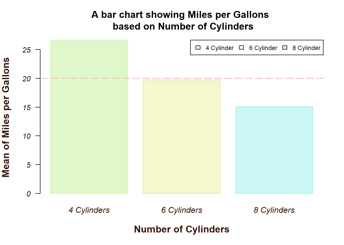
Adding the text on each bar - for mixed quantitative and qualitative variables
mybar <- barplot(d$mean_mpg, names.arg = c("4 Cylinders", "6 Cylinders", "8 Cylinders"),
   main = "A bar chart showing Miles per Gallons \n based on Number of Cylinders",
        xlab= "Number of Cylinders",
        ylab= "Mean of Miles per Gallons",
        col = c("#E0F7CB", "#F6F7CB", "#CBF7F4"),
        border = c("#C7F78A", "#DEDE9F", "#8AF7EE"),
        width = c(20,20,20),
        legend.text = c("4 Cylinder", "6 Cylinder", "8 Cylinder"),
        args.legend = list(cex=0.75, x="topright", horiz=T),
        font.axis = 3,
        col.axis = "#381404",
        cex.axis = 0.9,
        cex.lab = 1.2,
        font.lab = 2,
        col.lab = "#381404",
        las = 1)
mybar
[,1]
[1,] 14
[2,] 38
[3,] 62text(mybar, d$mean_mpg,
paste(round(d$mean_mpg,2)),
cex = 0.78, offset = 3, pos = 1, font = 3)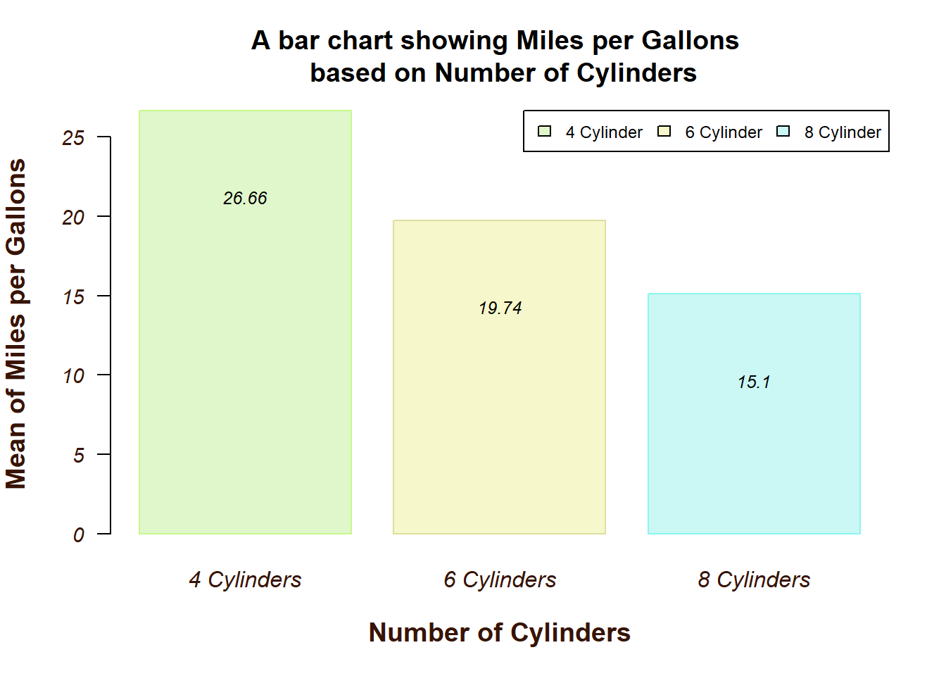
Adding the text on each bar - for non mixed variable
mybar1 <- barplot(table(mtcars$cyl),
main = "A bar chart showing distribution of \n Number of Cylinders",
xlab = "Number of Cylinders",
ylab = "Frequency",
col=c("#F0C6BD", "#DDF0BD", "#BDF0F0" ),
border=c("#801106", "#078006", "#068080" ),
width = c(0.5,0.5,0.5),
horiz = F,
font.axis = 2,
col.axis = "steelblue",
cex.axis = 0.8,
cex.lab = 1,
font.lab= 3,
las = 1)
mybar1 [,1]
[1,] 0.35
[2,] 0.95
[3,] 1.55text(mybar1, y=table(mtcars$cyl),
label = table(mtcars$cyl),
pos=1, cex = 0.85, font = 2)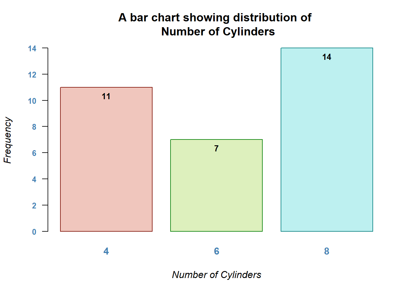
Adjusting the y-axis limit
barplot(d$mean_mpg, names.arg = c("4 Cylinders", "6 Cylinders", "8 Cylinders"),
main = "A bar chart showing Miles per Gallons \n based on Number of Cylinders",
xlab= "Number of Cylinders",
ylab= "Mean of Miles per Gallons",
col = c("#E0F7CB", "#F6F7CB", "#CBF7F4"),
border = c("#C7F78A", "#DEDE9F", "#8AF7EE"),
width = c(20,20,20),
legend.text = c("4 Cylinder", "6 Cylinder", "8 Cylinder"),
args.legend = list(cex=0.75, x="topright", horiz=T),
font.axis = 3,
col.axis = "#381404",
cex.axis = 0.9,
cex.lab = 1.2,
font.lab = 2,
col.lab = "#381404",
las = 1,
ylim = c(0,30))
text(mybar, d$mean_mpg,
     paste(round(d$mean_mpg,2)),
     cex = 0.78, offset = 3, pos = 1, font = 3)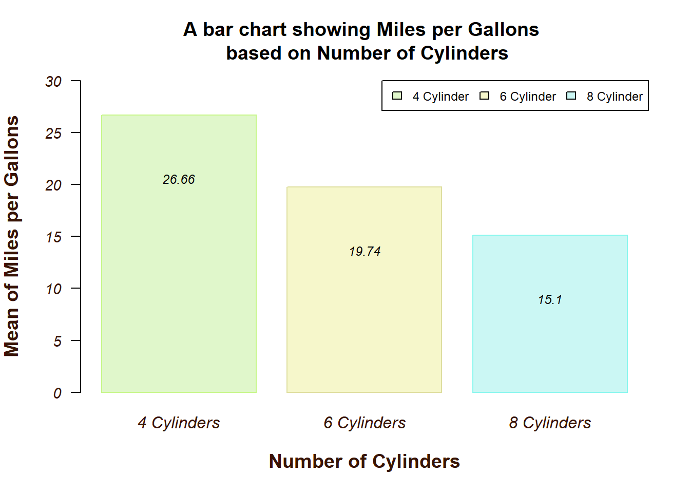
You can explore more parameters regarding this by looking at the documentation of set or query graphical parameter (?par).
2.1.12 9) Adding Labels - Percentage
barplot(table(mtcars$cyl),
        col = c("#9FD87D", "#E2E473", "#79E5F0"), #adding color to the bar
        border = "purple" , #adjusting the border of the bars
        main = "Bar Chart showing Frequency of \n Number of Cylinders (cyl) n=32",
        xlab = "Number of Cylinders",
        ylab = "Number of Cars",
        names.arg = c("4 cylinder", "6 cylinder", "8 cylinder"))

text(my_bar, table(mtcars$cyl), paste(round(prop.table(table(mtcars$cyl))*100,2), "%",  sep=""),  pos = 1, cex=0.8, family="serif", font = 4)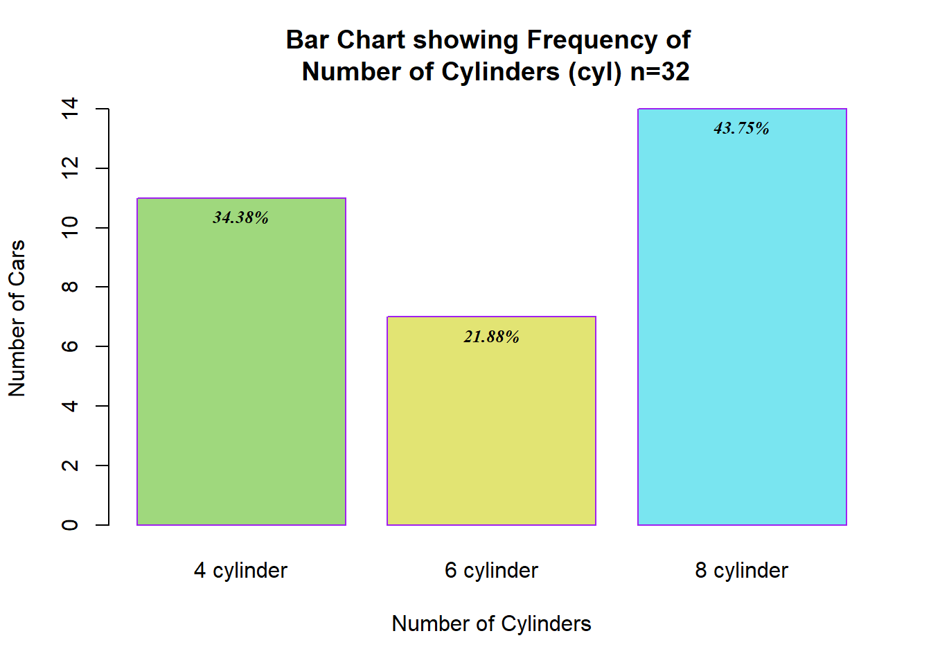
2.1.13 10) Making Horizontal Bar Chart
barplot(table(mtcars$cyl),
        col = c("#9FD87D", "#E2E473", "#79E5F0"), #adding color to the bar
        border = "purple" , #adjusting the border of the bars
        main = "Bar Chart showing Frequency of \n Number of Cylinders (cyl) n=32",
        ylab = "Number of Cylinders",
        xlab = "Number of Cars",
        las= 3,
        names.arg = c("4 cylinder", "6 cylinder", "8 cylinder"),
        horiz = TRUE)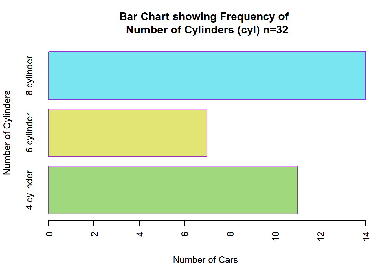
2.1.14 11) Putting all together
In this example, I would like to compare the number of cylinders with the mean of miles per gallon. Remember that the boxplot data should be in form of aggregate data.
#getting the aggregate data for cyl and mean mpg
library(dplyr)

counts <- mtcars %>%
  group_by(cyl) %>%
  summarise(means= mean(mpg, na.rm = T))

library(wesanderson)
colors <- wes_palette("Royal1", n=3, type="discrete")

par(mar=c(5, 4, 4, 2) + 0.1)

bp <- barplot(counts$means,
        names.arg = c("3 Cylinders", "4 Cylinders", "6 Cylinders"),
        main = "The distribution of Mean Miles per Gallon \n by Number of Cylinders",
        xlab = "Number of Cylinders",
        ylab = "Mean Miles per Gallons",
        las = 2,
        col = colors,
        border = "grey41",            # colour of the bar borders
        horiz=FALSE,                  # If want horizontal bar
        cex.main = 1,                 # Font size of title
        font.main= 2,                 # Font style for title (4-bold italic)
        font.axis = 2,                # Font style for axis (4-bold italic)
        font.lab = 2,                 # Font style for axis title (4-bold italic)
        family = "serif",             # Font face
        las = 1,                      # style of axis labels (1-alway horizontal)
        col.main = "#5D485D",         # color the main title
        col.axis = "#8E6A8D",         # color the label in the axis
        col.lab = "#A97EA8",          # color the axis title
        yaxt = "n",                  # to remove y-axis line
        legend.text = c("4 Cylinder", "6 Cylinder", "8 Cylinder"),
        args.legend = list(cex=0.75, x="topright", horiz=T))

#define tick marks for y-axis
ticks <- seq(0, 30, by=2)

#add y-axis with default color for labels but without ticks
axis(side = 2, at =ticks, labels = TRUE,
     cex.axis=0.8, col.axis="#8E6A8D", font=1)

#add y-axis again, this time without labels but with coloured ticks
axis(side=2, at=ticks, labels = FALSE,
     col="#8E6A8D", tck=-0.01, font=2)

# to make line on x-axis
abline(h=0, col="#8E6A8D", lwd=2, lty=2)

# Add the mean on top of each bar
text(x = bp,
     y = counts$means - 3, # add a little space below each bar; adjust the value as needed
     labels = sprintf("%.1f", counts$means), # format the means to 1 decimal place
     pos = 3, # position the text above the bars
     cex = 0.8,
     col = "black")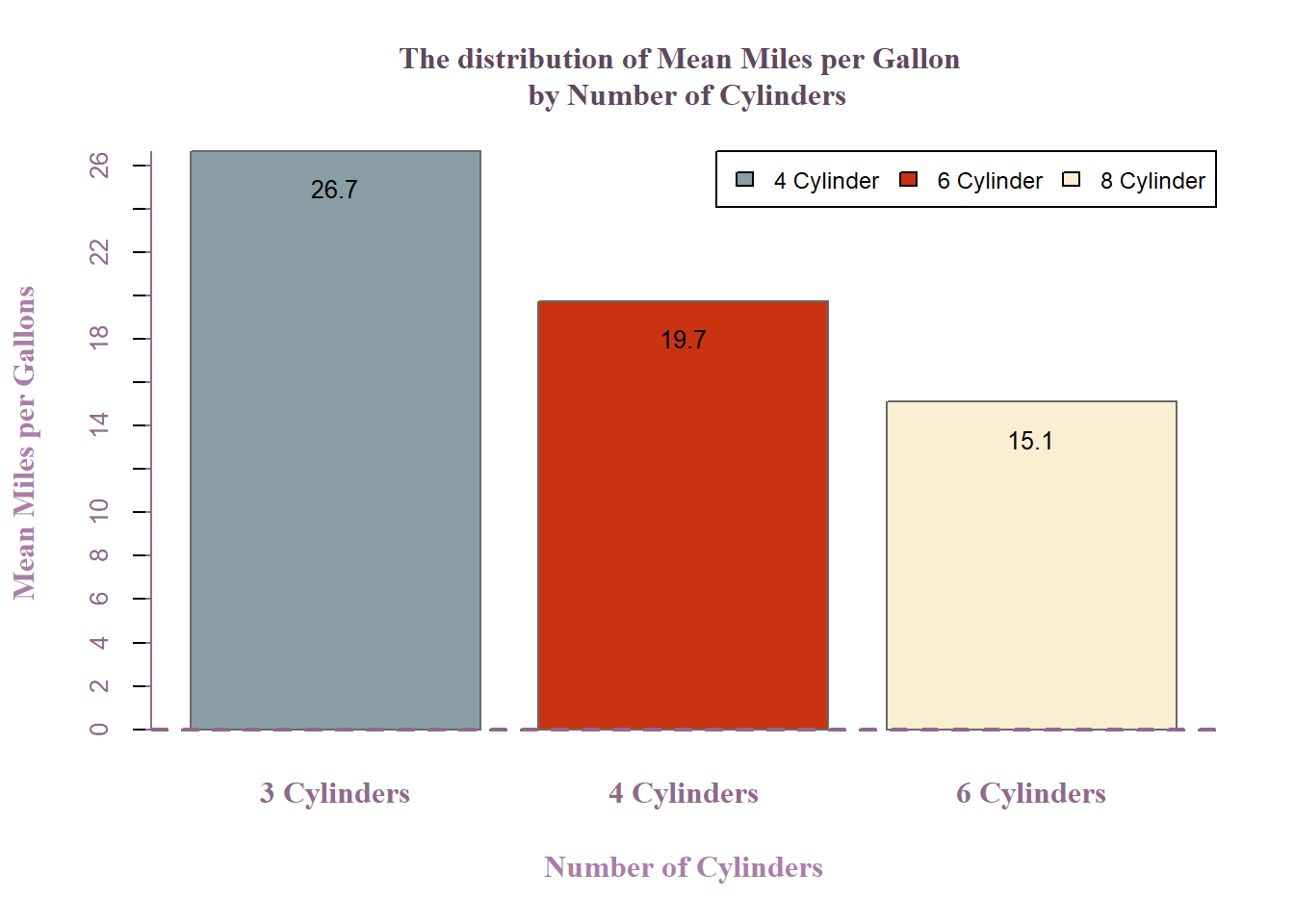
2.2 Stacked Bar Chart
Stacked bar charts are a useful way to display quantitative information about different groups that are segmented by some categorical variable. In R, using the base graphics package, stacked bar charts can be created by passing a matrix to the barplot() function, where each column represents a different group and each row represents a segment within the groups. Stacked bar charts can become difficult to interpret when there are many segments or when the segments have similar counts. It might be challenging to compare the sizes of segments that are not at the bottom of the stack across different groups. It’s important to consider colorblindness when choosing colors for your segments to ensure that the chart is accessible to a wider audience. Be cautious about using stacked bar charts to compare the totals across groups, as the visual emphasis is on the segment size within each group rather than the total height of each stack.
For this example, we’ll construct a stacked bar chart that shows the distribution of cars by the number of gears (gear) for each number of cylinders (cyl).
# Use the table() function to create a matrix of counts for gears within each cylinder group
gear_cyl_table <- table(mtcars$cyl, mtcars$gear)

barplot(gear_cyl_table, main="Car Distribution by Gears and Cylinders",
        xlab="Number of Cylinders",
        col=c("rosybrown1","skyblue", "lightgreen" ),
        legend =  rownames(gear_cyl_table),
        args.legend = list(x="topright"), #to position the lagend
        names.arg = c("3 Cylinders", "4 Cylinders", "6 Cylinders"))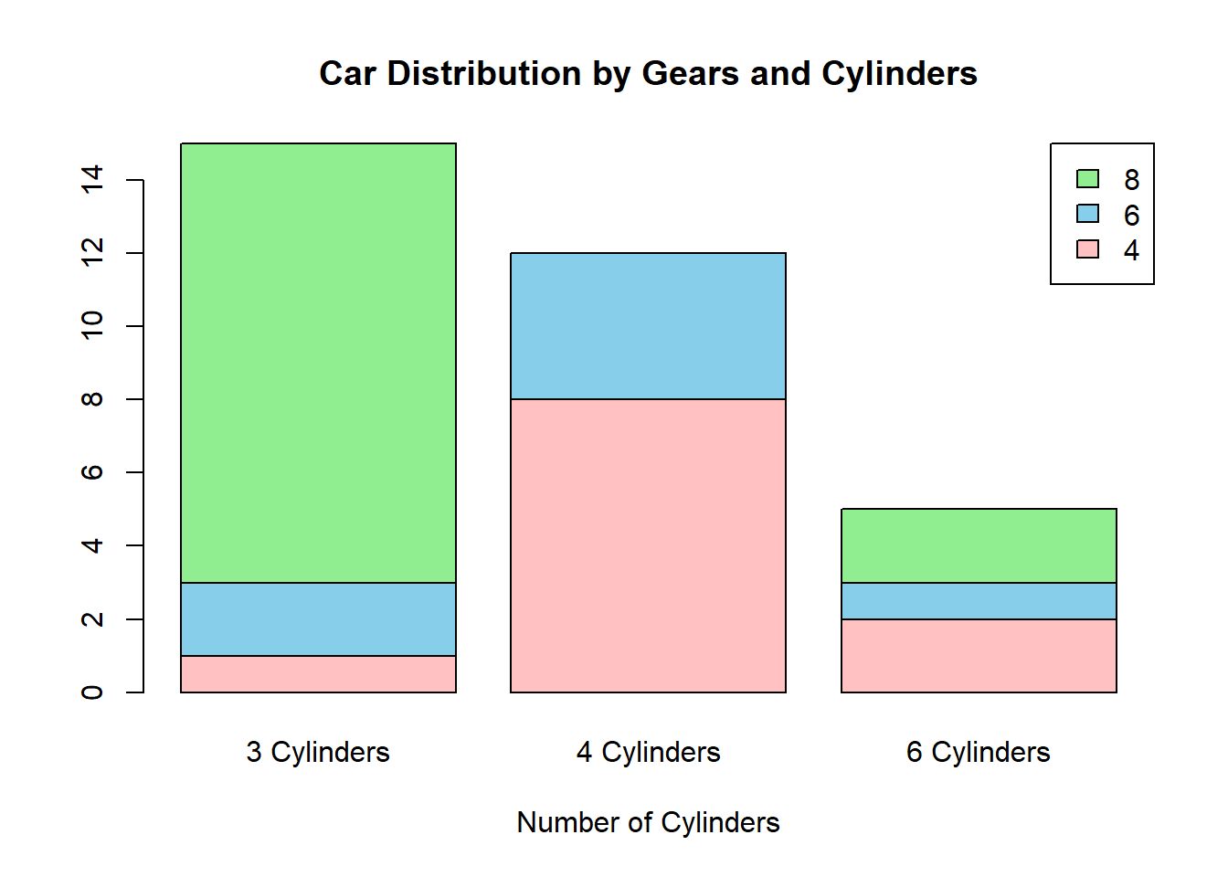
Here’s another example on how to construct stacked bar chart, we try to tabulate type of engine (vs) and number of forward gears (gear).
counts <- table(mtcars$vs, mtcars$gear)

barplot(counts, main="Car Distribution by Gears and VS",
        xlab="Number of Gears", col=c("rosybrown1","skyblue" ),
        legend = rownames(counts),
        border=NA,
        horiz= FALSE)#if wanted horizontal chart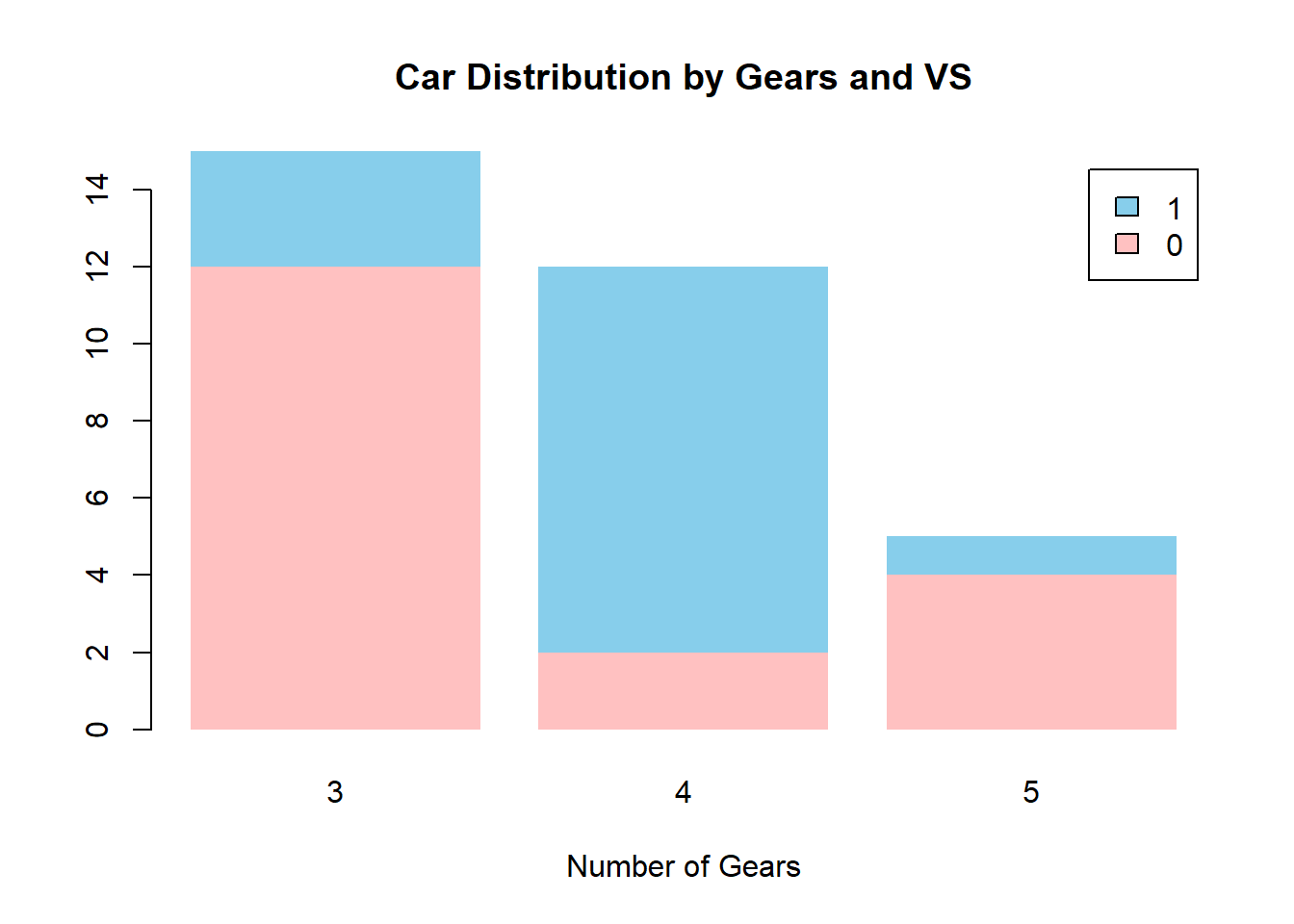
Let’s use the VADeaths dataset, which is a data matrix giving the number of deaths per 1,000 for four age groups in both rural and urban Virginia in 1940. We’ll create a stacked bar chart that displays this information, with the age groups on the x-axis and the death rates for each area (rural and urban) stacked in each bar.
# The VADeaths dataset is already in matrix form where the rows are the age groups and the columns are the areas.
# View the matrix structure
VADeaths
Rural Male Rural Female Urban Male Urban Female
50-54 11.7 8.7 15.4 8.4
55-59 18.1 11.7 24.3 13.6
60-64 26.9 20.3 37.0 19.3
65-69 41.0 30.9 54.6 35.1
70-74 66.0 54.3 71.1 50.0# Plotting the stacked bar chart
barplot(VADeaths,
beside=FALSE,
main="Death Rates in Virginia (1940)",
xlab="Age Group", las=3,
ylab="Deaths per 1,000",
col=c("lightblue", "salmon"),
legend.text=colnames(VADeaths),
args.legend=list(x="bottomright"),
horiz = T)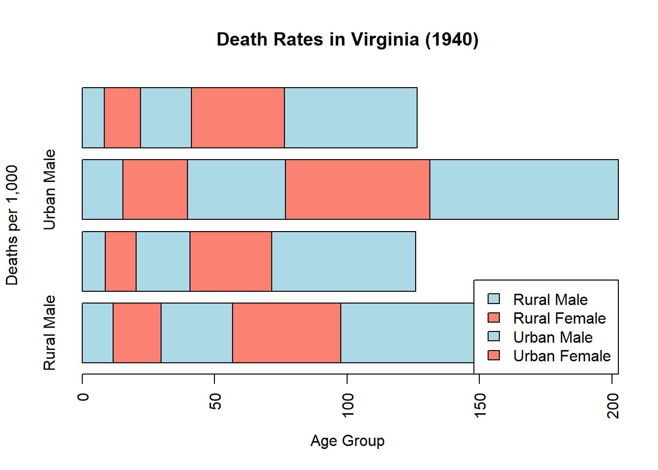
Lets try another example from palmerpenguins dataset. The palmerpenguins dataset is a newer and alternative dataset that has gained popularity for data exploration and visualization, much like the iris dataset. It contains size measurements for three penguin species from the Palmer Archipelago in Antarctica. Assuming you are referring to the palmerpenguins dataset, we can create an example stacked bar chart using this data.
First, you will need to install and load the palmerpenguins package to access the dataset, unless it is already installed:
# Install palmerpenguins package if you haven't already
install.packages("palmerpenguins")
# Load the palmerpenguins package
library(palmerpenguins)Once the package is loaded, you can access the penguins dataset. For this example, let’s create a stacked bar chart showing the count of penguins by species, with the bars stacked by sex.
Here’s how you might do that:
# Create a table of counts of species by sex
species_sex_table <- table(penguins$species, penguins$sex)

species_sex_table
            female male
  Adelie        73   73
  Chinstrap     34   34
  Gentoo        58   61
# Plotting the stacked bar chart
barplot(species_sex_table,
main="Penguin Count by Species and Sex",
xlab="Species",
ylab="Count",
col=c("lightblue", "lightpink", "lightgreen"),
legend.text=rownames(species_sex_table),
args.legend=list(x="bottom"),
horiz = TRUE)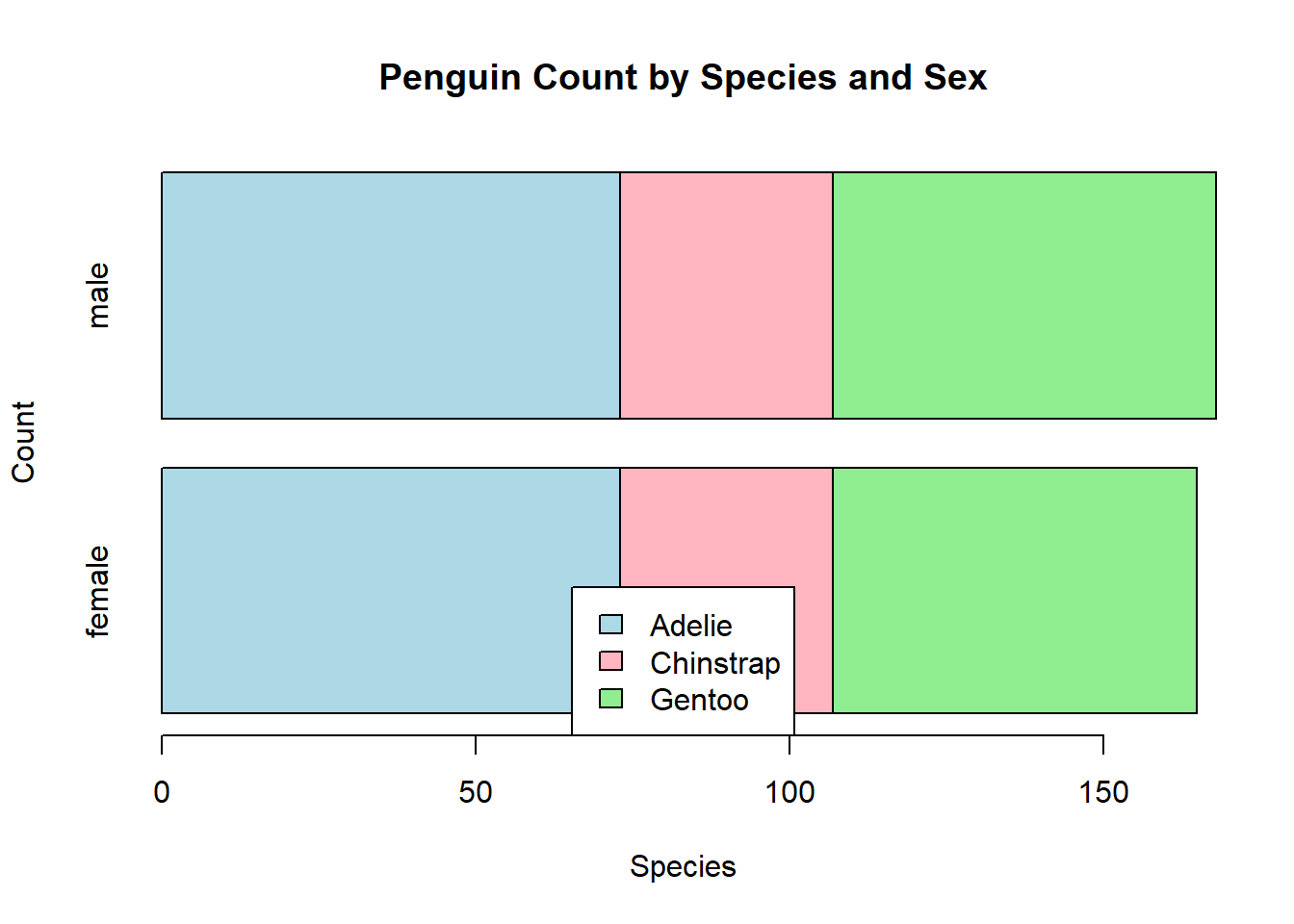
2.3 Cluster Bar Chart
A clustered bar chart, also known as a grouped bar chart, is a type of bar chart where categories of data are displayed as grouped bars, typically to compare and contrast different groups. In R, clustered bar charts can be made using the base graphics system by setting the beside parameter to TRUE in the barplot() function.
2.4 Example Code
Here’s an example code snippet for creating a clustered bar chart with vs and gear variable from mtcars dataset.
# Used beside = TRUE
counts <- table(mtcars$vs, mtcars$gear)

barplot(counts, main="Car Distribution by Gears and VS",
        xlab="Number of Gears", col=c("rosybrown1","skyblue"),
        legend = rownames(counts),
        beside=TRUE,
        border = "grey72",
        horiz=FALSE) #If want horizontal bar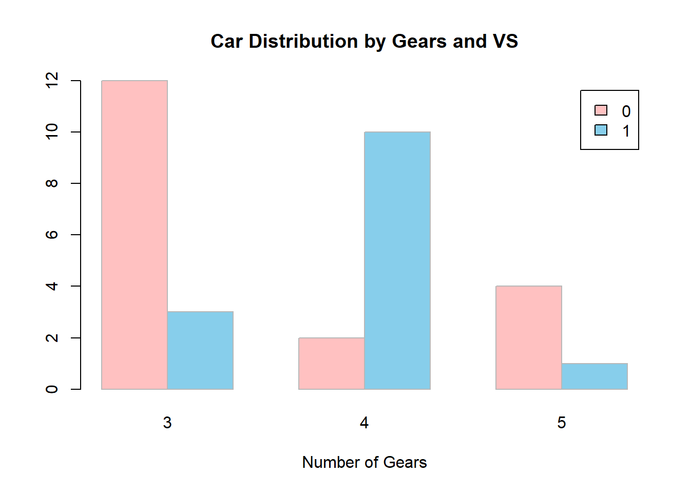
Another example by using number of cylinders and number of gears
table(mtcars$cyl, mtcars$gear)
     3  4  5
  4  1  8  2
  6  2  4  1
8 12 0 2barplot(table(mtcars$cyl, mtcars$gear), beside = TRUE,
col =c("#F0C6BD", "#DDF0BD", "#BDF0F0" ),
names.arg = c("3 Gears", "4 Gears", "5 Gears"),
legend.text = c("4 Cylinders", "6 Cylinders", "8 Cylinders"),
args.legend = list(cex=0.85, x = "topright", horiz=T),
main = "A Cluster bar chart showing \n disribution of Number of Cylinders and Number of Gear",
xlab = "Number of Gear",
ylab = "Frequency",
font.axis = 3,
col.axis = "#381404",
cex.axis = 0.9,
cex.lab = 1.2,
font.lab = 2,
col.lab = "#381404",
las = 1,
ylim = c(0,14))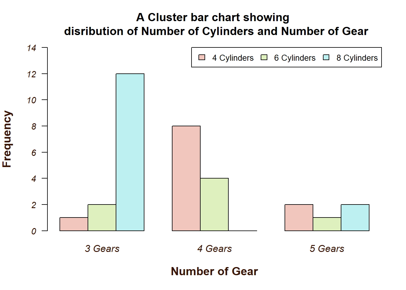
Adding text label on each bar
a1 <- barplot(table(mtcars$cyl, mtcars$gear), beside = TRUE,
              col =c("#F0C6BD", "#DDF0BD", "#BDF0F0" ),
              names.arg = c("3 Gears", "4 Gears", "5 Gears"),
              legend.text = c("4 Cylinders", "6 Cylinders", "8 Cylinders"),
              args.legend = list(cex=0.85, x = "topright", horiz=T),
              main = "A Cluster bar chart showing \n disribution of Number of Cylinders and Number of Gear",
              xlab = "Number of Gear",
              ylab = "Frequency",
              font.axis = 3,
              col.axis = "#381404",
              cex.axis = 0.9,
              cex.lab = 1.2,
              font.lab = 2,
              col.lab = "#381404",
              las = 1,
              ylim = c(0,14))
text (a1, table(mtcars$cyl, mtcars$gear),
      paste(table(mtcars$cyl, mtcars$gear)),
      pos = 3)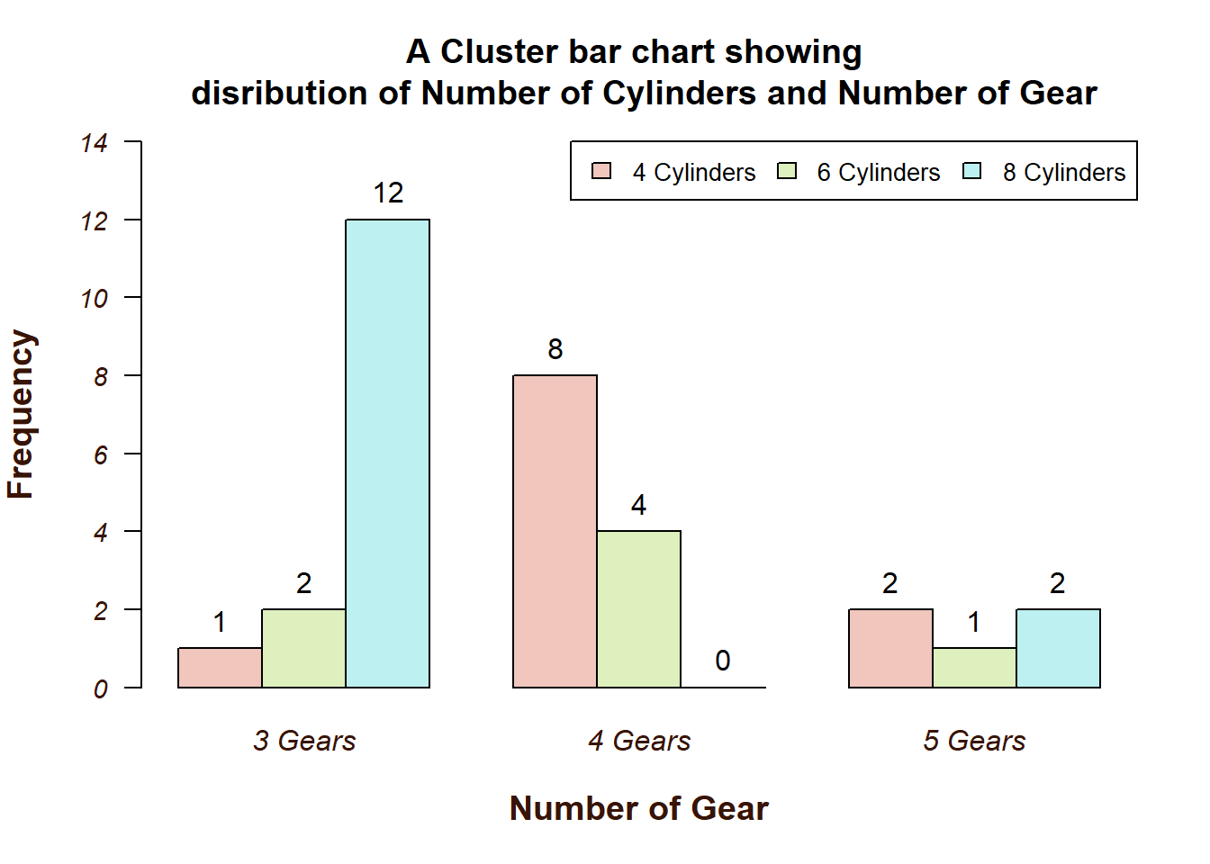
Horizontal Cluter Bar Chart
barplot(table(mtcars$cyl, mtcars$gear), beside = TRUE,
        col =c("#F0C6BD", "#DDF0BD", "#BDF0F0" ),
        names.arg = c("3 Gears", "4 Gears", "5 Gears"),
        legend.text = c("4 Cylinders", "6 Cylinders", "8 Cylinders"),
        args.legend = list(cex=0.85, x = "topright", horiz=T),
        main = "A Cluster bar chart showing \n disribution of Number of Cylinders and Number of Gear",
        ylab = "Number of Gear",
        xlab = "Frequency",
        font.axis = 3,
        col.axis = "#381404",
        cex.axis = 0.9,
        cex.lab = 1.2,
        font.lab = 2,
        col.lab = "#381404",
        las = 3,
        ylim = c(0,14),
        horiz = T)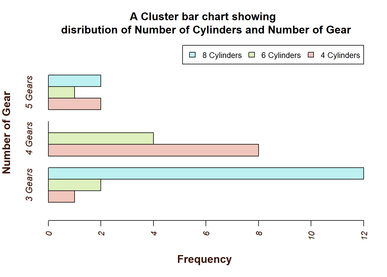
A cluster bar chart with aggregate data
mtcars2 <- mtcars %>%
  group_by(cyl, gear) %>%
  summarise(mean_mpg = mean(mpg, na.rm = T))
`summarise()` has grouped output by 'cyl'. You can override using the `.groups`
argument.barplot(mtcars2$mean_mpg~mtcars2$cyl+mtcars2$gear, beside = T,
names.arg=c("3 Gear", "4 Gear", "8 Gear"),
legend.text = c("4 Cylinders", "6 Cylinders", "8 Cylinders"),
args.legend = list(cex=0.85, x = "topright", horiz=T),
col = brewer.pal(n=3, name = "Pastel2"),
main = "A Cluster bar chart showing \n disribution of Number of Cylinders and Number of Gear",
xlab = "Number of Gear",
ylab = "Mean of Miles per Gallons",
font.axis = 3,
col.axis = "#381404",
cex.axis = 0.9,
cex.lab = 1.2,
font.lab = 2,
col.lab = "#381404",
las = 3,
ylim = c(0,35),
space = c(0.4, 2.5))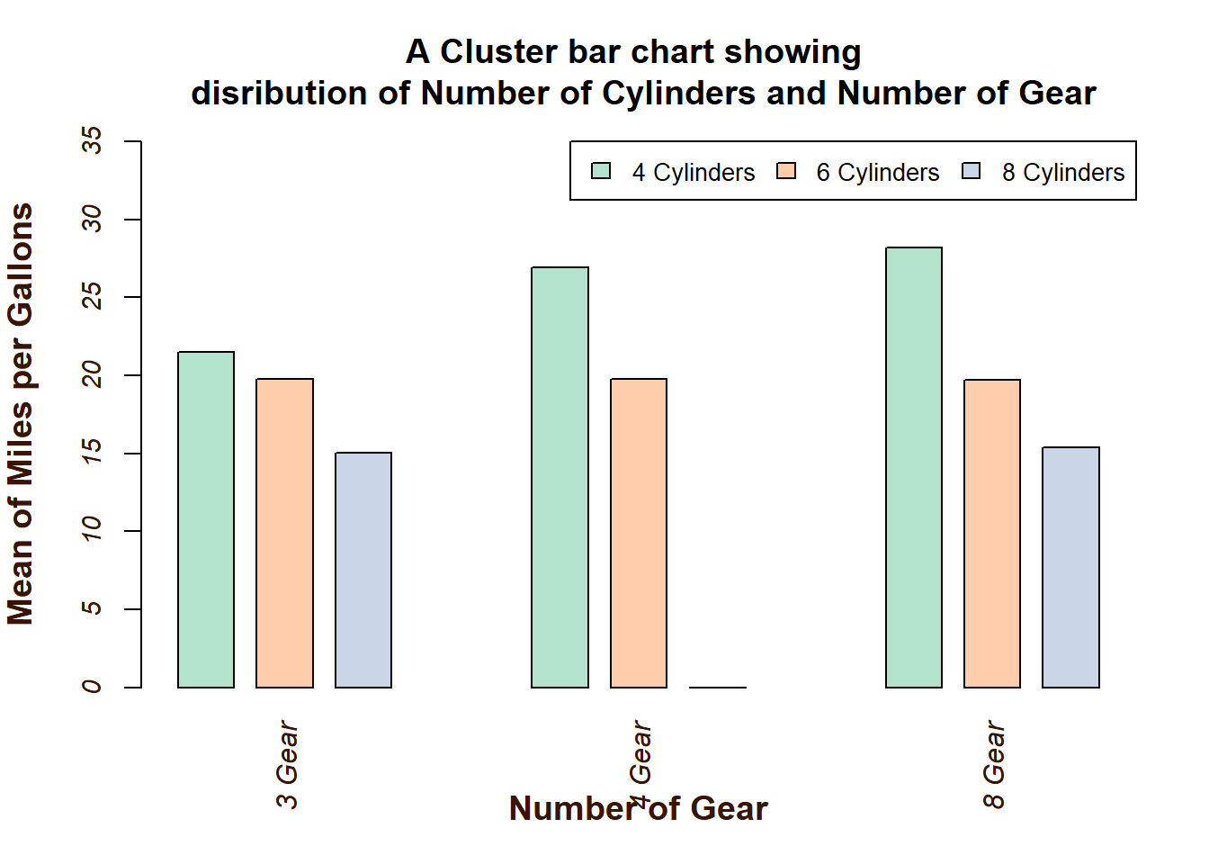
Enhanced graph by imputing several argument - Frequency
counts <- table(mtcars$vs, mtcars$gear)

#setting background of the chart, position and font style
par(bg="#FEF7F7", las=1, family='serif', mar=c(5, 4, 4, 5) + 0.1)

#setting background of the chart
bp <- barplot(counts, main="Car Distribution by Gears and Type of Engine",
        xlab="Number of Gears",
        ylab = "Number of cars",
        col=c("#FFD8E2", "#EFD8FF"),   #colour of each bar
      # legend = rownames(counts),
        beside=TRUE,                  # cluster bar chart
        border = "grey41",            # colour of the bar borders
        horiz=FALSE,                  # If want horizontal bar
        cex.main = 1.5,               # Font size of title
        font.main= 2,                 # Font style for title (4-bold italic)
        font.axis = 2,                # Font style for axis (4-bold italic)
        font.lab = 2,                 # Font style for axis title (4-bold italic)
      # family = "serif",             # Font face
      # las = 1,                      # style of axis labels (1-alway horizontal)
        col.main = "#5D485D",         # color the main title
        col.axis = "#8E6A8D",         # color the label in the axis
        col.lab = "#A97EA8",          # color the axis title
        yaxt = "n",                   # to remove y-axis line
        space = c(0.4,2.5),          #adding space betweeen bars
        names.arg = c("3 Gears", "4 Gears", "5 Gears")) #changing the x label names


#define tick marks for y-axis
ticks <- seq(0, max(counts), by=1)

#add y-axis with default color for labels but without ticks
axis(side = 2, at =ticks, labels = TRUE,
     cex.axis=0.8, col.axis="#8E6A8D", font=1)

#add y-axis again, this time without labels but with coloured ticks
axis(side=2, at=ticks, labels = FALSE,
     col="#8E6A8D", tck=-0.01, font=2)

# to make line on x-axis
abline(h=0, col="#8E6A8D", lwd=2, lty=2)

# Add the frequencies on top of each bar
text(x = bp, y = counts-0.1 ,
     labels = as.character(counts),
     pos = 1, cex = 0.8, col = "#5D485D")

#Add a custom legend without a box
legend("topright",
        inset=.05,  #to adjust the position
        title="Engine Type",
        legend = c("V-Shape", "Straight"),
        fill = c("#FFD8E2", "#EFD8FF"),
        bty = "n", # no box around the legend
        cex = 0.8,
        text.col= "#5D485D")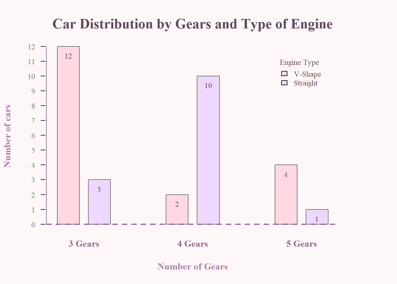
Yet,Another example for cluster bar chart in aggregate data
bp <- barplot(mtcars2$mean_mpg~mtcars2$cyl+mtcars2$gear, beside = T,
        names.arg=c("3 Gear", "4 Gear", "8 Gear"),
        col = wes_palette("Royal2", n=3),
main = "A Cluster bar chart showing \n disribution of Number of Cylinders and Number of Gear",
        xlab = "Number of Gear",
        ylab = "Mean of Miles per Gallons",
        font.axis = 3,
        border=wes_palette("Royal2", n=3),
        col.main = "#5D485D",
        col.axis = "#381404",
        col.lab = "#381404",
        cex.axis = 0.9,
        cex.main = 1.5,
        cex.lab = 1.2,
        font.lab = 2,
        font.axis = 2,
        family="serif",
        las =1,
        ylim = c(0,35),
        width = c(50,50,50),
        space = c(0.4, 2.5)
        )

#define tick marks for y-axis
ticks <- c(0,35)

#add y-axis with default color for labels but without ticks
axis(side = 2, at =ticks, labels = TRUE,
     cex.axis=0.8, col.axis="#8E6A8D", font=1)

#add y-axis again, this time without labels but with coloured ticks
axis(side=2, at=ticks, labels = FALSE,
     col="#8E6A8D", tck=-0.01, font=2)

# to make line on x-axis
abline(h=0, col="#8E6A8D", lwd=2, lty=2)

#Add a custom legend without a box
legend("topright",
        inset=.01,  #to adjust the position
        title="Number of Cylinders",
        legend = c("4 Cylinders", "6 Cylinders", "8 Cylinders"),
        fill = wes_palette("Royal2", n=3),
        bty = "n", # no box around the legend
        cex = 0.8,
        text.col= "#5D485D")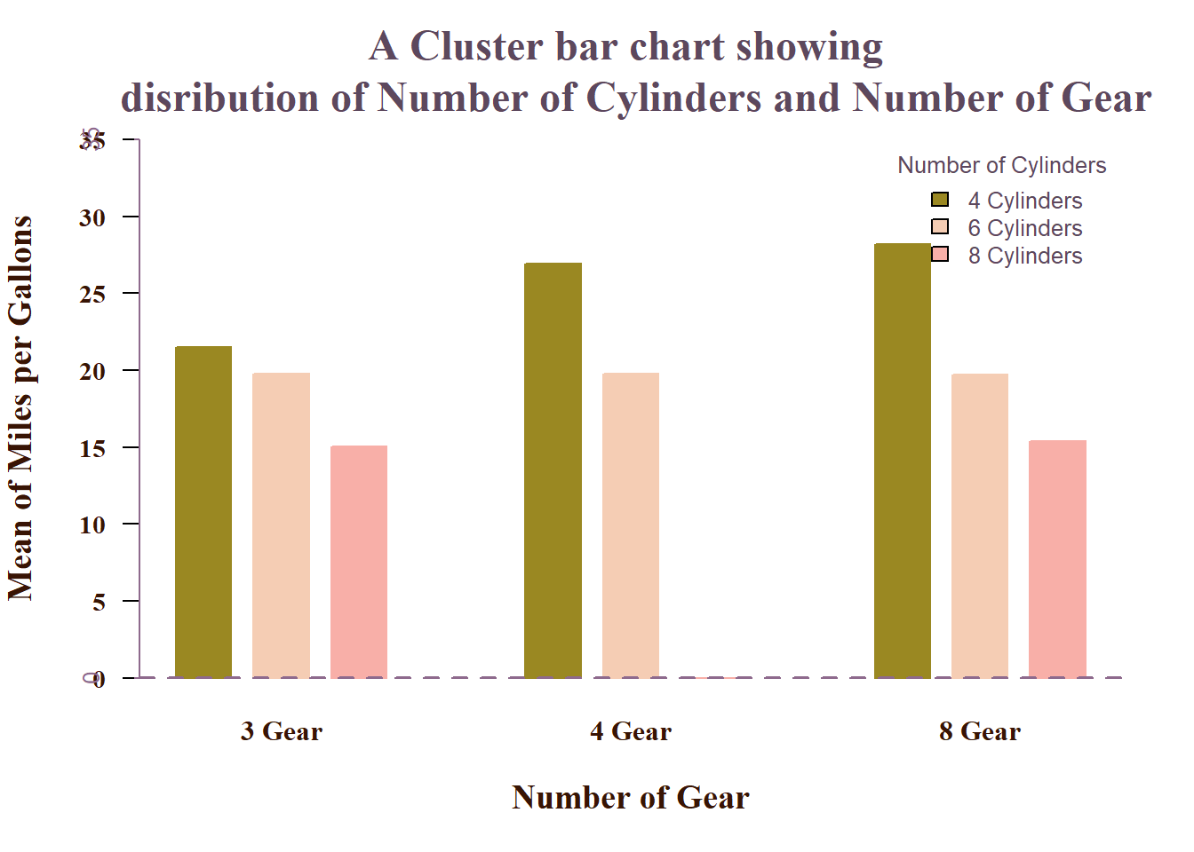
Note
For others chart, we can use the above knowledge to enhanced or beautify our chart. In the next section, I would just provide a simple way to use the functions for each chart type. The rest would be the same application as above.
3 Scatter Plot
Scatter plots display the relationship between two continuous variables.
3.1 Example: mtcars
# mtcars: weight vs MPG data(mtcars)
plot(mtcars$wt, mtcars$mpg,
     main = "MPG vs Weight",
     xlab = "Weight (1000 lbs)",
     ylab = "Miles/(US) gallon",
     col  = "steelblue",
     pch  = 16)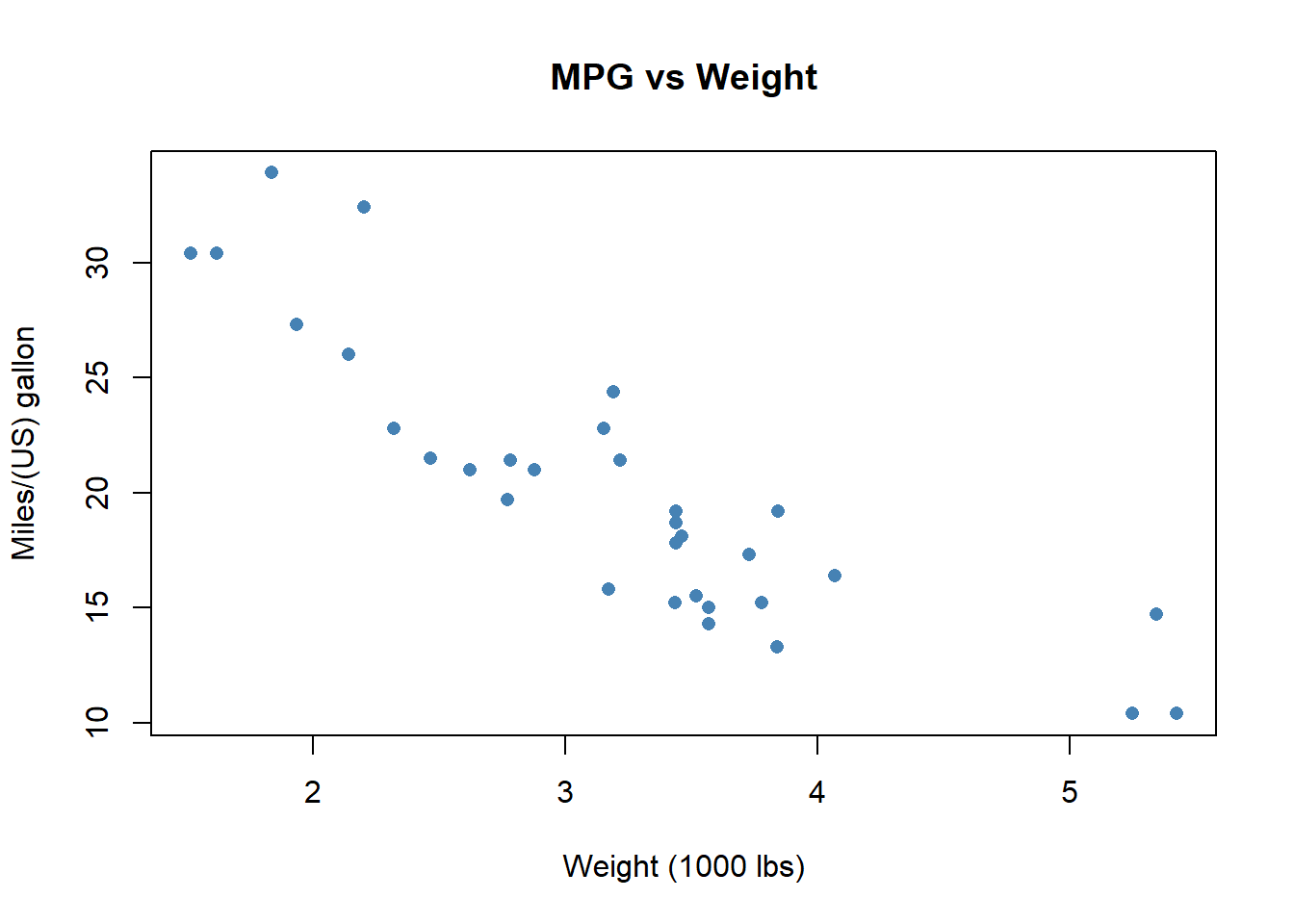
3.2 Example: iris
# iris: Sepal length vs width
with(iris,
     plot(Sepal.Length, Sepal.Width,
          main = "Iris Sepal Dimensions",
          xlab = "Sepal Length (cm)",
          ylab = "Sepal Width (cm)",
          col  = as.numeric(Species),
          pch  = 17))

legend("topright",
       legend = levels(iris$Species),
       col = 1:3,
       pch = 17)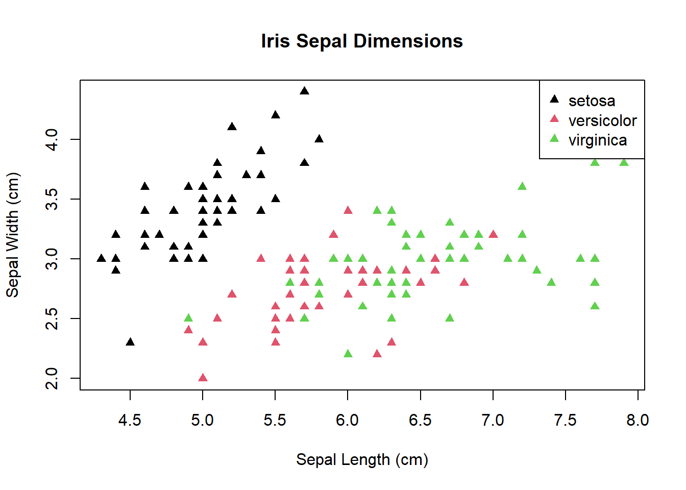
3.3 Example: penguins
# penguins: bill length vs depth
library(palmerpenguins)
plot(penguins$bill_length_mm,
     penguins$bill_depth_mm,
     main = "Penguins Bill Dimensions",
     xlab = "Bill Length (mm)",
     ylab = "Bill Depth (mm)",
     col  = as.numeric(penguins$species),
     pch  = 19)


legend("bottomright",
       legend = levels(penguins$species),
       col = 1:3,
       pch = 19)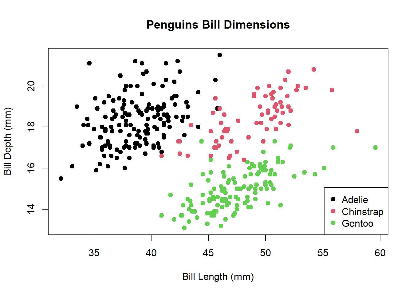
4 Line Chart
Line charts connect observations in order, ideal for time series.
4.1 Example: AirPassengers
data(AirPassengers)
plot(AirPassengers,
     main = "Monthly Air Passengers (1949–1960)",
     xlab = "Year",
     ylab = "Passengers",
     type = "o",
     col  = "darkgreen",
     lty  = 2)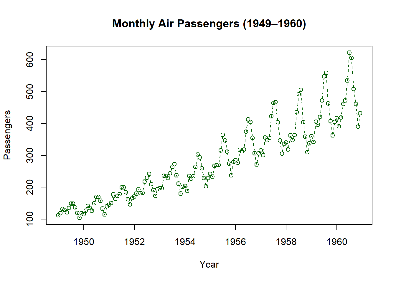
4.2 Example: mtcars (engine displacement vs horsepower)
with(mtcars,
     plot(disp, hp,
          type = "l",
          main = "HP vs Displacement",
          xlab = "Displacement (cu.in.)",
          ylab = "Horsepower",
          col  = "darkred",
          lwd  = 2))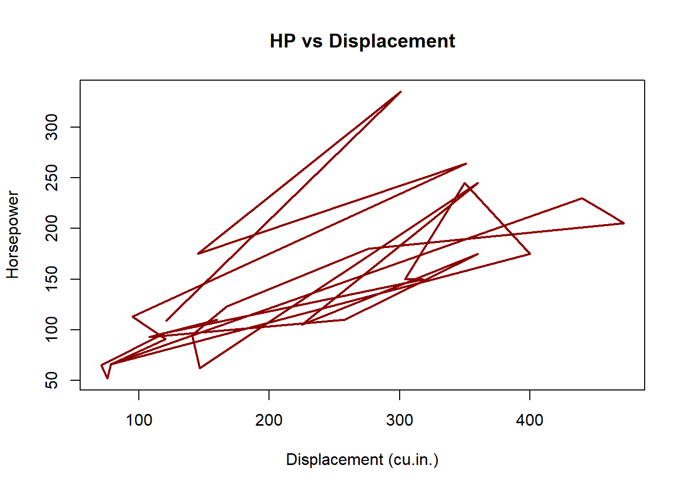
4.3 Example: Nile river flow
data(Nile)
plot(Nile,
     main = "Annual Nile Flow",
     xlab = "Year",
     ylab = "Flow",
     type = "s",
     col  = "blue")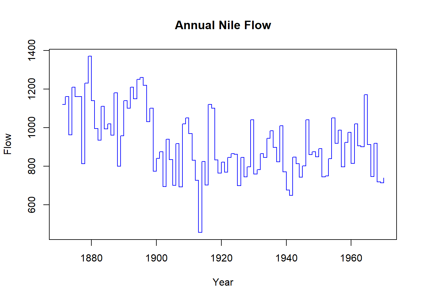
5 Histograms
Histograms show the distribution of a numeric variable.
5.1 Simple Histogram
hist(iris$Sepal.Length,
     main = "Distribution of Iris Sepal Length",
     xlab = "Sepal Length (cm)",
     col  = "lightgreen",
     breaks = 10)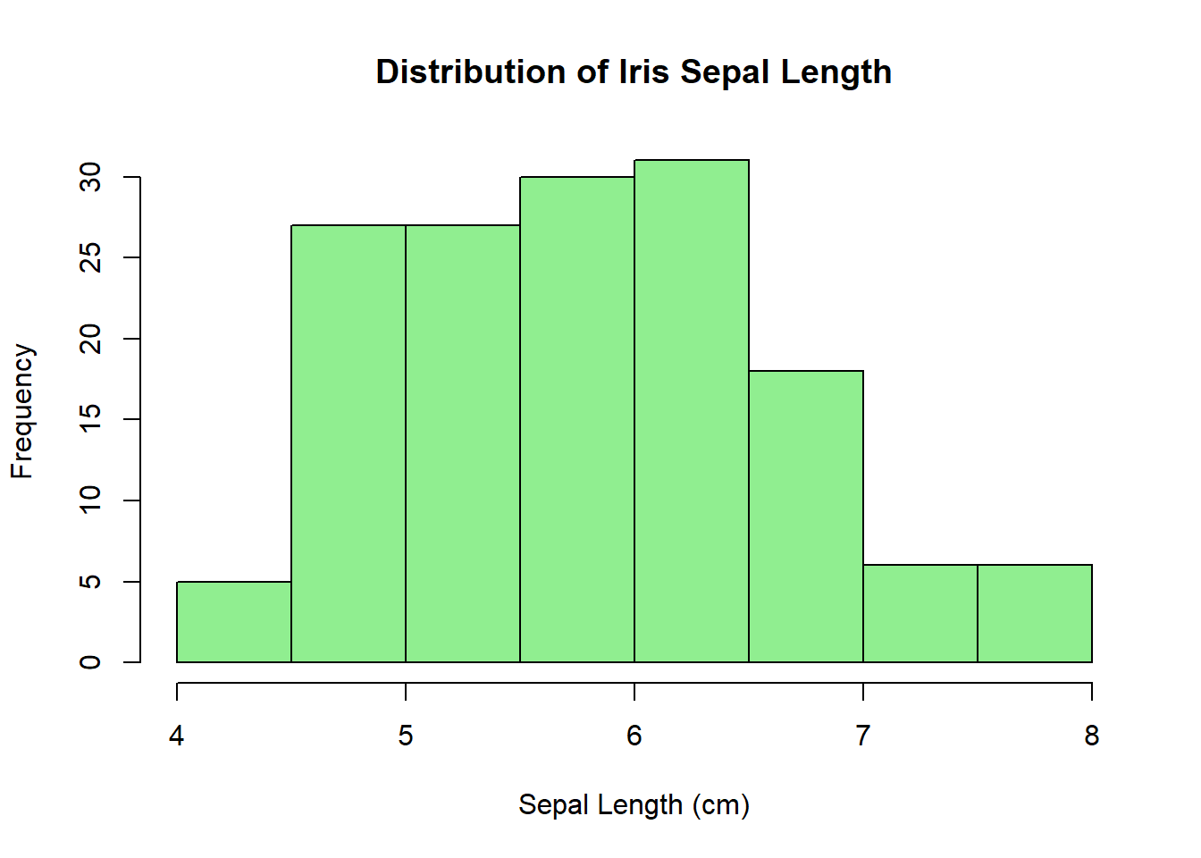
5.2 Histogram with Normal Curve
h <- hist(mtcars$mpg,
          main = "MPG Distribution with Normal Curve",
          xlab = "MPG",
          col  = "lightgray",
          breaks = 8,
          freq   = FALSE)
# overlay normal density
xfit <- seq(min(mtcars$mpg), max(mtcars$mpg), length = 40)
yfit <- dnorm(xfit, mean = mean(mtcars$mpg), sd = sd(mtcars$mpg))
lines(xfit, yfit, col = "blue", lwd = 2)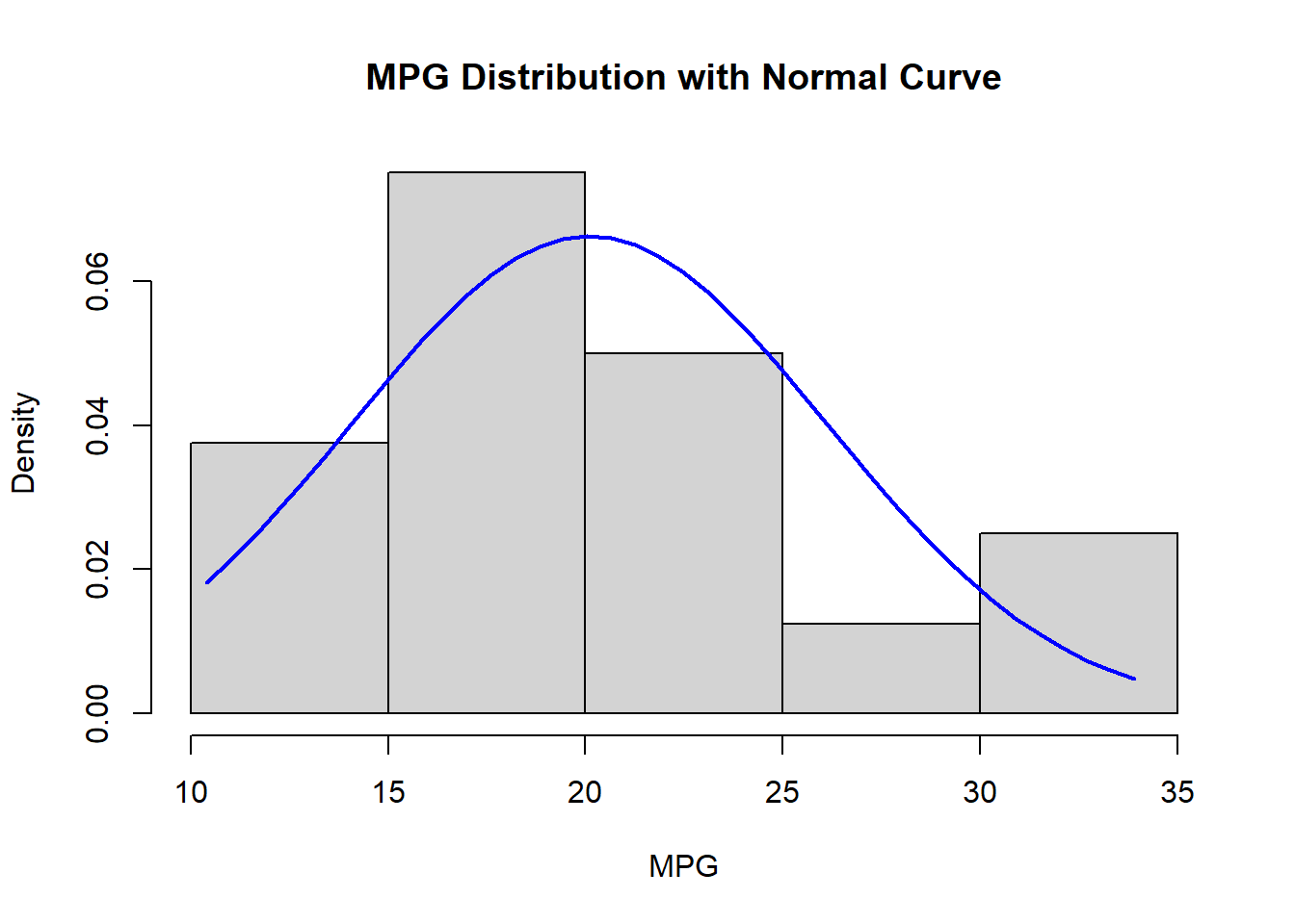
5.3 Histogram by Facet of Groups
# penguins bill length by species
data(penguins)
par(mfrow = c(1, 3))
for(sp in levels(penguins$species)) {
  hist(penguins$bill_length_mm[penguins$species == sp],
       main = paste(sp, "Bill Length"),
       xlab = "Bill Length (mm)",
       col  = "lightsalmon",
       breaks = 10)
}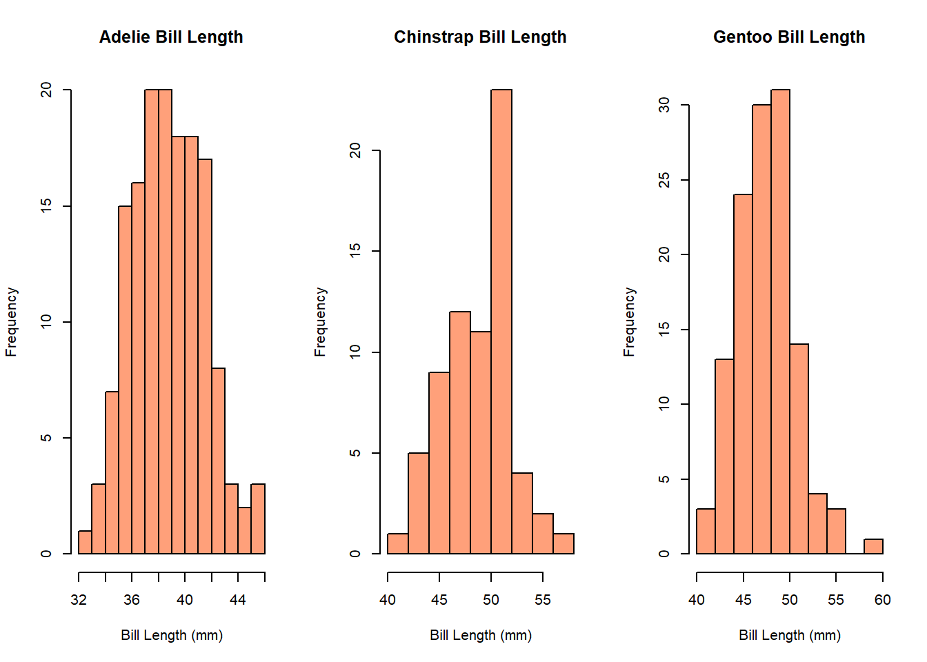
par(mfrow = c(1, 1)) # reset6 Boxplots
Boxplots summarize distribution with quartiles and outliers.
6.1 Single Boxplot
boxplot(iris$Petal.Length,
        main = "Boxplot of Iris Petal Length",
        ylab = "Petal Length (cm)",
        col  = "violet")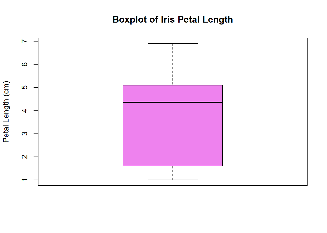
6.2 Grouped Boxplot
boxplot(Petal.Length ~ Species, data = iris,
        main = "Petal Length by Iris Species",
        xlab = "Species",
        ylab = "Petal Length (cm)",
        col  = c("lightblue", "lightpink", "lightgreen"))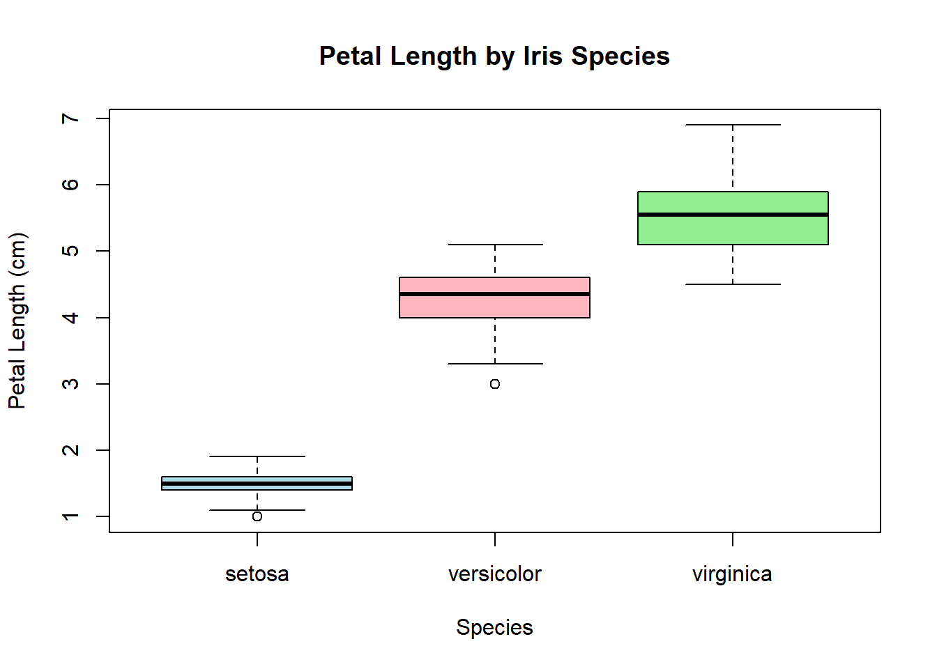
7 Conclusion
Base R graphics provide a flexible way to create and customize a wide range of plots. By mastering functions like plot(), lines(), barplot(), hist(), and boxplot(), along with their arguments (title, labels, colors, scales), students can effectively explore and present data.