Regression analysis is a statistical methodology that utilizes the relation between two or more quantitative variables so that a response or outcome variable can be predicted from the other, or others. This methodology is widely used in business, the social and behavioural sciences, the biological sciences, and many other disciplines.
A few examples of applications are:
1) Drug Dosage Determination - Regression analysis helps in determining the appropriate drug dosage for patients based on factors like age, weight, and other physiological parameters. By analyszing the relationship between these variables and drug response, doctors can optimize dosage for better treatment outcomes.
2) Disease Progression Prediction - Regression models are used to predict the progression of diseases like diabetes, cancer, or cardiovascular conditions. By analysing historical patient data (for example: biomarkers, genetic factors, lifestyle habits), regression helps estimate the likelihood and pace of disease advancement in individuals.
3) Price Optimization - Regression analysis assists in determining the optimal pricing strategy by examining the relationship between price changes and customer demand. It helps businesses understand how price adjustment affect sales volume and revenue, enabling them to set competitive yet profitable prices.
4) The performance of an employee on a job can be predicted by utilizing the relationship between performance and a battery of aptitude tests.
Simple Linear Regression
The simple linear regression estimate the linear equation for a relationship between continuous variables so one variable can be predicted or estimated. It is also used to determine the relationship between one numerical dependent variable and one numerical or categorical independent variable. It measures the strength of association between these variables as in correlation but it provides more information compared to correlation method.
The simple linear regression is usually used as the preliminary step of multiple linear regression. As in correlation analysis, the linear regression also provides the coefficient of relationship named as coefficient of determination, which represents the proportion of the variation of dependent variable explained by the independent variable.
Some examples of research questions for simple linear regression are:
1) Is the amount of calories associated with body weight?
2) Would the amount of exercise in hours predict the change in blood pressure?
3) How much a 15-hour physical activity changes the weight in kilograms?
4) How much will a 1gm of salt change blood pressure in mmHg in Perak population?
Remember!
Linear regression measures the linear association between continuous variables and it is useful when a dependent variable and independent variable are clearly defined.
The most important part in linear regression is, it applied when a prediction in the target variable is among the objectives of the analysis.
Assumptions in Simple Linear Regression
The assumptions in simple linear regression with two variables (1 independent variable and 1 dependent variable) are:
1) The values of the independent variable is fixed or non-random (should be in mathematical variable).
2) The independent variable is measured without error (this should be done at research design and data collection stage).
3) For each of the independent variable, the sub-population of dependent variable must be normally distributed (means that the dependent variable must be normally distributed at any point of independent variable).
4) The variances of the sub-population of the dependent variable are all equal (means equal variances of dependent variable at any point of independent variable).
5) The means of the sub-population of the dependent variable, must lie on the same straight line (this is the assumption of linearity of the dependent variable).
6) The dependent variable Y, has the values that are statistically independent.
As conclusion, we can conclude all the assumptions above as L.I.N.E. Which brings the meaning of L - Linearity, I - Independence, N-Normality, and E-Equal variances.
In this example, we will use oxygen.sav dataset from this link: https://sta334.s3.ap-southeast-1.amazonaws.com/data/Oxygen.sav. This dataset is about cardiovascular risk factors. There are 1000 males engaged in sedentary occupation. We want to study the relationship oxygen consumption among the risk factors in this population. The possible risk factors under considerations are Systolic blood pressure, total cholesterol, HDL cholesterol, and Triglycerides.
Research Questions:
1) Is there a significant relationship between oxygen consumption and systolic blood pressure levels?
2) Does a meaningful relationship exist between oxygen consumption and total cholesterol levels?
3) Is there a notable association between oxygen consumption and HDL cholesterol levels?
4) Do triglyceride levels exhibit a significant connection with oxygen consumption?
Research Hypothesis:
Systolic Blood Pressure:
Null Hypothesis (H0): There is no significant linear relationship between oxygen consumption and systolic blood pressure (β = 0).
Alternative Hypothesis (H1): There is a significant linear relationship between oxygen consumption and systolic blood pressure (β ≠ 0).
Total Cholesterol:
Null Hypothesis (H0): There is no significant linear relationship between oxygen consumption and total cholesterol levels (β = 0).
Alternative Hypothesis (H1): There is a significant linear relationship between oxygen consumption and total cholesterol levels (β ≠ 0).
HDL Cholesterol:
Null Hypothesis (H0): There is no significant linear relationship between oxygen consumption and HDL cholesterol levels (β = 0).
Alternative Hypothesis (H1): There is a significant linear relationship between oxygen consumption and HDL cholesterol levels (β ≠ 0).
Triglycerides:
Null Hypothesis (H0): There is no significant linear relationship between oxygen consumption and triglyceride levels (β = 0).
Alternative Hypothesis (H1): There is a significant linear relationship between oxygen consumption and triglyceride levels (β ≠ 0).
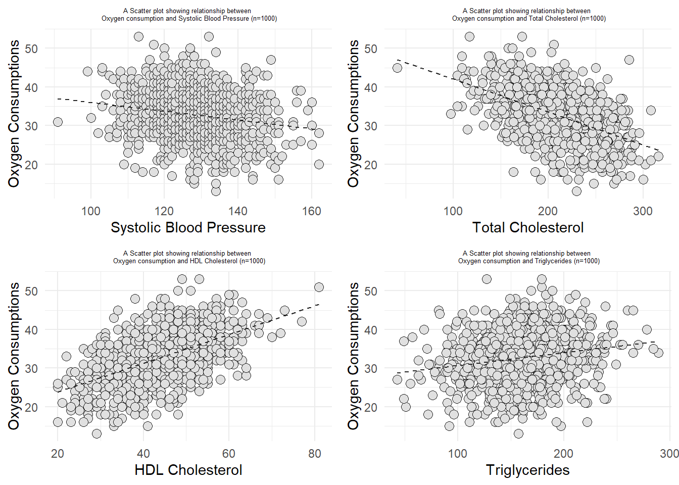
library(ggplot2)library(gridExtra)#Oxygen and SBPa <-ggplot(data1, aes(x=Sbp, y=Oxygen)) +geom_point(size =3, bg ="grey88", col="grey12", pch =21) +geom_smooth(method ="lm", color="grey14",lwd =0.5, lty =2, se = F) +labs(title ="A Scatter plot showing relationship between \n Oxygen consumption and Systolic Blood Pressure (n=1000)", x ="Systolic Blood Pressure", y ="Oxygen Consumptions") +theme_minimal() +theme(plot.title =element_text(hjust=0.5, size =5))#Oxygen and Total Cholesterolb <-ggplot(data1, aes(x=TChol, y=Oxygen)) +geom_point(size =3, bg ="grey88", col="grey12", pch =21) +geom_smooth(method ="lm", color="grey14",lwd =0.5, lty =2, se = F) +labs(title ="A Scatter plot showing relationship between \n Oxygen consumption and Total Cholesterol (n=1000)", x ="Total Cholesterol", y ="Oxygen Consumptions") +theme_minimal() +theme(plot.title =element_text(hjust=0.5, size =5))#Oxygen and HDL Cholesterolc <-ggplot(data1, aes(x=HDL, y=Oxygen)) +geom_point(size =3, bg ="grey88", col="grey12", pch =21) +geom_smooth(method ="lm", color="grey14",lwd =0.5, lty =2, se = F) +labs(title ="A Scatter plot showing relationship between \n Oxygen consumption and HDL Cholesterol (n=1000)", x ="HDL Cholesterol", y ="Oxygen Consumptions") +theme_minimal() +theme(plot.title =element_text(hjust=0.5, size =5))#Oxygen and Triglyceridesd <-ggplot(data1, aes(x=Triglycerides, y=Oxygen)) +geom_point(size =3, bg ="grey88", col="grey12", pch =21) +geom_smooth(method ="lm", color="grey14",lwd =0.5, lty =2, se = F) +labs(title ="A Scatter plot showing relationship between \n Oxygen consumption and Triglycerides (n=1000)", x ="Triglycerides", y ="Oxygen Consumptions") +theme_minimal() +theme(plot.title =element_text(hjust=0.5, size =5))grid.arrange(arrangeGrob(a,b, ncol =2), arrangeGrob(c, d, ncol =2), nrow =2)
From the scatter diagram, we can conclude that the relationship between oxygen consumption and systolic blood pressure was negatively correlated, Oxygen consumption and Total Cholesterol has negative correlation, both oxygen consumption and HDL cholesterol, and oxygen consumption and Triglycerides had positive correlation.
Step 3: Perform simple linear regression for each pairs
1) Oxygen Consumption and Systolic Blood Pressure
#Simple linear regression for Oxygen consumption and Systolic Blood Pressure.OS <-lm(data1$Oxygen~data1$Sbp)summary(OS)
Call:
lm(formula = data1$Oxygen ~ data1$Sbp)

Residuals:
     Min       1Q   Median       3Q      Max
-19.1063  -4.4535   0.1093   4.4446  20.6662

Coefficients:
            Estimate Std. Error t value Pr(>|t|)
(Intercept) 47.34954    2.45707  19.271  < 2e-16 ***
data1$Sbp   -0.11376    0.01904  -5.973 3.23e-09 ***
---
Signif. codes:  0 '***' 0.001 '**' 0.01 '*' 0.05 '.' 0.1 ' ' 1

Residual standard error: 6.468 on 998 degrees of freedom
Multiple R-squared:  0.03452,   Adjusted R-squared:  0.03355
F-statistic: 35.68 on 1 and 998 DF,  p-value: 3.233e-09
Based on the result, we can conclude that there are statistically significant relationship between Oxygen consumption and Systolic blood pressure since the p-value was less than 0.05 [t-statistic (df): -5.973 (998); p-value <0.001]. The R-square (coefficient of determination) was 0.03452 which is 3.45%. This indicates that there are 3.45% of the total variation in Oxygen consumption can be explained by Systolic blood pressure, where the balance were not included in the model. Based on the beta coefficient for systolic blood pressure (-0.1138), it shows that the variable having weak negative relationship with oxygen consumption.
Step 4: Residual diagnostic to check the assumptions
We need to make sure the assumption of LINE are met before interpreting the model.
Checking the the linearity assumption (L) and Homoscedasticity (equal variance) assumption (E).
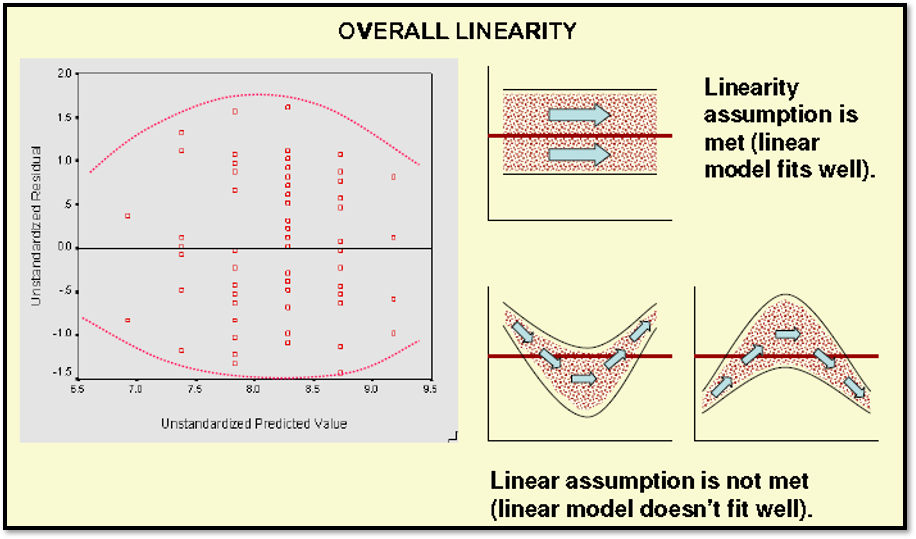
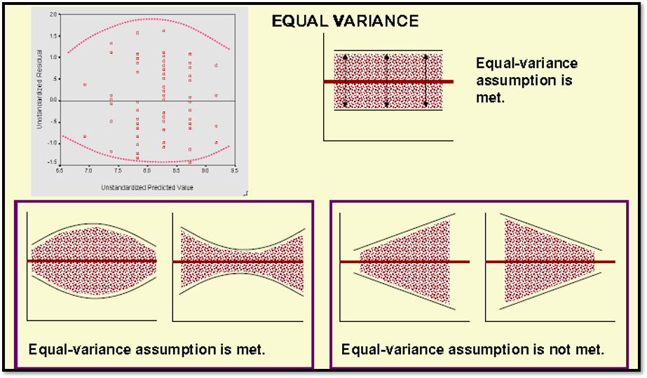
The linearity and equality of variances can be check through scatter diagram by plotting residuals and predicted values. The predicted values should be on X-axis, and the residual values should be on Y-axis on the plot. (It is XP-YR in short)!
To interpret the results of linearity of the model, the scatter plot should shows elliptical shape or it have equally even distributed around the graph area. Please refer to the illustration below:
1) Overall Linearity
2) Equality of variance
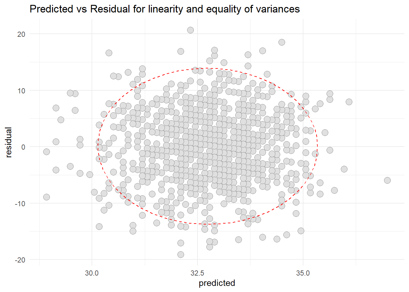
Now, For our current model, we first extract the residual and predicted values from the model and store the values into resid1 object, and then construct the plot.
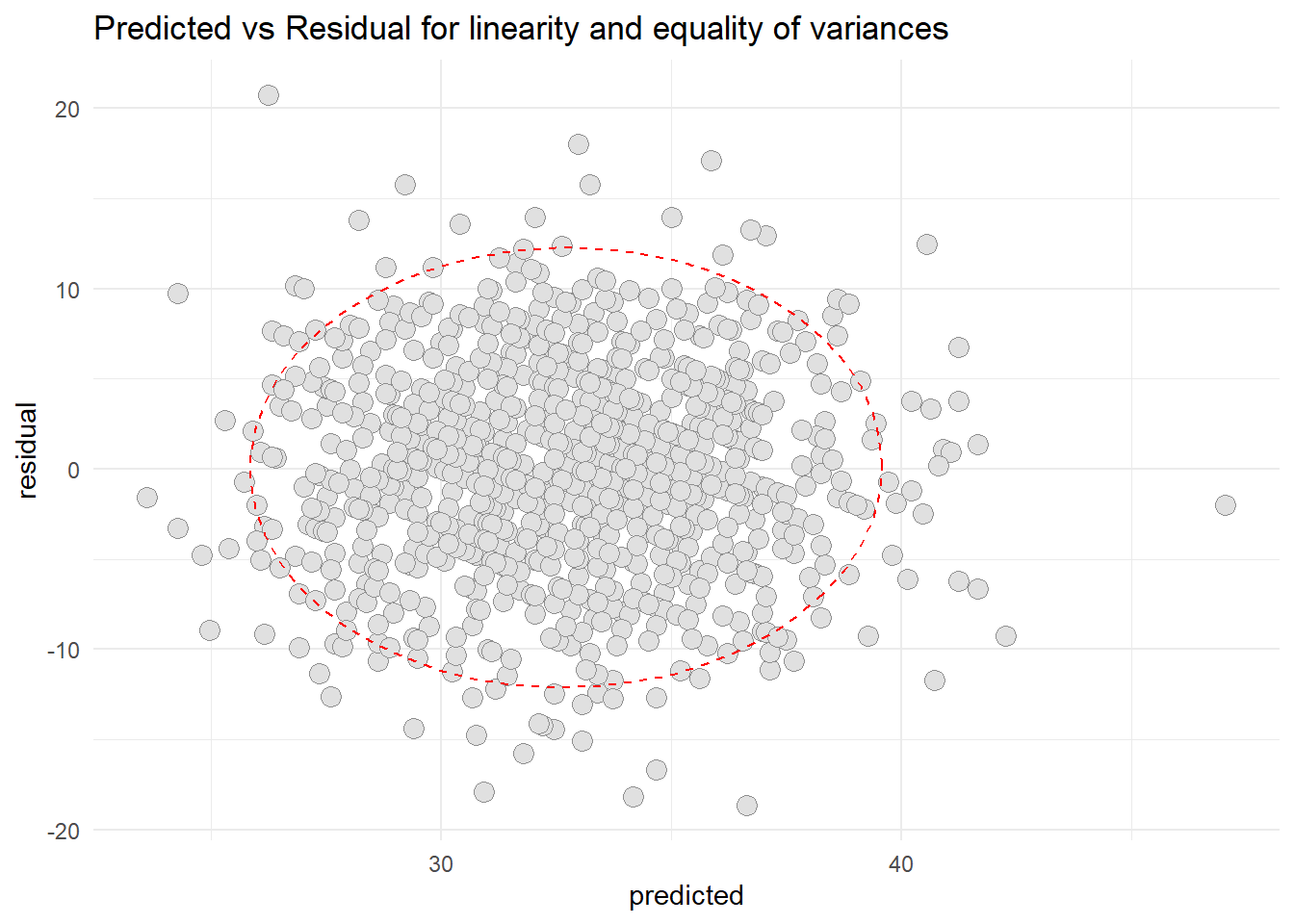
# plot(OS$fitted.values, OS$residuals)# abline(h=0)resid1 <-data.frame(cbind(residual = OS$residuals, predicted = OS$fitted.values))library(ggplot2)ggplot(resid1, aes(x=predicted, y=residual)) +geom_point(pch=21, size =3.5, bg="grey88", col="grey56") +stat_ellipse(lty=2, color ="red") +theme_minimal() +ggtitle("Predicted vs Residual for linearity and equality of variances")
Based on the scatter diagram of predicted and residual values, we can conclude that there were no peculiar pattern that can deny the linearity and the equality of variances. Thus, we can conclude that the linearity assumption is met and the equality of variances also met.
Normality of the residual values
Now to check the normality assumption, we will construct a Histogram and use Lilliefor’s test for this purpose.
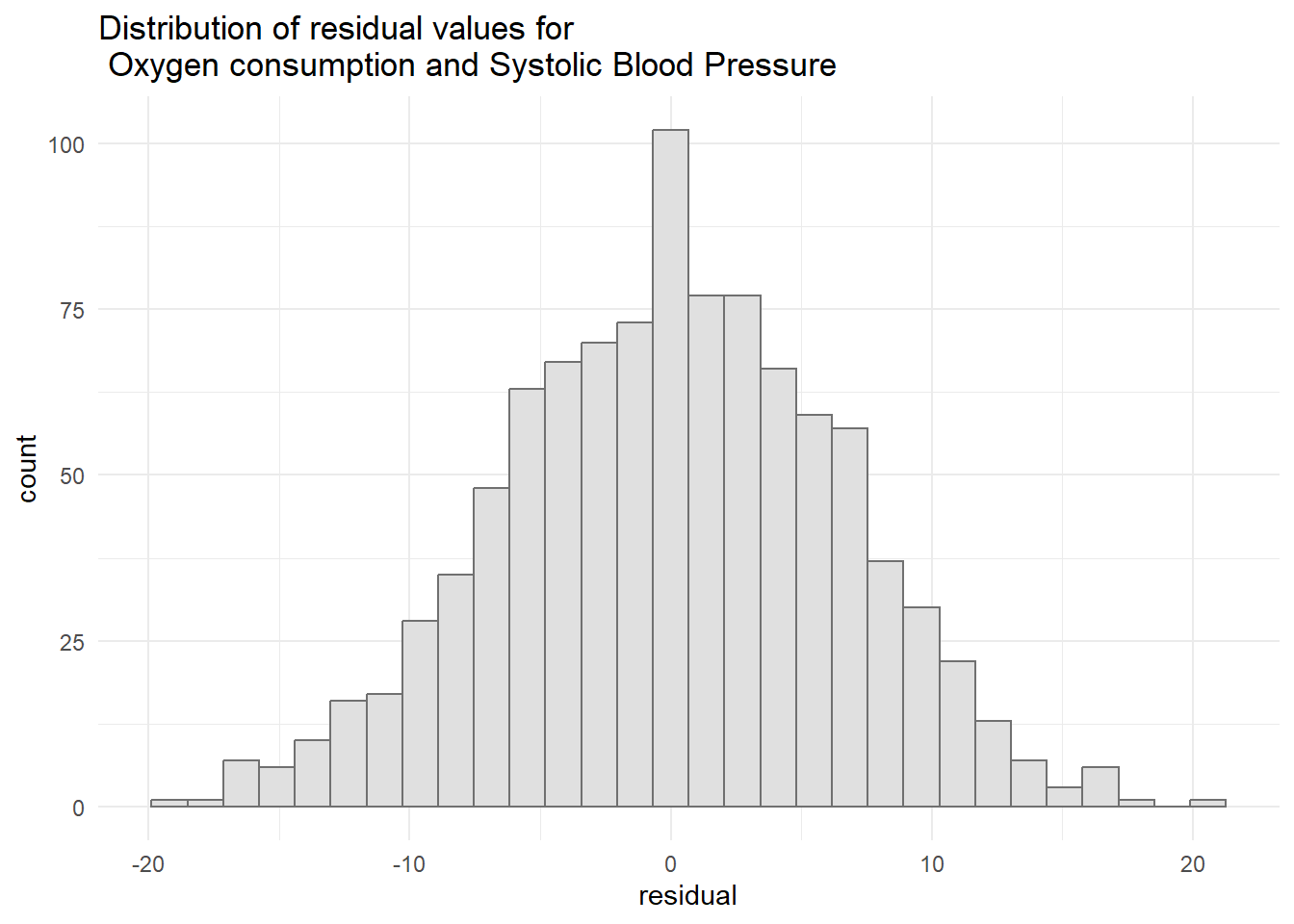
#Histogram of the residual valuesggplot(resid1, aes(x=residual)) +geom_histogram(col="grey44", bg="grey88") +ggtitle("Distribution of residual values for \n Oxygen consumption and Systolic Blood Pressure") +theme_minimal()
`stat_bin()` using `bins = 30`. Pick better value with `binwidth`.
#Lilliefor's test of normalitylibrary(nortest)lillie.test(resid1$residual)
    Lilliefors (Kolmogorov-Smirnov) normality test

data:  resid1$residual
D = 0.018977, p-value = 0.516
Based on the histogram, we can conclude that the data was normally distributed. Furthermore, based on the lilliefor’s test, it confirm the graphical result (histogram) that the data was normally distributed since the p-value was more than 0.05 [D-statistic: 0.0189; p-value: 0.516]. Hence, the normality assumption is met.
Repeat the same procedure for all others variables
2) Oxygen consumption and Total Cholesterol
#fit the simple linear regression modelOT <-lm(data1$Oxygen~data1$TChol)summary(OT)
Call:
lm(formula = data1$Oxygen ~ data1$TChol)

Residuals:
     Min       1Q   Median       3Q      Max
-18.6550  -3.6920  -0.0228   3.8707  20.7395

Coefficients:
             Estimate Std. Error t value Pr(>|t|)
(Intercept) 50.542809   1.022586   49.43   <2e-16 ***
data1$TChol -0.085201   0.004812  -17.71   <2e-16 ***
---
Signif. codes:  0 '***' 0.001 '**' 0.01 '*' 0.05 '.' 0.1 ' ' 1

Residual standard error: 5.742 on 998 degrees of freedom
Multiple R-squared:  0.2391,    Adjusted R-squared:  0.2383
F-statistic: 313.5 on 1 and 998 DF,  p-value: < 2.2e-16
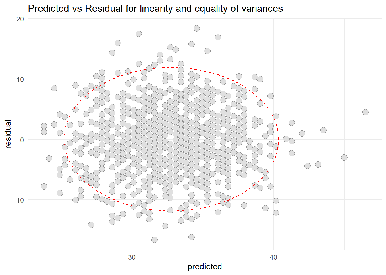
resid2 <-data.frame(cbind(residual = OT$residuals, predicted = OT$fitted.values))library(ggplot2)ggplot(resid2, aes(x=predicted, y=residual)) +geom_point(pch=21, size =3.5, bg="grey88", col="grey56") +stat_ellipse(lty=2, color ="red") +theme_minimal() +ggtitle("Predicted vs Residual for linearity and equality of variances")
Normality of the residuals
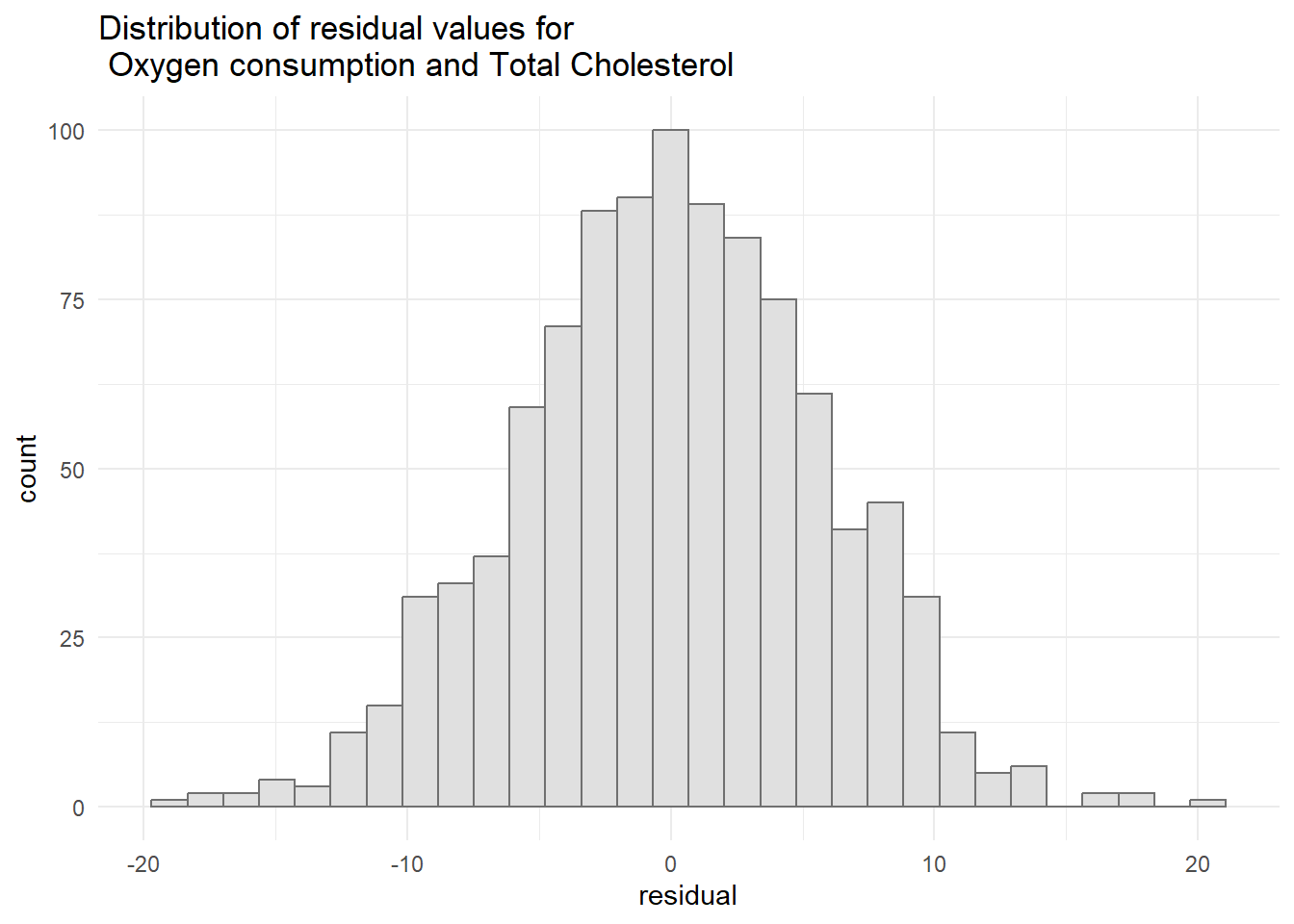
#Histogram of the residual valuesggplot(resid2, aes(x=residual)) +geom_histogram(col="grey44", bg="grey88") +ggtitle("Distribution of residual values for \n Oxygen consumption and Total Cholesterol") +theme_minimal()
`stat_bin()` using `bins = 30`. Pick better value with `binwidth`.
3) Oxygen consumption and HDL Cholesterol
#fit the simple linear regression model OH <-lm(data1$Oxygen~data1$HDL) summary(OH)
Call:
lm(formula = data1$Oxygen ~ data1$HDL)

Residuals:
     Min       1Q   Median       3Q      Max
-16.6115  -3.6115   0.0751   3.6443  18.4120

Coefficients:
            Estimate Std. Error t value Pr(>|t|)
(Intercept) 16.35696    0.83768   19.53   <2e-16 ***
data1$HDL    0.37206    0.01862   19.98   <2e-16 ***
---
Signif. codes:  0 '***' 0.001 '**' 0.01 '*' 0.05 '.' 0.1 ' ' 1

Residual standard error: 5.563 on 998 degrees of freedom
Multiple R-squared:  0.2858,    Adjusted R-squared:  0.2851
F-statistic: 399.4 on 1 and 998 DF,  p-value: < 2.2e-16
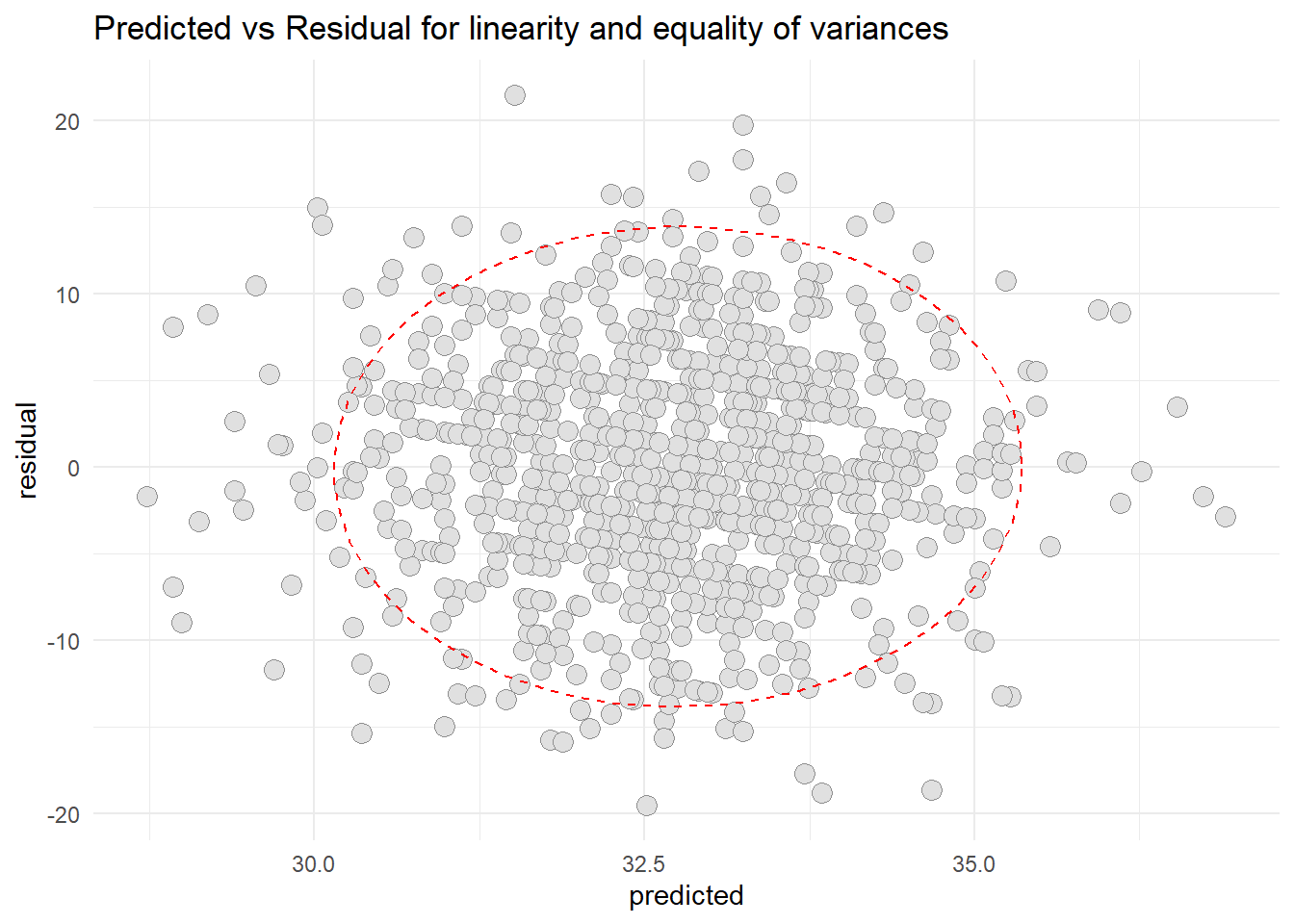
resid3 <-data.frame(cbind(residual = OH$residuals, predicted = OH$fitted.values)) library(ggplot2) ggplot(resid3, aes(x=predicted, y=residual)) +geom_point(pch=21, size =3.5, bg="grey88", col="grey56") +stat_ellipse(lty=2, color ="red") +theme_minimal() +ggtitle("Predicted vs Residual for linearity and equality of variances")
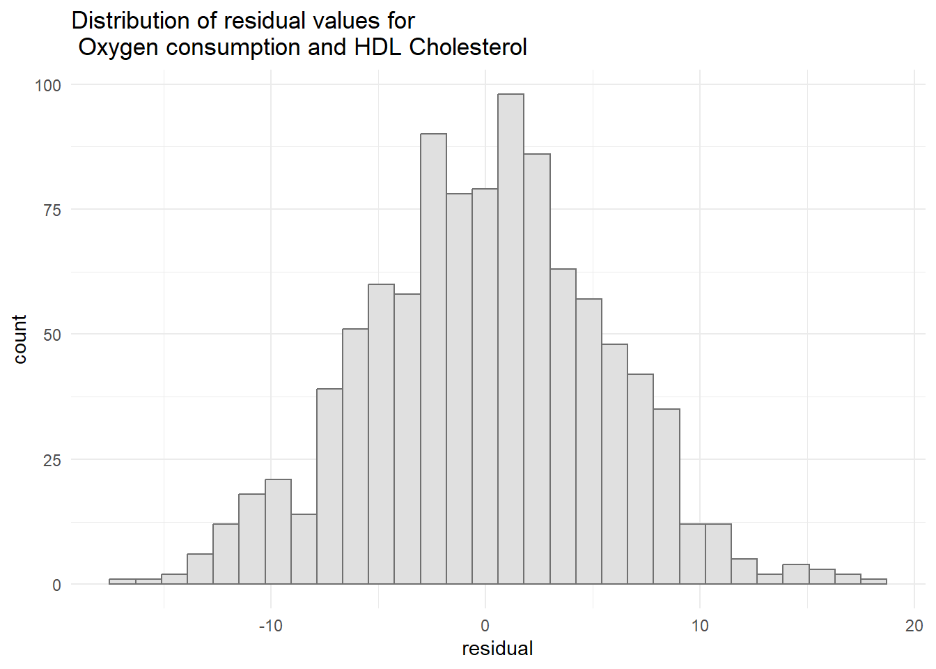
Normality of the residuals
#Histogram of the residual values ggplot(resid3, aes(x=residual)) +geom_histogram(col="grey44", bg="grey88") +ggtitle("Distribution of residual values for \n Oxygen consumption and HDL Cholesterol") +theme_minimal()
`stat_bin()` using `bins = 30`. Pick better value with `binwidth`.
2) Oxygen consumption and Triglycerides
#fit the simple linear regression model OT2 <-lm(data1$Oxygen~data1$Triglycerides) summary(OT2)
Call:
lm(formula = data1$Oxygen ~ data1$Triglycerides)

Residuals:
     Min       1Q   Median       3Q      Max
-19.5192  -4.1522  -0.0543   4.3903  21.4771

Coefficients:
                     Estimate Std. Error t value Pr(>|t|)
(Intercept)         27.304999   0.920704  29.657  < 2e-16 ***
data1$Triglycerides  0.033212   0.005502   6.036 2.22e-09 ***
---
Signif. codes:  0 '***' 0.001 '**' 0.01 '*' 0.05 '.' 0.1 ' ' 1

Residual standard error: 6.465 on 998 degrees of freedom
Multiple R-squared:  0.03523,   Adjusted R-squared:  0.03426
F-statistic: 36.44 on 1 and 998 DF,  p-value: 2.219e-09
resid4 <-data.frame(cbind(residual = OT2$residuals, predicted =OT2$fitted.values))library(ggplot2) ggplot(resid4, aes(x=predicted, y=residual)) +geom_point(pch=21, size =3.5, bg="grey88", col="grey56") +stat_ellipse(lty=2, color ="red") +theme_minimal() +ggtitle("Predicted vs Residual for linearity and equality of variances")
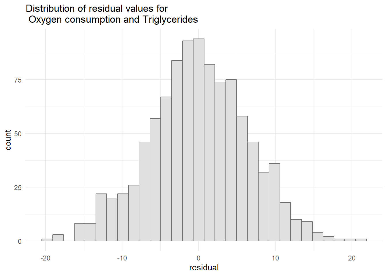
Normality of the residuals
#Histogram of the residual values ggplot(resid4, aes(x=residual)) +geom_histogram(col="grey44", bg="grey88") +ggtitle("Distribution of residual values for \n Oxygen consumption and Triglycerides") +theme_minimal()
`stat_bin()` using `bins = 30`. Pick better value with `binwidth`.
Presentation of the results
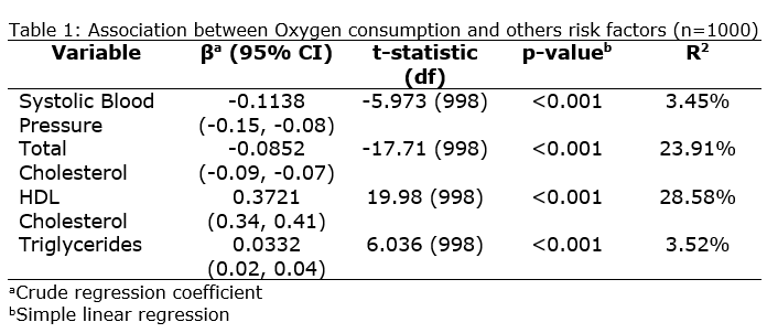
To present the results of simple linear regression analysis, we need to construct the table as below:
Alternatively, we can generate the report more easily using gtsummary package.
Based on the Table 1, the simple linear regression were performed to analyse the relationship between oxygen consumption and others risk factors such as systolic blood pressure, total cholesterol, HDL cholesterol, and Triglycerides. We can conclude that all the variables have statistically significant relationship with Oxygen consumption since the p-value for all variables were less than 0.05. For univariable relationship betwen oxygen consumption and systolic blood pressure was statistically significant since the p-value was less than 0.05 [t-statistic (df): -5.973 (998); p-value <0.001]. The coefficient of -0.1138 suggests a negative association. For every 1 mmHg increase in systolic blood pressure, oxygen consumption is estimated to decrease by 0.1138 units, holding other factors constant.
For Total cholesterol, there are significant relationship with Oxygen consumption since the p-value was less than 0.05 [t-statistic (df): -17.71 (998); p-value < 0.001]. The coefficient of -0.0852 also suggests a negative association. For every 1 mg/dL increase in total cholesterol, oxygen consumption is estimated to decrease by 0.0852 units, holding other factors constant. Next, for HDL cholesterol, the coefficient of 0.3721 suggests a positive association. For every 1 mg/dL increase in HDL cholesterol, oxygen consumption is estimated to increase by 0.3721 units, holding other factors constant. The p-value < 0.001 indicates a statistically significant relationship. Lastly, The coefficient of triglycerides (0.0332) suggests a positive association. For every 1 mg/dL increase in triglycerides, oxygen consumption is estimated to increase by 0.0332 units, holding other factors constant. The p-value < 0.001 indicates a statistically significant relationship.
The R-squared values for the individual risk factors range from 3.45% to 28.58%, suggesting that each factor explains a moderate amount of the variability in oxygen consumption on its own.
Example 2
In this example, we will use regression.dta from this link: adsad
In this dataset, we would like to find the relationship between abdominal fat thickness (fat) and waist circumference (waist), and random blood sugar levels (rbs).
Research Questions:
1) Is there a significant relationship between Abdominal Fat Thickness and Waist Circumference?
2) Is there a significant linear relationship between Abdominal Fat Thickness and Random Blood Sugar?
Hypothesis:
1) There are significant linear relationship between Abdominal Fat Thickness and Waist Circumference.
2) There are significant linear relationship between Abdominal Fat Thickness and Random Blood Sugar.
In this example, the dependent variable is Abdominal Fat Thickness, and the predictors variables are Waist Circumference and Random Blood Sugar.
Now, we would like to access the relationship between the pairs using scatter diagram.
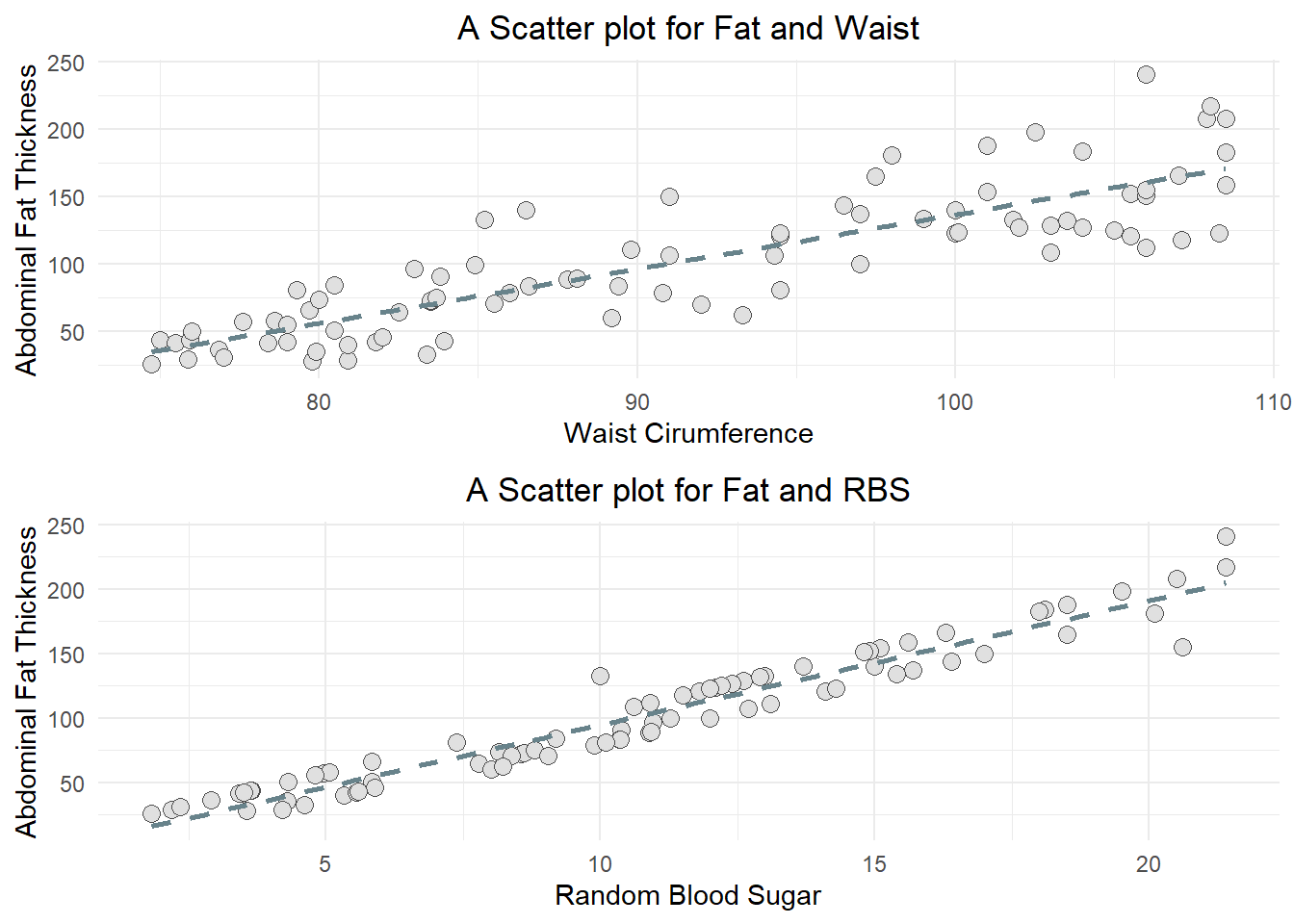
library(ggplot2)library(gridExtra)a <-ggplot(data1, aes(y=fat, x=waist)) +geom_point(pch=21, bg="grey88", col="grey30", size =3) +geom_smooth(method ="lm", se=F, lty =2, col="lightblue4") +labs(title ="A Scatter plot for Fat and Waist", x ="Waist Cirumference", y ="Abdominal Fat Thickness" ) +theme_minimal()+theme(plot.title=element_text(hjust=0.5))b <-ggplot(data1, aes(y=fat, x=rbs)) +geom_point(pch=21, bg="grey88", col="grey30", size =3) +geom_smooth(method ="lm", se=F, lty =2, col="lightblue4") +labs(title ="A Scatter plot for Fat and RBS", x ="Random Blood Sugar", y ="Abdominal Fat Thickness" ) +theme_minimal()+theme(plot.title=element_text(hjust=0.5))grid.arrange(arrangeGrob(a,b), nrow =1)
`geom_smooth()` using formula = 'y ~ x'
`geom_smooth()` using formula = 'y ~ x'
Based on the scatter diagram, we can see that both pairs Waist circumference and Abdominal fat thickness, and Random blood sugar and Abdominal fat thickness have positive correlations.
Step 2: Performing Univariable Analysis (Simple Linear Regression)
#Abdominal Fat Thickness and Waist CircumferenceFW <-lm(data1$fat~data1$waist)summary(FW)
Call:
lm(formula = data1$fat ~ data1$waist)

Residuals:
   Min     1Q Median     3Q    Max
-49.03 -18.81  -0.51  12.17  79.97

Coefficients:
             Estimate Std. Error t value Pr(>|t|)
(Intercept) -266.4461    24.8325  -10.73   <2e-16 ***
data1$waist    4.0328     0.2697   14.95   <2e-16 ***
---
Signif. codes:  0 '***' 0.001 '**' 0.01 '*' 0.05 '.' 0.1 ' ' 1

Residual standard error: 27.26 on 84 degrees of freedom
Multiple R-squared:  0.7269,    Adjusted R-squared:  0.7236
F-statistic: 223.5 on 1 and 84 DF,  p-value: < 2.2e-16
#Abdominal Fat Thickness and Random Blood SugarFR <-lm(data1$fat~data1$rbs)summary(FR)
Call:
lm(formula = data1$fat ~ data1$rbs)

Residuals:
    Min      1Q  Median      3Q     Max
-41.957 -11.576   2.895  10.194  38.186

Coefficients:
            Estimate Std. Error t value Pr(>|t|)
(Intercept)  -1.5463     3.2306  -0.479    0.633
data1$rbs     9.6361     0.2703  35.643   <2e-16 ***
---
Signif. codes:  0 '***' 0.001 '**' 0.01 '*' 0.05 '.' 0.1 ' ' 1

Residual standard error: 12.99 on 84 degrees of freedom
Multiple R-squared:  0.938, Adjusted R-squared:  0.9372
F-statistic:  1270 on 1 and 84 DF,  p-value: < 2.2e-16
Step 3: Checking the assumptions
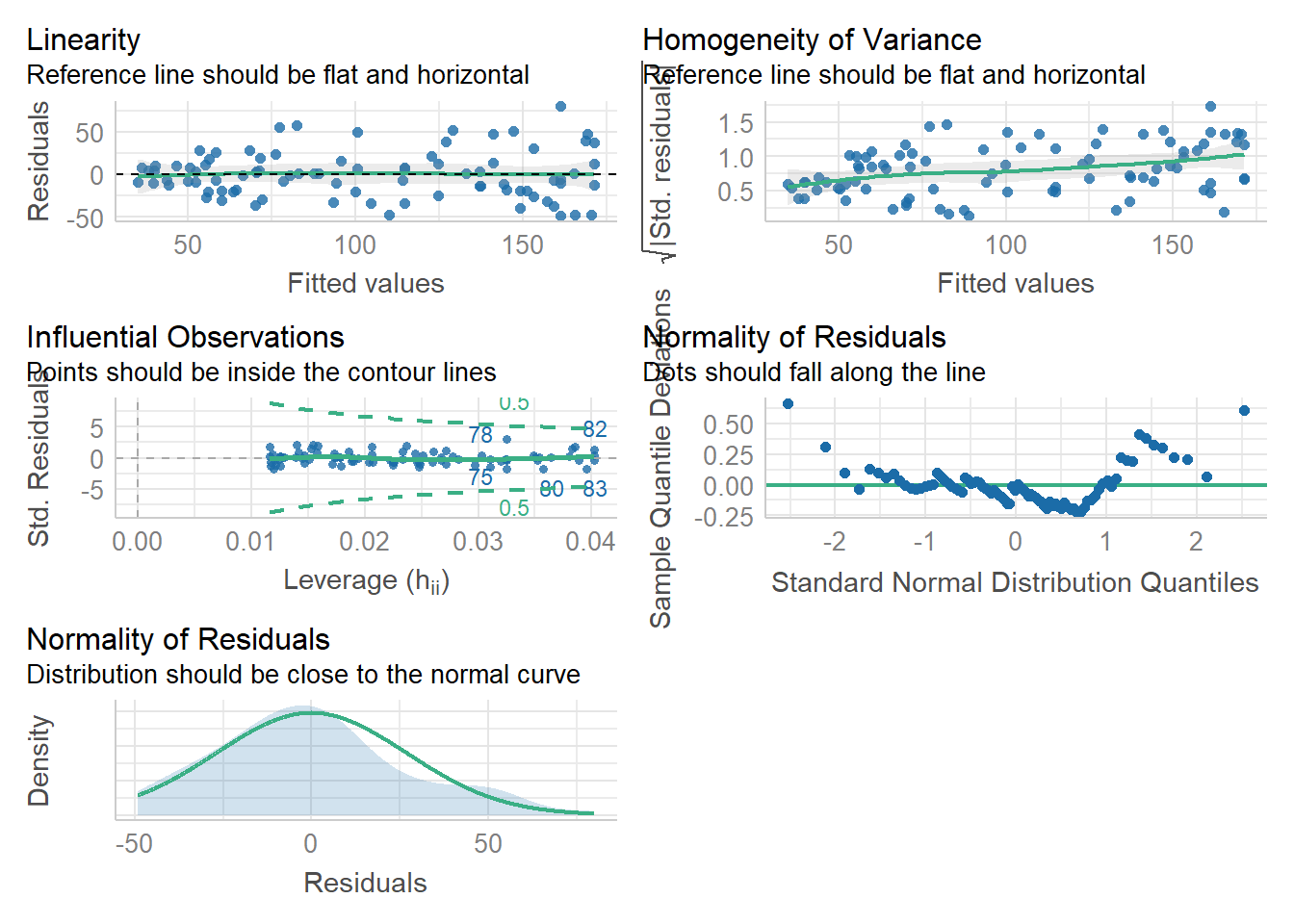
library(performance)#Checking overall assumption for Fat and Waistcheck_model(FW)
Based on charts produced by the model for Abdominal Fat Thickness and Waist Circumference, we can conclude that the linearity and equality of variances assumptions were met (this is based on the first table). Then the normality of the residual also met (last table (3rd row, 1st column)).
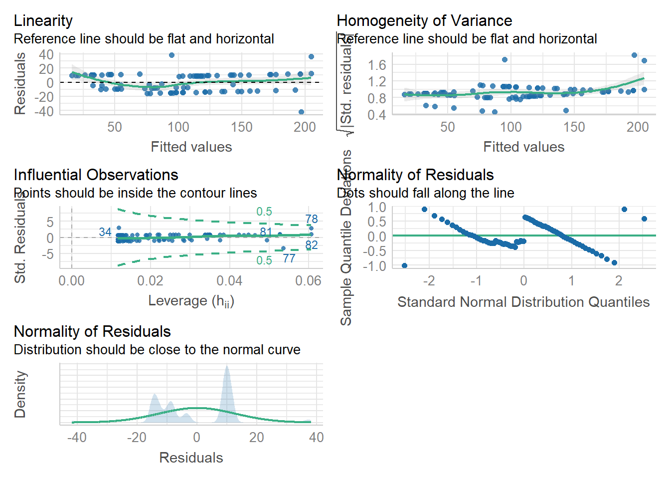
#checking overal assumption for Fat and RBSlibrary(performance)check_model(FR)
Based on charts produced by the model for Abdominal Fat Thickness and Random Blood Sugar, we can conclude that the linearity and equality of variances assumptions were met (this is based on the first table). Then the normality of the residual was not met, how ever, since the number of observations were more than 30, the central limit theorem was applied to indicate that the data was approximately to normal distribution (last table (3rd row, 1st column)).
Table 2. Association of Abdominal Fat Thickness and Risk Factors (n=86)
Risk Factors
N
Beta
SE1
Statistic
95% CI1
p-value
waist circumference (cm)
86
4.0
0.270
15.0
3.5, 4.6
<0.001
random blood sugar (mmol/l)
86
9.6
0.270
35.6
9.1, 10
<0.001
1 SE = Standard Error, CI = 95% Confidence Interval for Simple Linear Regression
Interpretation:
From Table 2, Waist circumference showed as a moderately strong companion, explaining 72.7% of the variation in abdominal fat thickness. For every increase in waistline, there was a 4.03 unit climb in visceral fat. This suggests that measuring the waist could be a useful screening tool. However, a more powerful predictor was found.
Random blood sugar, with a significant 93.8% explanation, emerged as the top predictor. Every increase in blood sugar was associated with a notable 9.64 unit surge in abdominal fat, indicating its close connection with visceral fat accumulation. This strength suggests that random blood sugar might be an early and sensitive indicator of hidden fat, offering valuable insights into metabolic health.
Exercise
Perform a simple linear regression with mpg as the dependent variable and wt as the independent variable in the mtcars dataset. Check and interpret the assumptions. Interpret the coefficients and the R-Squared value.
Perform a simple linear regression analysis with Sepal.Length as the dependent variable and Petal.Width as the independent variable in the iris dataset. Check and interpret the assumptions. Interpret the coefficients and the R-squared value.
Using pefr mlr.dta dataset from this link: https://sta334.s3.ap-southeast-1.amazonaws.com/data/pefr+mlr.dta. Perform simple linear regression by taking pefr as dependent variable. The independent variables are age, weight, and height. Check and interpret the assumptions then intrepret the coefficients and the R-squared values.