The correlation measures the association between two continuous variables. The correlation exists between two variables when the values of one variable are somehow associated with the values of the other variable. In theory, both variables are taken at random and quantitative variables. More specifically, the measure of association in correlation indicates the measure of strength. The correlation is not enough if your objective is to do prediction. The following is some examples of research questions for correlation analysis:
1) What is the strength of association between cholesterol level and body weight?
Based on this question, the researcher does not wish to assess the magnitude of the change in body weight for a unit change in cholesterol, so the appropriate analysis would be correlation analysis.
2) How much will a 1gm of salt change systolic blood pressure in mmHg in Perak population?
In this question, the researcher wishes to assess the magnitude of change in the systolic blood pressure for a 1gm salt intake, so the appropriate analysis would be linear regression, not the correlation analysis.
Measure the strength of the linear correlation with r
The use of linear correlation coefficient (r), which is a number that the strength of the linear association between the two variables. The linear correlation coefficeint is sometimes referred to as the Pearson product moment correlation coefficient in honor of Karl Pearson (1857-1936), who originally developed it.
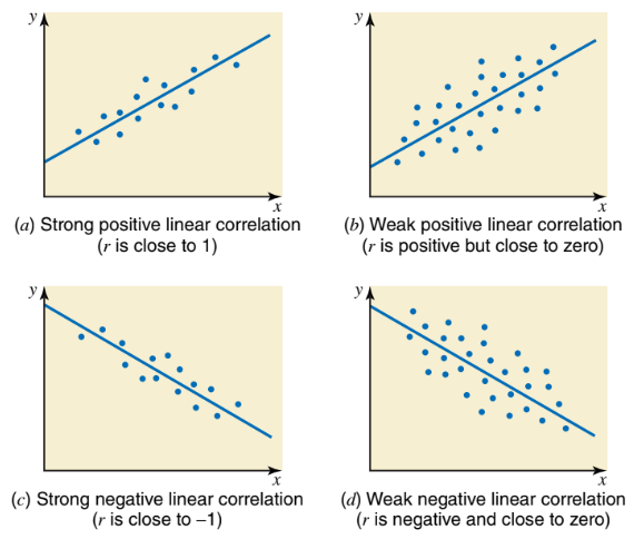
The value of the correlation coefficient always lies in the range -1 to 1. If r = 0, means there are no correlation, r = +1 means a perfect positive relationship, and r = -1 means a perfect negative relationship. Generally, If the correlation between two variables is positive and close to 1, we say that the variables have a strong positive linear correlation. If the correlation between two variables is positive by close to zero, then the variables have a weak positive linear correlation. In contrast, if the correlation between two variables is negative and close to -1, then the variables are said to have a strong negative linear correlation. If the correlation between two variables is negative but close to zero, there exists a weak negative linear correlation between the variables.
Suggested the distribution of coefficient rate can be defined as below:
Coefficient value
Interpretation
0
no linear correlation
0 < r ≤ 0.25
weak linear correlation
0.25 < r ≤ 0.50
fair linear correlation
0.50 < r ≤ 0.75
moderate linear correlation
0.75 < r ≤ 1.00
strong linear correlation
Example of strength of linear correlation
1) r = 0 : There is no linear relationship between x and y.
2) r = 1: There is a perfect positive linear relationship between x and y.
3) r = 0.83: There is a strong positive linear relationship between x and y.
4) r = -0.61: There is a moderate negative linear relationship between x and y.
5) r = -0.23: There is a weak negative linear relationship between x and y.
Method of Determine Linear Correlation
1) Scatter Diagram
Graphical Method
2) Pearson’s Product Moment Coefficient of Correlation (r)
For quantitative variables
3) Spearman’s Rank Coefficient of Correlation (rs)
For qualitative and quantitative variables
Scatter Diagram
A scatter diagram is a graph that shows the relationship between independent and dependent variables. It is also known as a scatter plot. By drawing a scatter diagram, we can determine the types of correlation between independent and dependent variables.
Example of scatter plot interpretation:
Assumption of correlation analysis
There are five (5) main assumptions for linear correlation analysis. But sometimes when we used our own data, maybe one or more of these assumptions will be violated. This is not an unusual situation when dealing with real-world data. Don’t worry much, even when your data fails certain assumptions, there is always a solution to overcome this.
1) Two variables should be continuous quantitative (measured at least ratio scale).
2) The relationship of two variables must be linear (confirm this using scatter diagram).
3) There should be no significant outlier. The outlier is a single data point within dataset that does not follow the usual pattern.
4) The joint distribution of two variables is normally distributed called as the bivariate normal distribution / multivariate normal distribution.
5) For each of the joint distribution, the marginal distribution must be normally distributed.
Type of data required
Both variables to be analysed using correlation analysis must be numerical/continuous for at least ratio scale of measurement.
Example 1
We using penguins dataset from palmerpenguins library. To measure the linear correlation between body mass and flipper length of the penguins.
Research question:
Is body mass of the penguins correlated linearly with flipper length?
Hypothesis Statement:
There is no correlation between body mass and flipper length of the penguins.
Step 1: Scatter diagram
library(ggplot2)
Warning: package 'ggplot2' was built under R version 4.3.2
library(palmerpenguins)
Warning: package 'palmerpenguins' was built under R version 4.3.2
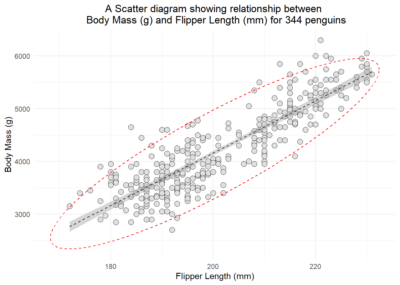
ggplot(penguins, aes(x=flipper_length_mm, y = body_mass_g)) +geom_point(size =3, bg="grey88", color ="grey12", pch=21, alpha =2) +geom_smooth(method ="lm", color="grey14", lwd =0.5, lty =2, se=TRUE) +labs(title ="A Scatter diagram showing relationship between \n Body Mass (g) and Flipper Length (mm) for 344 penguins", x ="Flipper Length (mm)", y ="Body Mass (g)") +theme_minimal() +theme(plot.title =element_text(hjust=0.5)) +stat_ellipse(lty=2, color ="red") #to draw elliptical shape
Based on the scatter diagram, we can conclude that there is a strong positive linear correlation between body mass (g) and flipper length of 344 penguins.
In addition, we can see the elliptical shape around the scatter diagram, which concludes that the variables are bivariately normal distributed.
Some explanation of the methods available in MVN library:
1) Mardia test: Calculates the Mardia’s multivariate skewness and kurtosis coefficients as well as their corresponding statistical significance. It can also calculate corrected version of skewness coefficient for small sample size (n<20). For multivariate normality, both p-values of skewness and kurtosis statistic should be greater than 0.05. If sample size less than 20, then p.value.small should be used as significance value of skewness instead of p.value.skew. If there are missing values in the data, a listwise deletion will be applied and a complete-case analysis will be performed.
2) Henze-Zirkler's test: The Henze-Zirkler test is based on a non-negative functional distance that measures the distance between two distribution functions. If the data is multivariate normal, the test statistic HZ is approximately lognormally distributed. It proceeds to calculate the mean, variance and smoothness parameter. Then, mean and variance are lognormalized and the p-value is estimated. If there are missing values in the data, a listwise deletion will be applied and a complete-case analysis will be performed.
3) Royston Test: A function to generate the Shapiro-Wilk’s W statistic needed to feed the Royston’s H test for multivariate normality However, if kurtosis of the data greater than 3 then Shapiro-Francia test is used for leptokurtic samples else Shapiro-Wilk test is used for platykurtic samples. If there are missing values in the data, a listwise deletion will be applied and a complete-case analysis will be performed. Do not apply Royston’s test, if dataset includes more than 5000 cases or less than 3 cases, since it depends on Shapiro-Wilk’s test.
We will use Henze-Zirkler method for Multivariate Normality test.
library(MVN) #load the library#first, we drop all missing valueslibrary(tidyverse)data1 <- penguins %>%drop_na()# We will use mvn(data= data1[c(5,6)], mvnTest ="hz", #Henze-Zirkler testunivariateTest ="Lillie") #Lilliefor's test
$multivariateNormality
           Test       HZ      p value MVN
1 Henze-Zirkler 5.344036 2.949085e-12  NO

$univariateNormality
                             Test          Variable Statistic   p value
1 Lilliefors (Kolmogorov-Smirnov) flipper_length_mm    0.1249  <0.001
2 Lilliefors (Kolmogorov-Smirnov)    body_mass_g       0.1057  <0.001
  Normality
1    NO
2    NO

$Descriptives
                    n     Mean   Std.Dev Median  Min  Max 25th 75th      Skew
flipper_length_mm 333  200.967  14.01577    197  172  231  190  213 0.3569099
body_mass_g       333 4207.057 805.21580   4050 2700 6300 3550 4775 0.4680001
                    Kurtosis
flipper_length_mm -0.9770375
body_mass_g       -0.7540362
Based on the Henze-Zirkler test, the result showed that the variables was not multivariate normal distribution. However, by comparing to the graphical method (scatter diagram), we can generally concluded that the variables were bivariately normal distributed (graphically). Hence, we can proceed with Pearson’s product moment correlation of coefficient to determine the correlation between body mass and flipper length.
Step 3: Perform correlation analysis
Since the variables were bivariately normal distributed (based on scatter diagram), we can proceed with Pearson’s Product Moment Correlation of Coefficient.
To perform the correlation analysis, we can use cor() function stats package. The cor() function is commonly used to calculate the correlation between two or more numeric variables.
Here’s a brief explanation of how the cor() function works in R:
#syntax of cor() functioncor(x, y=NULL, method =c("pearson", "kendall", "spearman"))
the cor() function is used to calculate the Pearson correlation coefficient between two numeric vectors, x and y. The result is stored in the variable correlation_coefficient.
If method = "pearson", the function calculates the Pearson correlation coefficient, which measures linear correlation.
If method = "kendall", the function calculates the Kendall rank correlation coefficient, which measures the strength and direction of the monotonic relationship between two variables.
If method = "spearman", the function calculates the Spearman rank correlation coefficient, another measure of monotonic relationship that is less sensitive to outliers.
In summary, the cor() function is a versatile tool for calculating different types of correlations between numeric variables, depending on the specified method.
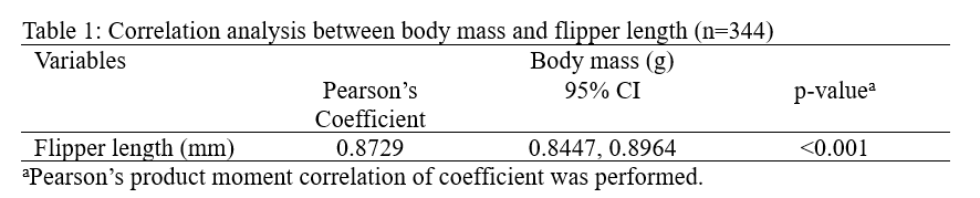
From the result, we can conclude that there are strong positive linear correlation between body mass (g) and flipper length (mm) of the penguins. The correlation coefficient value was 0.8730.
To find the p-value that associated with the correlation coefficient, we can use cor.test() from stats package.
cor.test(data1$flipper_length_mm, data1$body_mass_g, alternative ="two.sided", method ="pearson")
    Pearson's product-moment correlation

data:  data1$flipper_length_mm and data1$body_mass_g
t = 32.562, df = 331, p-value < 2.2e-16
alternative hypothesis: true correlation is not equal to 0
95 percent confidence interval:
 0.8447622 0.8963550
sample estimates:
      cor
0.8729789
Based on the result, we can conclude that there was statistically significant correlation between body mass (g) and flipper length (mm) since the p-value was less than 0.05 [Pearson’s r score: 0.8729, p-value: <0.001]. Below is the presentation of the result:
Alternatively, we can use ready made package from cran repository, such as ggstatsplot, corrr, Hmisc, corrplot, psych, and many more.
Example using ggstatsplot package
library(ggstatsplot)
Warning: package 'ggstatsplot' was built under R version 4.3.2
You can cite this package as:
     Patil, I. (2021). Visualizations with statistical details: The 'ggstatsplot' approach.
     Journal of Open Source Software, 6(61), 3167, doi:10.21105/joss.03167
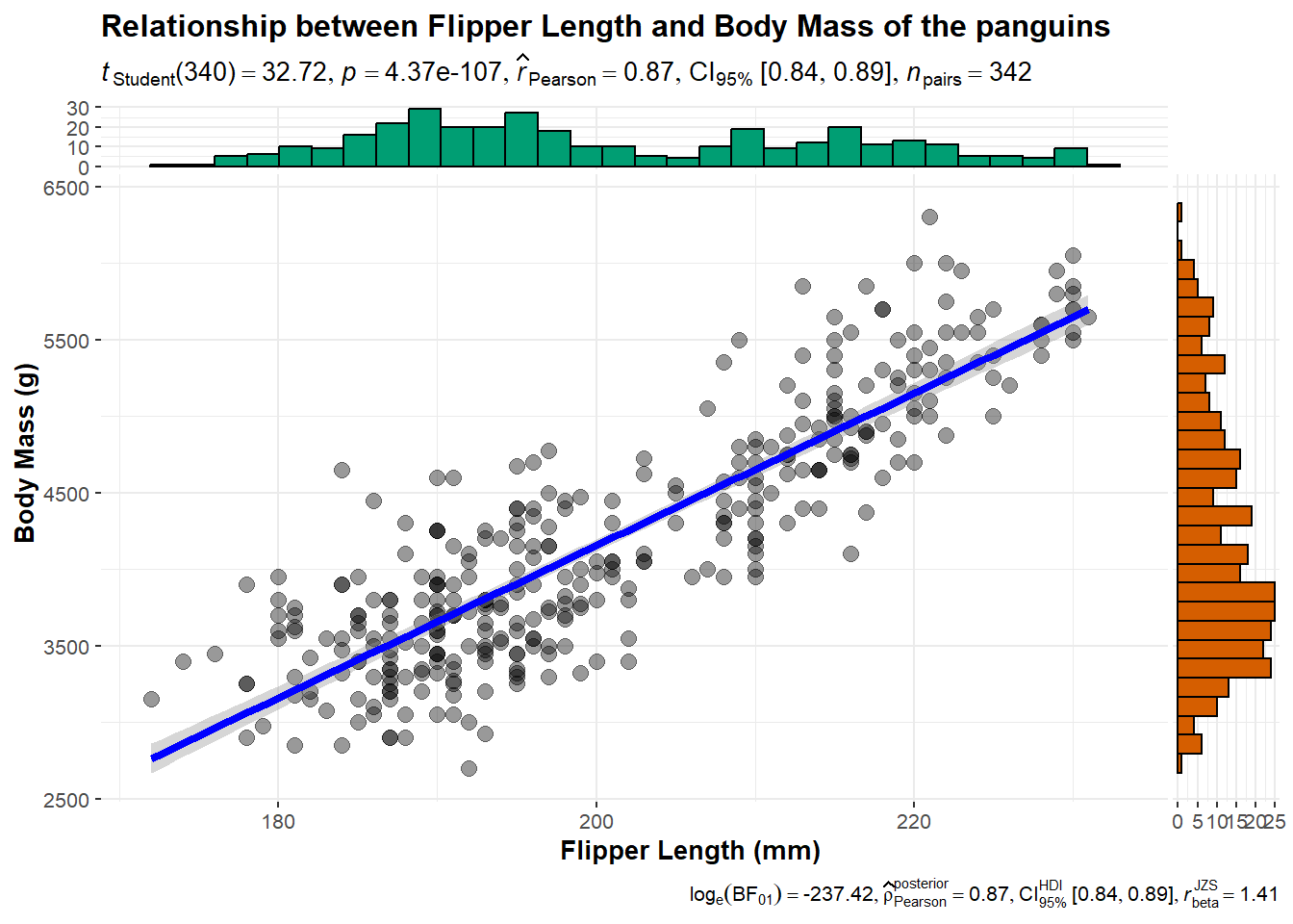
library(palmerpenguins)ggscatterstats(data = penguins, x = flipper_length_mm, y = body_mass_g, type ='parametric',xlab ="Flipper Length (mm)", ylab ="Body Mass (g)", title ="Relationship between Flipper Length and Body Mass of the panguins")
Registered S3 method overwritten by 'ggside':
  method from
  +.gg   ggplot2
`stat_bin()` using `bins = 30`. Pick better value with `binwidth`.
`stat_bin()` using `bins = 30`. Pick better value with `binwidth`.
In this function, it illustrate the scatter plot for flipper length and body mass, the p-value of correlation, correlation coefficient and 95% confidence interval.
Example using corrr package
library(corrr)
Warning: package 'corrr' was built under R version 4.3.2
a <-correlate(data1$flipper_length_mm, data1$body_mass_g, method ="pearson", use ="pairwise.complete.obs")
By using the correlate() function from corrr package, it will provide use the value of correlation coefficient. This function is same as cor() function from stats package, where we can adjust the method from pearson to kendall or spearman.
By using rcorr() from Hmisc package, it provide us the value of correlation coefficient interm of matrix formation. We can adjust the type of the method from pearson to spearman.
Finding the correlation coefficient value for more than 2 variables
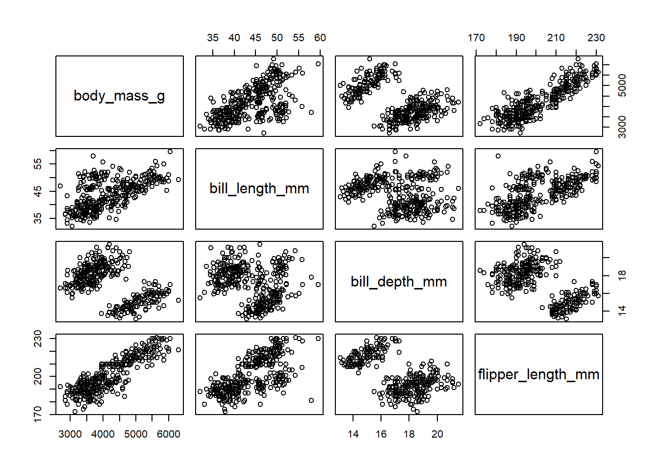
Usually, we want analyse the correlation values for more than 2 continuous variables simultaneously. To do so, we can use the same function by imputing all the variables that we wish to measure the correlation values.
For example, we wish to obtain the correlation measures for body mass, flipper length, bill length, and bill depth.
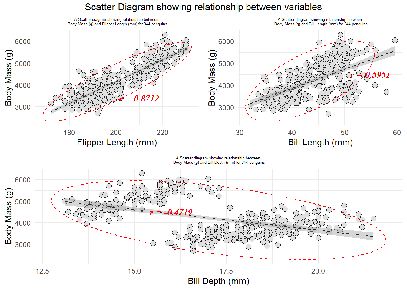
#checking the bivariate normality assumptions.library(gridExtra)library(ggplot2)library(palmerpenguins)corr1 <-round(cor(penguins$flipper_length_mm, penguins$body_mass_g, method ="pearson", use="complete.obs"), 4)bf <-ggplot(penguins, aes(x=flipper_length_mm, y = body_mass_g)) +geom_point(size =3, bg="grey88", color ="grey12", pch=21, alpha =2) +geom_smooth(method ="lm", color="grey14", lwd =0.5, lty =2, se=TRUE) +labs(title ="A Scatter diagram showing relationship between \n Body Mass (g) and Flipper Length (mm) for 344 penguins", x ="Flipper Length (mm)", y ="Body Mass (g)") +theme_minimal() +theme(plot.title =element_text(hjust=0.5, size =5)) +stat_ellipse(lty=2, color ="red") +#to draw elliptical shapegeom_text(x=210, y =3400, label =paste0("r = ", corr1), col ="red", size =4, fontface ="italic", family ="serif")corr2 <-round(cor(penguins$bill_length_mm, penguins$body_mass_g, method ="pearson", use="complete.obs"), 4)bl <-ggplot(penguins, aes(x=bill_length_mm, y = body_mass_g)) +geom_point(size =3, bg="grey88", color ="grey12", pch=21, alpha =2) +geom_smooth(method ="lm", color="grey14", lwd =0.5, lty =2, se=TRUE) +labs(title ="A Scatter diagram showing relationship between \n Body Mass (g) and Bill Length (mm) for 344 penguins", x ="Bill Length (mm)", y ="Body Mass (g)") +theme_minimal() +theme(plot.title =element_text(hjust=0.5, size =5)) +stat_ellipse(lty=2, color ="red") +#to draw elliptical shapegeom_text(x=55, y =4500, label =paste0("r = ", corr2), col ="red", size =4, fontface ="italic", family ="serif")corr2 <-round(cor(penguins$bill_depth_mm, penguins$body_mass_g, method ="pearson", use="complete.obs"), 4)bd <-ggplot(penguins, aes(x=bill_depth_mm, y = body_mass_g)) +geom_point(size =3, bg="grey88", color ="grey12", pch=21, alpha =2) +geom_smooth(method ="lm", color="grey14", lwd =0.5, lty =2, se=TRUE) +labs(title ="A Scatter diagram showing relationship between \n Body Mass (g) and Bill Depth (mm) for 344 penguins", x ="Bill Depth (mm)", y ="Body Mass (g)") +theme_minimal() +theme(plot.title =element_text(hjust=0.5, size =5)) +stat_ellipse(lty=2, color ="red") +#to draw elliptical shapegeom_text(x=16, y =4500, label =paste0("r = ", corr2), col ="red", size =4, fontface ="italic", family ="serif")grid.arrange(arrangeGrob(bf, bl, ncol=2), arrangeGrob(bd, ncol=1), nrow =2, top="Scatter Diagram showing relationship between variables")
Based on the scatter diagrams for all pairs of variables, we can conclude that all of pairs were bivariately normally distributed.
Alternatively, we can perform the scatter diagram from graphics package as well.
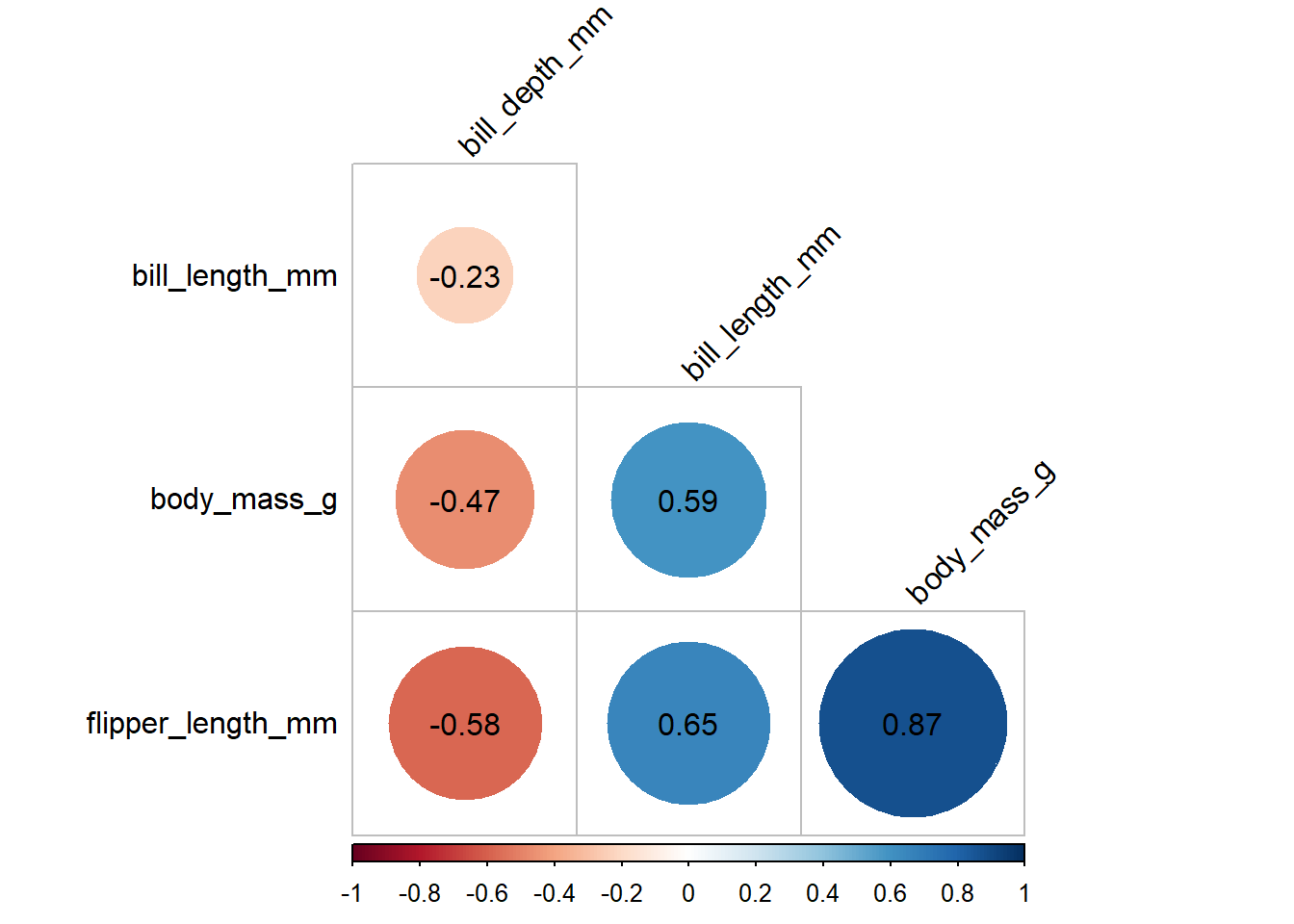
From the analysis, we can get the the correlation matrix of all pairs. The correlation for body mass and flipper length was 0.87, correlation for body mass and bill length was 0.59, and correlation for body mass and bill depth was -0.47. In addition, we also can get the correlation for bill length and bill depth, bill length and flipper length, and bill depth and flipper length.
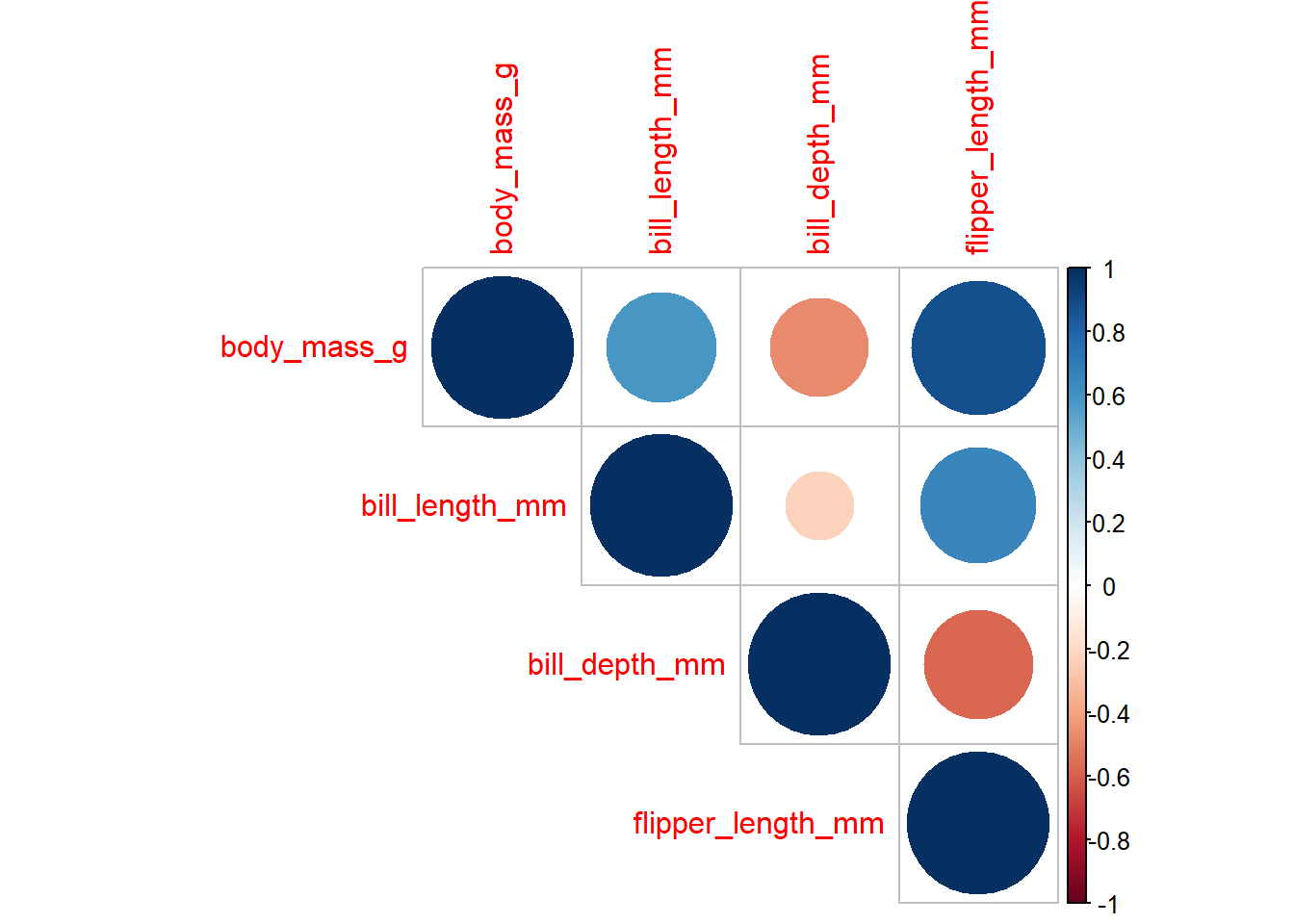
Alternatively, we can get the values of correlation coefficients for all variables together with the correlation plots
library(corrplot)
Warning: package 'corrplot' was built under R version 4.3.2
corrplot 0.92 loaded
#first we need to find the correlation matrix corr1 <-cor(data1[c(6,3,4,5)], method="pearson")#then input it into the corrplot functioncorrplot(corr1, method ="circle", type="upper")
#the method can be change to circle, square, ellipse, number, shade, color, or pie
To get the p-values for all variables, we can use cor_mat() and cor_get_pval() function from rstatix package.
library(rstatix)
Warning: package 'rstatix' was built under R version 4.3.2
Attaching package: 'rstatix'
The following object is masked from 'package:stats':

    filter
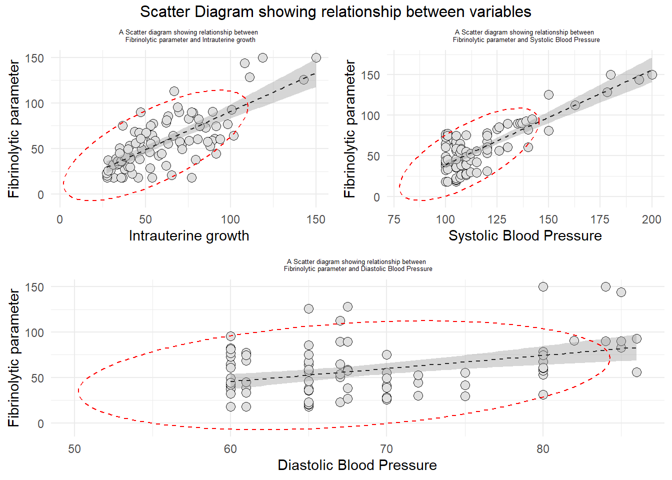
1) Is there are any significant correlation between Fibrinolytic parameter (coagulation) and level of systolic blood pressure?
2) Is there any significant correlation between Fibrinolytic parameter (coagulation) and level of diastolic blood pressure?
3) Is there any significant correlation between Fibrinolytic parameter (coagulation) and Intrauterine growth (hosp)?
Hypothesis Statement:
1) There are no significant correlation between Fibrinolytic parameter (coagulation) and level of systolic blood pressure.
2) There are no significant correlation between Fibrinolytic parameter (coagulation) and level of diastolic blood pressure.
3) There are no significant correlation between Fibrinolytic parameter (coagulation) and Intrauterine growth (hosp)?
#loading related packageslibrary(ggplot2)library(tidyverse)library(dplyr)library(foreign)#loading the datasetdata1 <-read.spss("https://sta334.s3.ap-southeast-1.amazonaws.com/data/correlation.sav", to.data.frame =TRUE)head(data1)
#checking the bivariate normality assumptions.library(gridExtra)a <-ggplot(data1, aes(x=hosp, y = coagu)) +geom_point(size =3, bg="grey88", color ="grey12", pch=21, alpha =2) +geom_smooth(method ="lm", color="grey14", lwd =0.5, lty =2, se=TRUE) +labs(title ="A Scatter diagram showing relationship between \n Fibrinolytic parameter and Intrauterine growth", x ="Intrauterine growth", y ="Fibrinolytic parameter") +theme_minimal() +theme(plot.title =element_text(hjust=0.5, size =5)) +stat_ellipse(lty=2, color ="red") #to draw elliptical shapeb <-ggplot(data1, aes(x=SBP, y = coagu)) +geom_point(size =3, bg="grey88", color ="grey12", pch=21, alpha =2) +geom_smooth(method ="lm", color="grey14", lwd =0.5, lty =2, se=TRUE) +labs(title ="A Scatter diagram showing relationship between \n Fibrinolytic parameter and Systolic Blood Pressure", x ="Systolic Blood Pressure", y ="Fibrinolytic parameter") +theme_minimal() +theme(plot.title =element_text(hjust=0.5, size =5)) +stat_ellipse(lty=2, color ="red") #to draw elliptical shapec <-ggplot(data1, aes(x=dbp, y = coagu)) +geom_point(size =3, bg="grey88", color ="grey12", pch=21, alpha =2) +geom_smooth(method ="lm", color="grey14", lwd =0.5, lty =2, se=TRUE) +labs(title ="A Scatter diagram showing relationship between \n Fibrinolytic parameter and Diastolic Blood Pressure", x ="Diastolic Blood Pressure", y ="Fibrinolytic parameter") +theme_minimal() +theme(plot.title =element_text(hjust=0.5, size =5)) +stat_ellipse(lty=2, color ="red") #to draw elliptical shapegrid.arrange(arrangeGrob(a, b, ncol=2), arrangeGrob(c, ncol=1), nrow =2, top="Scatter Diagram showing relationship between variables")
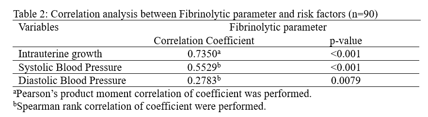
Since only one pairs was bivariately normal distributed (Fibrinolytic Parameter and Intrauterine growth), we will use Pearson’s Product Moment Correlation for this pair. Other pairs will be measured by using Spearman’s Rank Correlation.
#Pearson Correlation#Fibrinolytic parameter and Intrauterine growthcor.test(data1$coagu, data1$hosp,method ="pearson")
    Pearson's product-moment correlation

data:  data1$coagu and data1$hosp
t = 10.17, df = 88, p-value < 2.2e-16
alternative hypothesis: true correlation is not equal to 0
95 percent confidence interval:
 0.6227350 0.8176615
sample estimates:
     cor
0.735034
    Spearman's rank correlation rho

data:  data1$coagu and data1$SBP
S = 54315, p-value = 1.597e-08
alternative hypothesis: true rho is not equal to 0
sample estimates:
      rho
0.5529047
#Fibrinolytic parameter and Diastolic Blood Pressurecor.test(data1$coagu, data1$dbp, method ="spearman")
    Spearman's rank correlation rho

data:  data1$coagu and data1$dbp
S = 87672, p-value = 0.007901
alternative hypothesis: true rho is not equal to 0
sample estimates:
      rho
0.2783305
To present the result of the analysis:
Exercise 1
1) Using Waist circumference dataset Data Waist.sav from this link: https://sta334.s3.ap-southeast-1.amazonaws.com/data/Data+Waist.sav. Perform suitable analysis to measure the correlation between waist and fat, and waist and random blood sugar (rbs). State the research questions, objectives and hypothesis. Produce a proper report presentation for this analysis.
2) Calculate the Pearson correlation coefficient between mpg and disp in the mtcars dataset. Test the assumptions for correlation and interpret the results.
3) Perform correlation analysis for Sepal Length and Petal Length in the iris dataset. Test the assumptions for correlation and interpret the results.
4) Using College dataset from ISLR2 package, find correlation between Number of applications accepted (Accept), Number of new student enrolled (Enroll), and Graduation rate (Grad.Rate). What is your inference regarding this results?